This blog is a companion to my recent book, Exploring Data in Engineering, the Sciences, and Medicine, published by Oxford University Press. The blog expands on topics discussed in the book, and the content is heavily example-based, making extensive use of the open-source statistical software package R.

Sunday, March 9, 2014

A question of model uncertainty

It has been several months since my last post on classification tree models, because two things have been consuming all of my spare time.  The first is that I taught a night class for the University of Connecticut’s Graduate School of Business, introducing R to students with little or no prior exposure to either R or programming.  My hope is that the students learned something useful – I can say with certainty that I did – but preparing for the class and teaching it took a lot of time.  The other activity, that has taken essentially all of my time since the class ended, is the completion of a book on nonlinear digital filtering using Python, joint work with my colleague Moncef Gabbouj of the Tampere University of Technology in Tampere, Finland.  I will have more to say about both of these activities in the future, but for now I wanted to respond to a question raised about my last post.

Specifically, Professor Frank Harrell, the developer of the extremely useful Hmisc package, asked the following:

            How did you take into account model uncertainty?  The uncertainty resulting from data mining to find nodes and thresholds for continuous predictors has a massive impact on confidence intervals for estimates from recursive partitioning.

The short answer is that model uncertainty was not accounted for in the results I presented last time, primarily because – as Professor Harrell’s comments indicate – this is a complicated issue for tree-based models.  The primary objective of this post and the next few is to discuss this issue.

So first, what exactly is model uncertainty?  Any time we fit an empirical model to data, the results we obtain inherit some of the uncertainty present in the data.  For the specific example of linear regression models, the magnitude of this uncertainty is partially characterized by the standard errors included in the results returned by R’s summary() function.  This magnitude depends on both the uncertainty inherent in the data and the algorithm we use to fit the model.  Sometimes – and classification tree models are a case in point – this uncertainty is not restricted to variations in the values of a fixed set of parameters, but it can manifest itself in substantial structural variations.  That is, if we fit classification tree models to two similar but not identical datasets, the results may differ in the number of terminal nodes, the depths of these terminal nodes, the variables that determine the path to each one, and the values of these variables that determine the split at each intermediate node.  This is the issue Professor Harrell raised in his comments, and the primary point of this post is to present some simple examples to illustrate its nature and severity.

In addition, this post has two other objectives.  The first is to make amends for a very bad practice demonstrated in my last two posts.  Specifically, the classification tree models described there were fit to a relatively large dataset and then evaluated with respect to that same dataset.  This is bad practice because it can lead to overfitting, a problem that I will discuss in detail in my next post.  (For a simple example that illustrates this problem, see the discussion in Section 1.5.3 of Exploring Data in Engineering, the Sciences, and Medicine.)  In the machine learning community, this issue is typically addressed by splitting the original dataset randomly into three parts: a training subset (Tr) used for model-fitting, a validation subset (V) used for intermediate modeling decisions (e.g., which variables to include in the model), and a test subset (Te) used for final model evaluation.  This approach is described in Section 7.2 of The Elements of Statistical Learning by Hastie, Tibshirani, and Friedman, who suggest 50% training, 25% validation, and 25% test as a typical choice.

The other point of this post is to say something about the different roles of model uncertainty and data uncertainty in the practice of predictive modeling.  I will say a little more at the end, but whether we are considering business applications like predicting customer behavior or industrial process control applications to predict the influence of changes in control valve settings, the basic predictive modeling process consists of three steps: build a prediction model; fix (i.e., “finalize”) this model; and apply it to generate predictions from data not seen in the model-building process.  In these applications, model uncertainty plays an important role in the model development process, but once we have fixed the model, we have eliminated this uncertainty by fiat.  Uncertainty remains an important issue in these applications, but the source of this uncertainty is in the data from which the model generates its predictions and not in the model itself once we have fixed it.  Conversely, as George Box famously said, “all models are wrong, but some are useful,” and this point is crucial here: if the model uncertainty is great enough, it may be difficult or impossible to select a fixed model that is good enough to be useful in practice.


Returning to the topic of uncertainty in tree-based models, the above plot is a graphical representation of a classification tree model repeated from my previous two posts.  This model was fit using the ctree procedure in the R package party, taking all optional parameters at their default values.  As before, the dataset used to generate this model was the Australian vehicle insurance dataset car.csv, obtained from the website associated with the book Generalized Linear Models for Insurance Data, by Piet de Jong and Gillian Z. Heller.  This model – and all of the others considered in this post – was fit using the same formula as before:

            Fmla = clm ~ veh_value + veh_body + veh_age + gender + area + agecat

Each record in this dataset describes a single-vehicle, single-driver insurance policy, and clm is a binary response variable taking the value 1 if policy filed one or more claims during the observation period and 0 otherwise.  The other variables (on the right side of “~”) represent covariates that are either numeric (veh_value, the value of the vehicle) or categorical (all other variables, representing the vehicle body type, its age, the gender of the driver, the region where the vehicle is driven, and the driver’s age).

As I noted above, this model was fit to the entire dataset, a practice that is to be discouraged since it does not leave independent datasets of similar character for validation and testing.  To address this problem, I randomly partitioned the original dataset into a 50% training subset, a 25% validation subset, and a 25% test subset as suggested by Hastie, Tibshirani and Friedman.  The plot shown below represents the ctree model we obtain using exactly the same fitting procedure as before, but applied to the 50% random training subset instead of the complete dataset.  Comparing these plots reveals substantial differences in the overall structure of the trees we obtain, strictly as a function of the data used to fit the models.  In particular, while the original model has seven terminal nodes (i.e., the tree assigns every record to one of seven “leaves”), the model obtained from the training data subset has only four.  Also, note that the branches in the original tree model are determined by the three variables agecat, veh_body, and veh_value, while the branches in the model built from the training subset are determined by the two variables agecat and veh_value only.


These differences illustrate the point noted above about the strong dependence of classification tree model structure on the data used in model-building.  One could object that since the two datasets used here differ by a factor of two in size, the comparison isn’t exactly “apples-to-apples.”  To see that this is not really the issue, consider the following two cases, based on the idea of bootstrap resampling.  I won’t attempt a detailed discussion of the bootstrap approach here, but the basic idea is to assess the effects of data variability on a computational procedure by applying that procedure to multiple datasets, each obtained by sampling with replacement from a single source dataset.  (For a comprehensive discussion of the bootstrap and some of its many applications, refer to the book Bootstrap Methods and their Application by A.C. Davison and D.V. Hinkley.)  The essential motivation is that these datasets – called bootstrap resamples – all have the same essential statistical character as the original dataset.  Thus, by comparing the results obtained from different bootstrap resamples, we can assess the variability in results for which exact statistical characterizations are either unknown or impractical to compute.  Here, I use this idea to obtain datasets that should address the “apples-to-apples” concern raised above.  More specifically, I start with the training data subset used to generate the model described in the previous figure, and I use R’s built-in sample() function to sample the rows of this dataframe with replacement.  For an arbitrary dataframe DF, the code to do this is simple:

> set.seed(iseed) 
> BootstrapIndex = sample(seq(1,nrow(DF),1),size=nrow(DF),replace=TRUE 
> ResampleFrame = DF[BootstrapIndex,]

The only variable in this procedure is the seed for the random sampling function sample(), which I have denoted as iseed.  The extremely complicated figure below shows the ctree model obtained using the bootstrap resample generated from the training subset with iseed = 5.


Comparing this model with the previous one – both built from datasets of the same size, with the same general data characteristics – we see that the differences are even more dramatic than those between the original model (built from the complete dataset) and the second one (built from the training subset).  Specifically, while the training subset model has four terminal nodes, determined by two variables, the bootstrap subsample model uses all six of the variables included in the model formula, yielding a tree with 16 terminal nodes.  But wait – sampling with replacement generates a significant number of duplicated records (for large datasets, each bootstrap resample contains approximately 63.2% of the original data values, meaning that the other 36.8% of the resample values must be duplicates).  Could this be the reason the results are so different?  The following example shows that this is not the issue.


This plot shows the ctree model obtained from another bootstrap resample of the training data subset, obtained by specifying iseed = 6 instead of iseed = 5.  This second bootstrap resample tree is much simpler, with only 7 terminal nodes instead of 16, and the branches of the tree are based on only four of the prediction variables instead of all six (specifically, neither gender nor veh_body appear in this model).  While I don’t include all of the corresponding plots, I have also constructed and compared the ctree models obtained from the bootstrap resamples generated for all iseed values between 1 and 8, giving final models involving between four and six variables, with between 7 and 16 terminal nodes.  In all cases, the datasets used in building these models were exactly the same size and had the same statistical character.  The key point is that, as Professor Harrell noted in his comments, the structural variability of these classification tree models across similar datasets is substantial.  In fact, this variability of individual tree-based models was one of the key motivations for developing the random forest method, which achieves substantially reduced model uncertainty by averaging over many randomly generated trees.  Unfortunately, the price we pay for this improved model stability is a complete loss of interpretibility.  That is, looking at any one of the plots shown here, we can construct a simple description (e.g., node 12 in the above figure represents older drivers – agecat > 4 – with less expensive cars, and it has the lowest risk of any of the groups identified there).  While we may obtain less variable predictions by averaging over a large number of these trees, such simple intuitive explanations of the resulting model are no longer possible.

I noted earlier that predictive modeling applications typically involve a three-step strategy: fit the model, fix the model, and apply the model.  I also argued that once we fix the model, we have eliminated model uncertainty when we apply it to new data.  Unfortunately, if the inherent model uncertainty is large, as in the examples presented here, this greatly complicates the “fix the model” step.  That is, if small variations in our training data subset can cause large changes in the structure of our prediction model, it is likely that very different models will exhibit similar performance when applied to our validation data subset.  How, then, do we choose?  I will examine this issue further in my next post when I discuss overfitting and the training/validation/test split in more detail. 


Tuesday, August 6, 2013

Assessing the precision of classification tree model predictions

My last post focused on the use of the ctree procedure in the R package party to build classification tree models.  These models map each record in a dataset into one of M mutually exclusive groups, which are characterized by their average response.  For responses coded as 0 or 1, this average may be regarded as an estimate of the probability that a record in the group exhibits a “positive response.”  This interpretation leads to the idea discussed here, which is to replace this estimate with the size-corrected probability estimate I discussed in my previous post (Screening for predictive characteristics).  Also, as discussed in that post, these estimates provide the basis for confidence intervals that quantify their precision, particularly for small groups.

In this post, the basis for these estimates is the R package PropCIs, which includes several procedures for estimating binomial probabilities and their confidence intervals, including an implementation of the method discussed in my previous post.  Specifically, the procedure used here is addz2ci, discussed in Chapter 9 of Exploring Data in Engineering, the Sciences, and Medicine.  As noted in both that discussion and in my previous post, this estimator is described in a paper by Brown, Cai and DasGupta in 2002, but the documentation for the PropCIs package cites an earlier paper by Agresti and Coull (“Approximate is better than exact for interval estimation of binomial proportions,” in The American Statistician, vol. 52, 1998, pp. 119-126).  The essential idea is to modify the classical estimator, augmenting the counts of 0’s and 1’s in the data by z2/2, where z is the normal z-score associated with the significance level.  As a specific example, z is approximately 1.96 for 95% confidence limits, so this modification adds approximately 2 to each count.  In cases where both of these counts are large, this correction has negligible effect, so the size-corrected estimates and their corresponding confidence intervals are essentially identical with the classical results.  In cases where either the sample is small or one of the possible responses is rare, these size-corrected results are much more reasonable than the classical results, which motivated their use both here and in my earlier post.


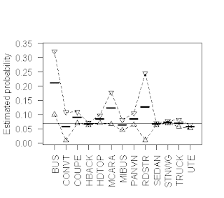
The above plot provides a simple illustration of the results that can be obtained using the addz2ci procedure, in a case where some groups are small enough for these size-corrections to matter.  More specifically, this plot is based on the Australian vehicle insurance dataset that I discussed in my last post, and it characterizes the probability that a policy files a claim (i.e., that the variable clm has the value 1), for each of the 13 vehicle types included in the dataset.  The heavy horizontal line segments in this plot represent the size-corrected claim probability estimates for each vehicle type, while the open triangles connected by dotted lines represent the upper and lower 95% confidence limits around these probability estimates, computed as described above.  The solid horizontal line represents the overall claim probability for the dataset, to serve as a reference value for the individual subset results.

An important observation here is that although this dataset is reasonably large (there are a total of 67,856 records), the subgroups are quite heterogeneous in size, spanning the range from 27 records listing “RDSTR” as the vehicle type to 22,233 listing “SEDAN”.  As a consequence, although the classical and size-adjusted claim probability estimates and their confidence intervals are essentially identical for the dataset overall, the extent of this agreement varies substantially across the different vehicle types.  Taking the extremes, the results for the largest group (“SEDAN”) are, as with the dataset overall, almost identical: the classical estimate is 0.0665, while the size-adjusted estimate is 0.0664; the lower 95% confidence limit also differs by one in the fourth decimal place (classical 0.0631 versus size-corrected 0.0632), and the upper limit is identical to four decimal places, at 0.0697.  In marked contrast, the classical and size-corrected estimates for the “RDSTR” group are 0.0741 versus 0.1271, the upper 95% confidence limits are 0.1729 versus 0.2447, and the lower confidence limits are -0.0247 versus 0.0096.  Note that in this case, the lower classical confidence limit violates the requirement that probabilities must be positive, something that is not possible for the addz2ci confidence limits (specifically, negative values are less likely to arise, as in this example, and if they ever do arise, they are replaced with zero, the smallest feasible value for the lower confidence limit; similarly for upper confidence limits that exceed 1).  As is often the case, the primary advantage of plotting these results is that it gives us a much more immediate indication of the relative precision of the probability estimates, particularly in cases like “RDSTR” where these confidence intervals are quite wide.

The R code used to generate these results uses both the addz2ci procedure from the PropCIs package, and the summaryBy procedure from the doBy package.  Specifically, the following function returns a dataframe with one row for each distinct value of the variable GroupingVar.  The columns of this dataframe include this value, the total number of records listing this value, the number of these records for which the binary response variable BinVar is equal to 1, the lower confidence limit, the upper confidence limit, and the size-corrected estimate.  The function is called with BinVar, GroupingVar, and the significance level, with a default of 95%.  The first two lines of the function require the doBy and PropCIs packages.  The third line constructs an internal dataframe, passed to the summaryBy function in the doBy package, which applies the length and sum functions to the subset of BinVar values defined by each level of GroupingVar, giving the total number of records and the total number of records with BinVar = 1.  The main loop in this program applies the addz2ci function to these two numbers, for each value of GroupingVar, which returns a two-element list.  The element $estimate gives the size-corrected probability estimate, and the element $conf.int is a vector of length 2 with the lower and upper confidence limits for this estimate.  The rest of the program appends these values to the internal dataframe created by the summaryBy function, which is returned as the final result.  The code listing follows:

BinomialCIbyGroupFunction <- function(BinVar, GroupingVar, SigLevel = 0.95){
  #
  require(doBy)
  require(PropCIs)
  #
  IntFrame = data.frame(b = BinVar, g = as.factor(GroupingVar))
  SumFrame = summaryBy(b ~ g, data = IntFrame, FUN=c(length,sum))
  #
  n = nrow(SumFrame)
  EstVec = vector("numeric",n)
  LowVec = vector("numeric",n)
  UpVec = vector("numeric",n)
  for (i in 1:n){
    Rslt = addz2ci(x = SumFrame$b.sum[i],n = SumFrame$b.length[i],conf.level=SigLevel)
    EstVec[i] = Rslt$estimate
    CI = Rslt$conf.int
    LowVec[i] = CI[1]
    UpVec[i] = CI[2]
  }
  SumFrame$LowerCI = LowVec
  SumFrame$UpperCI = UpVec
  SumFrame$Estimate = EstVec
  return(SumFrame)
}


 The binary response characterization tools just described can be applied to the results obtained from a classification tree model.  Specifically, since a classification tree assigns every record to a unique terminal node, we can characterize the response across these nodes, treating the node numbers as the data groups, analogous to the vehicle body types in the previous example.  As a specific illustration, the figure above gives a graphical representation of the ctree model considered in my previous post, built using the ctree command from the party package with the following formula:

            Fmla = clm ~ veh_value + veh_body + veh_age + gender + area + agecat

Recall that this formula specifies we want a classification tree that predicts the binary claim indicator clm from the six variables on the right-hand side of the tilde, separated by “+” signs.  Each of the terminal nodes in the resulting ctree model is characterized with a rectangular box in the above figure, giving the number of records in each group (n) and the average positive response (y), corresponding to the classical claim probability estimate.  Note that the product ny corresponds to the total number of claims in each group, so these products and the group sizes together provide all of the information we need to compute the size-corrected claim probability estimates and their confidence limits for each terminal node.  Alternatively, we can use the where method associated with the binary tree object that ctree returns to extract the terminal nodes associated with each observation.  Then, we simply use the terminal node in place of vehicle body type in exactly the same analysis as before.


The above figure shows these estimates, in the same format as the original plot of claim probability broken down by vehicle body type given earlier.  Here, the range of confidence interval widths is much less extreme than before, but it is still clearly evident: the largest group (Node 10, with 23,315 records) exhibits the narrowest confidence interval, while the smallest groups (Node 9, with 1,361 records, and Node 13, with 1,932 records) exhibit the widest confidence intervals.  Despite its small size, however, the smallest group does exhibit a significantly lower claim probability than any of the other groups defined by this classification tree model.

The primary point of this post has been to demonstrate that binomial confidence intervals can be used to help interpret and explain classification tree results, especially when displayed graphically as in the above figure.  These displays provide a useful basis for comparing classification tree models obtained in different ways (e.g., by different algorithms like rpart and ctree, or by different tuning parameters for one specific algorithm).  Comparisons of this sort will form the basis for my next post.

Saturday, April 13, 2013

Classification Tree Models

On March 26, I attended the Connecticut R Meetup in New Haven, which featured a talk by Illya Mowerman on decision trees in R.  I have gone to these Meetups before, and I have always found them to be interesting and informative.  Attendees range from those who are just starting to explore R to those who have multiple CRAN packages to their credit.  Each session is organized around a talk that focuses on some aspect of R and both the talks and the discussion that follow are typically lively and useful.  More information about the Connecticut R Meetup can be found here, and information about R Meetups in other areas can be found with a Google search on “R Meetup” with a location.


Mowerman’s talk focused on decision trees like the one shown in the figure above.  I give a somewhat more detailed discussion of this example below, but the basic idea is that the tree assigns every record in a dataset to a unique group, and a predicted response is generated for each group.  The basic decision tree models are either classification trees, appropriate to binary response variables, or regression tree models, appropriate to numeric response variables.  The figure above represents a classification tree model that predicts the probability that an automobile insurance policyholder will file a claim, based on a publicly available insurance dataset discussed further below.  Two advantages of classification tree models that Mowerman emphasized in his talk are, first, their simplicity of interpretation, and second, their ability to generate predictions from a mix of numerical and categorical covariates.  The above example illustrates both of these points – the decision tree is based on both categorical variables like veh_body (vehicle body type) and numerical variables like veh_value (the vehicle value in units of 10,000 Australian dollars). 

To interpret this tree, begin by reading from the top down, with the root node, numbered 1, which partitions the dataset into two subsets based on the variable agecat.  This variable is an integer-coded driver age group with six levels, ranging from 1 for the youngest drivers to 6 for the oldest drivers.  The root node splits the dataset into a younger driver subgroup (to the left, with agecat values 1 through 4) and an older driver subgroup (to the right, with agecat values 5 and 6).  Going to the right, node 11 splits the older driver group on the basis of vehicle value, with node 12 consisting of older drivers with veh_value less than or equal to 2.89, corresponding to vehicle values not more than 28,900 Australian dollars.  This subgroup contains 15,351 policy records, of which 5.3% file claims.  Similarly, node 13 corresponds to older drivers with vehicles valued more than 28,900 Australian dollars; this is a smaller group (1,932 policy records) with a higher fraction filing claims (8.3%).  Going to the left, we partition the younger driver group first on vehicle body type (node 2), then possibly a second time on driver age (node 4), possibly further on vehicle value (node 6) and finally again on vehicle body type (node 7).  The key point is that every record in the dataset is ultimately assigned to one of the seven terminal nodes of this tree (the “leaves,” numbered 3, 5, 8, 9, 10, 12, and 13).  The numbers associated with these nodes gives their size and the fraction of each group that files a claim, which may be viewed as an estimate of the conditional probability that a driver from each group will file a claim. 

Classification trees can be fit to data using a number of different algorithms, several of which are included in various R packages.  Mowerman’s talk focused primarily on the rpart package that is part of the standard R distribution and includes a procedure also named rpart, based on what is probably the best known algorithm for fitting classification and regression trees.  In addition, Mowerman also discussed the rpart.plot package, a very useful adjunct to rpart that provides a lot of flexibility in representing the resulting tree models graphically.  In particular, this package can be used to make much nicer plots than the one shown above; I haven't done that here largely because I have used a different tree fitting procedure, for reasons discussed in the next paragraph.  Another classification package that Mowerman mentioned in his talk is C50, which implements the C5.0 algorithm popular in the machine learning community.  The primary focus of this post is the ctree procedure in the party package, which was used to fit the tree shown here.

The reason I have used the ctree procedure instead of the rpart procedure is that for the dataset I consider here, the rpart procedure returns a trivial tree.  That is, when I attempt to fit a tree to the dataset using rpart with the response variable and covariates described below, the resulting “tree” assigns the entire dataset to a single node, declaring the overall fraction of positive responses in the dataset to be the common prediction for all records.  Applying the ctree procedure (the code is listed below) yields the nontrivial tree shown in the plot above.  The reason for the difference in these results is that the rpart and ctree procedures use different tree-fitting algorithms.  Very likely, the reason rpart has such difficulty with this dataset is its high degree of class imbalance: the positive response (i.e., “policy filed one or more claims”) occurs in only 4,264 of 67,856 data records, representing 6.81% of the total.  This imbalance problem is known to make classification difficult, enough so that it has become the focus of a specialized technical literature.  For a rather technical survey of this topic, refer to the paper “The Class Imbalance Problem: A Systematic Study,” by Japkowicz and Stephen (Intelligent Data Analysis, volume 6, number 5, November, 2002).  (So far, I have not been able to find a free version of this paper, but if you are interested in the topic, a search on this title turns up a number of other useful papers on the topic, although generally more specialized than this broad survey.)

To obtain the tree shown in the plot above, I used the following R commands:

> library(party)
> carFrame = read.csv("car.csv")
> Fmla = clm ~ veh_value + veh_body + veh_age + gender + area + agecat
> TreeModel = ctree(Fmla, data = carFrame)
> plot(TreeModel, type="simple")


The first line loads the party package to make the ctree procedure available for our use, and the second line reads the data file described below into the dataframe carFrame (note that this assumes the data file "car.csv" has been loaded into R's current working directory, which can be shown using the getwd() command).  The third line defines the formula that specifies the response as the binary variable clm (on the left side of "~") and the six other variables listed above as potential predictors, each separated by the "+" symbol.  The fourth line invokes the ctree procedure to fit the model and the last line displays the results.

The dataset I used here is car.csv, available from the website associated with the book Generalized Linear Models for Insurance Data, by Piet de Jong and Gillian Z. Heller.  As noted, this dataset contains 67,856 records, each characterizing an automobile insurance policy associated with one vehicle and one driver.  The dataset has 10 columns, each representing an observed value for a policy characteristic, including claim and loss information, vehicle characteristics, driver characteristics, and certain other variables (e.g., a categorical variable characterizing the type of region where the vehicle is driven).  The ctree model shown above was built to predict the binary response variable clm (where clm = 1 if one or more claims have been filed by the policyholder, and 0 otherwise), based on the following prediction variables:


-         the numeric variable veh_value;
-         veh_body, a categorical variable with 13 levels;
-         veh_age, an integer-coded categorical variable with 4 levels;
-         gender, a binary indicator of driver gender;
-         area, a categorical variable with six levels;
-         agecat, and integer-coded driver age variable.

The tree model shown above illustrates one of the points Mowerman made in his talk, that classification tree models can easily handle mixed covariate types: here, these covariates include one numeric variable (veh_value), one binary variable (gender), and four categorical variables.  In principle, tree models can be built using categorical variables with an arbitrary number of levels, but in practice procedures like ctree will fail if the number of levels becomes too large.

One of the tuning parameters in tree-fitting procedures like rpart and ctree is the minimum node size.  In his R Meetup talk, Mowerman showed that increasing this value from the default limit of 7 yielded simpler trees for the dataset he considered (the churn dataset from the C50 package).  Specifically, increasing the minimum node size parameter eliminated very small nodes from the tree, nodes whose practical utility was questionable due to their small size.  In my next post, I will show how a graphical tool for displaying binomial probability confidence limits can be used to help interpret classification tree results by explicitly displaying the prediction uncertainties.  The tool I use is GroupedBinomialPlot, one of those included in the ExploringData package that I am developing.

Finally, I should say in response to a question about my last post that, sadly, I do not yet have a beta test version of the ExploringData package.

Saturday, February 16, 2013

Finding outliers in numerical data

One of the topics emphasized in Exploring Data in Engineering, the Sciences and Medicine is the damage outliers can do to traditional data characterizations.  Consequently, one of the procedures to be included in the ExploringData package is FindOutliers, described in this post.  Given a vector of numeric values, this procedure supports four different methods for identifying possible outliers.

Before describing these methods, it is important to emphasize two points.  First, the detection of outliers in a sequence of numbers can be approached as a mathematical problem, but the interpretation of these data observations cannot.  That is, mathematical outlier detection procedures implement various rules for identifying points that appear to be anomalous with respect to the nominal behavior of the data, but they cannot explain why these points appear to be anomalous.  The second point is closely related to the first: one possible source of outliers in a data sequence is gross measurement errors or other data quality problems, but other sources of outliers are also possible so it is important to keep an open mind.  The terms “outlier” and “bad data” are not synonymous.  Chapter 7 of Exploring Data briefly describes two examples of outliers whose detection and interpretation led to a Nobel Prize and to a major new industrial product (Teflon, a registered trademark of the DuPont Company).

In the case of a single sequence of numbers, the typical approach to outlier detection is to first determine upper and lower limits on the nominal range of data variation, and then declare any point falling outside this range to be an outlier.  The FindOutliers procedure implements the following methods of computing the upper and lower limits of the nominal data range:

1.                  The ESD identifier, more commonly known as the “three-sigma edit rule,” well known but unreliable;
2.                  The Hampel identifier, a more reliable procedure based on the median and the MADM scale estimate;
3.                  The standard boxplot rule, based on the upper and lower quartiles of the data distribution;
4.                  An adjusted boxplot rule, based on the upper and lower quartiles, along with a robust skewness estimator called the medcouple.

The rest of this post briefly describes these four outlier detection rules and illustrates their application to two real data examples.

Without question, the most popular outlier detection rule is the ESD identifier (an abbreviation for “extreme Studentized deviation”), which declares any point more than t standard deviations from the mean to be an outlier, where the threshold value t is most commonly taken to be 3.  In other words, the nominal range used by this outlier detection procedure is the closed interval:

            [mean – t * SD, mean + t * SD]

where SD is the estimated standard deviation of the data sequence.  Motivation for the threshold choice t = 3 comes from the fact that for normally-distributed data, the probability of observing a value more than three standard deviations from the mean is only about 0.3%.  The problem with this outlier detection procedure is that both the mean and the standard deviation are themselves extremely sensitive to the presence of outliers in the data.  As a consequence, this procedure is likely to miss outliers that are present in the data.  In fact, it can be shown that for a contamination level greater than 10%, this rule fails completely, detecting no outliers at all, no matter how extreme they are (for details, see the discussion in Sec. 3.2.1 of Mining Imperfect Data).

The default option for the FindOutliers procedure is the Hampel identifier, which replaces the mean with the median and the standard deviation with the MAD (or MADM)  scale estimate.  The nominal data range for this outlier detection procedure is:

            [median – t * MAD, median + t * MAD]

As I have discussed in previous posts, the median and the MAD scale are much more resistant to the influence of outliers than the mean and standard deviation.  As a consequence, the Hampel identifier is generally more effective than the ESD identifier, although the Hampel identifier can be too aggressive, declaring too many points as outliers.  For detailed comparisons of the ESD and Hampel identifiers, refer to Sec. 7.5 of Exploring Data or Sec. 3.3 of Mining Imperfect Data.

The third method option for the FindOutliers procedure is the standard boxplot rule, based on the following nominal data range:

            [Q1 – c * IQD, Q3 + c * IQD]

where Q1 and Q3 represent the lower and upper quartiles, respectively, of the data distribution, and IQD = Q3 – Q1 is the interquartile distance, a measure of the spread of the data similar to the standard deviation.  The threshold parameter c is analogous to t in the first two outlier detection rules, and the value most commonly used in this outlier detection rule is c = 1.5.  This outlier detection rule is much less sensitive to the presence of outliers than the ESD identifier, but more sensitive than the Hampel identifier, and, like the Hampel identifier, it can be somewhat too aggressive, declaring nominal data observations to be outliers.  An advantage of the boxplot rule over these two alternatives is that, because it does not depend on an estimate of the “center” of the data (e.g., the mean in the ESD identifier or the median in the Hampel identifier), it is better suited to distributions that are moderately asymmetric.

The fourth method option is an extension of the standard boxplot rule, developed for data distributions that may be strongly asymmetric.  Basically, this procedure modifies the threshold parameter c by an amount that depends on the asymmetry of the distribution, modifying the upper threshold and the lower threshold differently.  Because the standard moment-based skewness estimator is extremely outlier-sensitive (for an illustration of this point, see the discussion in Sec. 7.1.1 of Exploring Data), it is necessary to use an outlier-resistant alternative to assess distributional asymmetry.  The asymmetry measure used here is the medcouple, a robust skewness measure available in the robustbase package in R and that I have discussed in a previous post (Boxplots and Beyond - Part II: Asymmetry ).   An important point about the medcouple is that it can be either positive or negative, depending on the direction of the distributional asymmetry; positive values arise more frequently in practice, but negative values can occur and the sign of the medcouple influences the definition of the asymmetric boxplot rule.  Specifically, for positive values of the medcouple MC, the adjusted boxplot rule’s nominal data range is:

            [Q1 – c * exp(a * MC) * IQD, Q3 + c * exp(b * MC) * IQD ]

while for negative medcouple values, the nominal data range is:

            [Q1 – c * exp(-b * MC) * IQD, Q3 + c * exp(-a * MC) * IQD ]

An important observation here is that for symmetric data distributions, MC should be zero, reducing the adjusted boxplot rule to the standard boxplot rule described above.  As in the standard boxplot rule, the threshold parameter is typically taken as c = 1.5, while the other two parameters are typically taken as a = -4 and b = 3.  In particular, these are the default values for the procedure adjboxStats in the robustbase package.


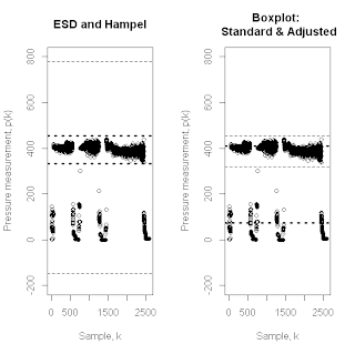
To illustrate how these outlier detection methods compare, the above pair of plots shows the results of applying all four of them to the makeup flow rate dataset discussed in Exploring Data (Sec. 7.1.2) in connection with the failure of the ESD identifier.  The points in these plots represent approximately 2,500 regularly sampled flow rate measurements from an industrial manufacturing process.  These measurements were taken over a long enough period of time to contain both periods of regular process operation – during which the measurements fluctuate around a value of approximately 400 – and periods when the process was shut down, was being shut down, or was being restarted, during which the measurements exhibit values near zero.  If we wish to characterize normal process operation, these shut down episodes represent outliers, and they correspond to about 20% of the data.  The left-hand plot shows the outlier detection limits for the ESD identifier (lighter, dashed lines) and the Hampel identifier (darker, dotted lines).  As discussed in Exploring Data, the ESD limits are wide enough that they do not detect any outliers in this data sequence, while the Hampel identifier nicely separates the data into normal operating data and outliers that correspond to the shut down episodes.  The right-hand plot shows the analogous results obtained with the standard boxplot method (lighter, dashed lines) and the adjusted boxplot method (darker, dotted lines).  Here, the standard boxplot rule gives results very similar to the Hampel identifier, again nicely separating the dataset into normal operating data and shut down episodes.  Unfortunately, the adjusted boxplot rule does not perform very well here, placing its lower nominal data limit in about the middle of the shut down data and its upper nominal data limit in about the middle of the normal operating data.  The likely cause of this behavior is that the relatively large fraction of lower tail outliers, which introduces a fairly strong negative skewness (the medcouple value for this example is -0.589).


The second example considered here is the industrial pressure data sequence shown in the above figure, in the same format as the previous figure.  This data sequence was discussed in Exploring Data (pp. 326-327) as a troublesome case because the two smallest values in this data sequence – near the right-hand end of the plots – appear to be downward outliers in a sequence with generally positive skewness (here, the medcouple value is 0.162).  As a consequence, neither the ESD identifier nor the Hampel identifier give fully satisfactory performance, in both cases declaring only one of these points as a downward outlier and arguably detecting too many upward outliers.  In fact, because the Hampel identifier is more aggressive here, it actually declares more upward outliers, making its performance worse for this example.  The right-hand plot in the above figure shows the outlier detection limits for the standard boxplot rule (lighter, dashed lines) and the adjusted boxplot rule (darker, dotted lines).  As in the previous example, the limits for the standard boxplot rule are almost the same as those for the Hampel identifier (the darker, dotted lines in the left-hand plot), but here the adjusted boxplot rule gives much better results, identifying both of the visually evident downward outliers and declaring far fewer points as upward outliers.

The primary point of this post has been to describe and demonstrate the outlier detection methods to be included in the FindOutliers procedure in the forthcoming ExploringData R package.  It should be clear from these results that, when it comes to outlier detection, “one size does not fit all” – method matters, and the choice of method requires a comparison of the results obtained by each one.  I have not included the code for the FindOutliers procedure here, but that will be the subject of my next post.

Saturday, December 15, 2012

Data Science, Data Analysis, R and Python

The October 2012 issue of Harvard Business Review prominently features the words “Getting Control of Big Data” on the cover, and the magazine includes these three related articles:

  1. “Big Data: The Management Revolution,” by Andrew McAfee and Erik Brynjolfsson, pages 61 – 68;
  2. “Data Scientist: The Sexiest Job of the 21st Century,” by Thomas H. Davenport and D.J. Patil, pages 70 – 76;
  3. “Making Advanced Analytics Work For You,” by Dominic Barton and David Court, pages 79 – 83.

All three provide food for thought; this post presents a brief summary of some of those thoughts.

One point made in the first article is that the “size” of a dataset – i.e., what constitutes “Big Data” – can be measured in at least three very different ways: volume, velocity, and variety.  All of these aspects of the Big Data characterization problem affect it, but differently:

·        For very large data volumes, one fundamental issue is the incomprehensibility of the raw data itself.  Even if you could display a data table with several million, billion, or trillion rows and hundreds or thousands of columns, making any sense of this display would be a hopeless task. 
·        For high velocity datasets – e.g., real-time, Internet-based data sources – the data volume is determined by the observation time: at a fixed rate, the longer you observe, the more you collect.  If you are attempting to generate a real-time characterization that keeps up with this input data rate, you face a fundamental trade-off between exploiting richer datasets acquired over longer observation periods, and the longer computation times required to process those datasets, making you less likely to keep up with the input data rate. 
·        For high-variety datasets, a key challenge lies in finding useful ways to combine very different data sources into something amenable to a common analysis (e.g., combining images, text, and numerical data into a single joint analysis framework).

One practical corollary to these observations is the need for a computer-based data reduction process or “data funnel” that matches the volume, velocity, and/or variety of the original data sources with the ultimate needs of the organization.  In large organizations, this data funnel generally involves a mix of different technologies and people.  While it is not a complete characterization, some of these differences are evident from the primary software platforms used in the different stages of this data funnel: languages like HTML for dealing with web-based data sources; typically, some variant of SQL for dealing with large databases; a package like R for complex quantitative analysis; and often something like Microsoft Word, Excel, or PowerPoint delivers the final results.  In addition, to help coordinate some of these tasks, there are likely to be scripts, either in an operating system like UNIX or in a platform-independent scripting language like perl or Python.

An important point omitted from all three articles is that there are at least two distinct application areas for Big Data:

1.      The class of “production applications,” which were discussed in these articles and illustrated with examples like the un-named U.S. airline described by McAfee and Brynjolfsson that adopted a vendor-supplied procedure to obtain better estimates of flight arrival times, improving their ability to schedule ground crews and saving several million dollars per year at each airport.  Similarly, the article by Barton and Court described a shipping company (again, un-named) that used real-time weather forecast data and shipping port status data, developing an automated system to improve the on-time performance of its fleet.  Examples like these describe automated systems put in place to continuously exploit a large but fixed data source. 
2.      The exploitation of Big Data for “one-off” analyses: a question is posed, and the data science team scrambles to find an answer.  This use is not represented by any of the examples described in these articles.  In fact, this second type of application overlaps a lot with the development process required to create a production application, although the end results are very different.  In particular, the end result of a one-off analysis is a single set of results, ultimately summarized to address the question originally posed.  In contrast, a production application requires continuing support and often has to meet challenging interface requirements between the IT systems that collect and preprocess the Big Data sources and those that are already in use by the end-users of the tool (e.g., a Hadoop cluster running in a UNIX environment versus periodic reports generated either automatically or on demand from a Microsoft Access database of summary information).

A key point of Davenport and Patil’s article is that data science involves more than just the analysis of data: it is also necessary to identify data sources, acquire what is needed from them, re-structure the results into a form amenable to analysis, clean them up, and in the end, present the analytical results in a useable form.  In fact, the subtitle of their article is “Meet the people who can coax treasure out of messy, unstructured data,” and this statement forms the core of the article’s working definition for the term “data scientist.” (The authors indicate that the term was coined in 2008 by D.J. Patil, who holds a position with that title at Greylock Partners.)  Also, two particularly interesting tidbits from this article were the authors’ suggestion that a good place to find data scientists is at R User Groups, and their description of R as “an open-source statistical tool favored by data scientists.”

Davenport and Patil emphasize the difference between structured and unstructured data, especially relevant to the R community since most of R’s procedures are designed to work with the structured data types discussed in Chapter 2 of Exploring Data in Engineering, the Sciences and Medicine: continuous, integer, nominal, ordinal, and binary.  More specifically, note that these variable types can all be included in dataframes, the data object type that is best supported by R’s vast and expanding collection of add-on packages.  Certainly, there is some support for other data types, and the level of this support is growing – the tm package and a variety of other related packages support the analysis of text data, the twitteR package provides support for analyzing Twitter tweets, and the scrapeR package supports web scraping – but the acquisition and reformatting of unstructured data sources is not R’s primary strength.  Yet it is a key component of data science, as Davenport and Patil emphasize:

“A quantitative analyst can be great at analyzing data but not at subduing a mass of unstructured data and getting it into a form in which it can be analyzed.  A data management expert might be great at generating and organizing data in structured form but not at turning unstructured data into structured data – and also not at actually analyzing the data.”


To better understand the distinction between the quantitative analyst and the data scientist implied by this quote, consider mathematician George Polya’s book, How To Solve It.  Originally published in 1945 and most recently re-issued in 2009, 24 years after the author’s death, this book is a very useful guide to solving math problems.  Polya’s basic approach consists of these four steps:

  1. Understand the problem;
  2. Formulate a plan for solving the problem;
  3. Carry out this plan;
  4. Check the results.

It is important to note what is not included in the scope of Polya’s four steps: Step 1 assumes a problem has been stated precisely, and Step 4 assumes the final result is well-defined, verifiable, and requires no further explanation.  While quantitative analysis problems are generally neither as precisely formulated as Polya’s method assumes, nor as clear in their ultimate objective, the class of “quantitative analyst” problems that Davenport and Patil assume in the previous quote correspond very roughly to problems of this type.  They begin with something like an R dataframe and a reasonably clear idea of what analytical results are desired; they end by summarizing the problem and presenting the results.  In contrast, the class of “data scientist” problems implied in Davenport and Patil’s quote comprises an expanded set of steps:

  1. Formulate the analytical problem: decide what kinds of questions could and should be asked in a way that is likely to yield useful, quantitative answers;
  2. Identify and evaluate potential data sources: what is available in-house, from the Internet, from vendors?  How complete are these data sources?  What would it cost to use them?  Are there significant constraints on how they can be used?  Are some of these data sources strongly incompatible?  If so, does it make sense to try to merge them approximately, or is it more reasonable to omit some of them?
  3. Acquire the data and transform it into a form that is useful for analysis; note that for sufficiently large data collections, part of this data will almost certainly be stored in some form of relational database, probably administered by others, and extracting what is needed for analysis will likely involve writing SQL queries against this database;
  4. Once the relevant collection of data has been acquired and prepared, examine the results carefully to make sure it meets analytical expectations: do the formats look right?  Are the ranges consistent with expectations?  Do the relationships seen between key variables seem to make sense?
  5. Do the analysis: by lumping all of the steps of data analysis into this simple statement, I am not attempting to minimize the effort involved, but rather emphasizing the other aspects of the Big Data analysis problem;
  6. After the analysis is complete, develop a concise summary of the results that clearly and succinctly states the motivating problem, highlights what has been assumed, what has been neglected and why, and gives the simplest useful summary of the data analysis results.  (Note that this will often involve several different summaries, with different levels of detail and/or emphases, intended for different audiences.)

Here, Steps 1 and 6 necessarily involve close interaction with the end users of the data analysis results, and they lie mostly outside the domain of R.  (Conversely, knowing what is available in R can be extremely useful in formulating analytical problems that are reasonable to solve, and the graphical procedures available in R can be extremely useful in putting together meaningful summaries of the results.)  The primary domain of R is Step 5: given a dataframe containing what are believed to be the relevant variables, we generate, validate, and refine the analytical results that will form the basis for the summary in Step 6.  Part of Step 4 also lies clearly within the domain of R: examining the data once it has been acquired to make sure it meets expectations.  In particular, once we have a dataset or a collection of datasets that can be converted easily into one or more R dataframes (e.g., csv files or possibly relational databases), a preliminary look at the data is greatly facilitated by the vast array of R procedures available for graphical characterizations (e.g., nonparametric density estimates, quantile-quantile plots, boxplots and variants like beanplots or bagplots, and much more); for constructing simple descriptive statistics (e.g., means, medians, and quantiles for numerical variables, tabulations of level counts for categorical variables, etc.); and for preliminary multivariate characterizations (e.g., scatter plots, classical and robust covariance ellipses, classical and robust principal component plots, etc.).   

The rest of this post discusses those parts of Steps 2, 3, and 4 above that fall outside the domain of R.  First, however, I have two observations.  My first observation is that because R is evolving fairly rapidly, some tasks which are “outside the domain of R” today may very well move “inside the domain of R” in the near future.  The packages twitteR and scrapeR, mentioned earlier, are cases in point, as are the continued improvements in packages that simplify the use of R with databases.  My second observation is that, just because something is possible within a particular software environment doesn’t make it a good idea.  A number of years ago, I attended a student talk given at an industry/university consortium.  The speaker set up and solved a simple linear program (i.e., he implemented the simplex algorithm to solve a simple linear optimization problem with linear constraints) using an industrial programmable controller.  At the time, programming those controllers was done via relay ladder logic, a diagrammatic approach used by electricians to configure complicated electrical wiring systems.  I left the talk impressed by the student’s skill, creativity and persistence, but I felt his efforts were extremely misguided.

Although it does not address every aspect of the “extra-R” components of Steps 2, 3, and 4 defined above – indeed, some of these aspects are so application-specific that no single book possibly could – Paul Murrell’s book Introduction to Data Technologies provides an excellent introduction to many of them.  (This book is also available as a free PDF file under creative commons.)   A point made in the book’s preface mirrors one in Davenport and Patil’s article:

“Data sets never pop into existence in a fully mature and reliable state; they must be cleaned and massaged into an appropriate form.  Just getting the data ready for analysis often represents a significant component of a research project.”

 Since Murrell is the developer of R’s grid graphics system that I have discussed in previous posts, it is no surprise that his book has an R-centric data analysis focus, but the book’s main emphasis is on the tasks of getting data from the outside world – specifically, from the Internet – into a dataframe suitable for analysis in R.  Murrell therefore gives detailed treatments of topics like HTML and Cascading Style Sheets (CSS) for working with Internet web pages; XML for storing and sharing data; and relational databases and their associated query language SQL for efficiently organizing data collections with complex structures.  Murrell states in his preface that these are things researchers – the target audience of the book – typically aren’t taught, but pick up in bits and pieces as they go along.  He adds:

            “A great deal of information on these topics already exists in books and on the internet; the value of this book is in collecting only the important subset of this information that is necessary to begin applying these technologies within a research setting.”

My one quibble with Murrell’s book is that he gives Python only a passing mention.  While I greatly prefer R to Python for data analysis, I have found Python to be more suitable than R for a variety of extra-analytical tasks, including preliminary explorations of the contents of weakly structured data sources, as well as certain important reformatting and preprocessing tasks.  Like R, Python is an open-source language, freely available for a wide variety of computing environments.  Also like R, Python has numerous add-on packages that support an enormous variety of computational tasks (over 25,000 at this writing).  In my day job in a SAS-centric environment, I commonly face tasks like the following: I need to create several nearly-identical SAS batch jobs, each to read a different SAS dataset that is selected on the basis of information contained in the file name; submit these jobs, each of which creates a CSV file; harvest and merge the resulting CSV files; run an R batch job to read this combined CSV file and perform computations on its contents.  I can do all of these things with a Python script, which also provides a detailed recipe of what I have done, so when I have to modify the procedure slightly and run it again six months later, I can quickly re-construct what I did before.  I have found Python to be better suited than R to tasks that involve a combination of automatically generating simple programs in another language, data file management, text processing, simple data manipulation, and batch job scheduling.

Despite my Python quibble, Murrell’s book represents an excellent first step toward filling the knowledge gap that Davenport and Patil note between quantitative analysts and data scientists; in fact, it is the only book I know addressing this gap.  If you are an R aficionado interested in positioning yourself for “the sexiest job of the 21st century,” Murrell’s book is an excellent place to start.

Saturday, October 27, 2012

Characterizing a new dataset

In my last post, I promised a further examination of the spacing measures I described there, and I still promise to do that, but I am changing the order of topics slightly.  So, instead of spacing measures, today’s post is about the DataframeSummary procedure to be included in the ExploringData package, which I also mentioned in my last post and promised to describe later.  My next post will be a special one on Big Data and Data Science, followed by another one about the DataframeSummary procedure (additional features of the procedure and the code used to implement it), after which I will come back to the spacing measures I discussed last time.

A task that arises frequently in exploratory data analysis is the initial characterization of a new dataset.  Ideally, everything we could want to know about a dataset should come from the accompanying metadata, but this is rarely the case.  As I discuss in Chapter 2 of Exploring Data in Engineering, the Sciences, and Medicine, metadata is the available “data about data” that (usually) accompanies a data source.  In practice, however, the available metadata is almost never as complete as we would like, and it is sometimes wrong in important respects.  This is particularly the case when numeric codes are used for missing data, without accompanying notes describing the coding.  An example, illustrating the consequent problem of disguised missing data is described in my paper The Problem of Disguised Missing Data.  (It should be noted that the original source of one of the problems described there – a comment in the UCI Machine Learning Repository header file for the Pima Indians diabetes dataset that there were no missing data records – has since been corrected.)

Once we have converted our data source into an R data frame (e.g., via the read.csv function for an external csv file), there are a number of useful tools to help us begin this characterization process.  Probably the most general is the str command, applicable to essentially any R object.  Applied to a dataframe, this command first tells us that the object is a dataframe, second, gives us the dimensions of the dataframe, and third, presents a brief summary of its contents, including the variable names, their type (specifically, the results of R’s class function), and the values of their first few observations.  As a specific example, if we apply this command to the rent dataset from the gamlss package, we obtain the following summary:

> str(rent)
'data.frame':   1969 obs. of  9 variables:
 $ R  : num  693 422 737 732 1295 ...
 $ Fl : num  50 54 70 50 55 59 46 94 93 65 ...
 $ A  : num  1972 1972 1972 1972 1893 ...
 $ Sp : num  0 0 0 0 0 0 0 0 0 0 ...
 $ Sm : num  0 0 0 0 0 0 0 0 0 0 ...
 $ B  : Factor w/ 2 levels "0","1": 1 1 1 1 1 1 1 1 1 1 ...
 $ H  : Factor w/ 2 levels "0","1": 1 1 1 1 1 1 2 1 1 1 ...
 $ L  : Factor w/ 2 levels "0","1": 1 1 1 1 1 1 1 1 1 1 ...
 $ loc: Factor w/ 3 levels "1","2","3": 2 2 2 2 2 2 2 2 2 2 ...
> 
This dataset summarizes a 1993 random sample of housing rental prices in Munich, including a number of important characteristics about each one (e.g., year of construction, floor space in square meters, etc.).  A more detailed description can be obtained via the command “help(rent)”.

The head command provides similar information to the str command, in slightly less detail (e.g., it doesn’t give us the variable types), but in a format that some will find more natural:

> head(rent)
       R Fl    A Sp Sm B H L loc
1  693.3 50 1972  0  0 0 0 0   2
2  422.0 54 1972  0  0 0 0 0   2
3  736.6 70 1972  0  0 0 0 0   2
4  732.2 50 1972  0  0 0 0 0   2
5 1295.1 55 1893  0  0 0 0 0   2
6 1195.9 59 1893  0  0 0 0 0   2
> 
 (An important difference between these representations is that str characterizes factor variables by their level number and not their level value: thus the first few observations of the factor B assume the first level of the factor, which is the value 0.  As a consequence, while it may appear that str is telling us that the first few records list the value 1 for the variable B while head is indicating a zero, this is not the case.  This is one reason that data analysts may prefer the head characterization.)

While the R data types for each variable can be useful to know – particularly in cases where it isn’t what we expect it to be, as when integers are coded as factors – this characterization doesn’t really tell us the whole story.  In particular, note that R has commands like “as.character” and “as.factor” that can easily convert numeric variables to character or factor data types.  Even beyond this, the range of inherent behaviors that numerically-coded data can exhibit cannot be fully described by a simple data type designation.  As a specific example, one of the variables in the rent dataframe is “A,” described in the metadata available from the help command as “year of construction.”  While this variable is coded as type “numeric,” in fact it takes integer values from 1890 to 1988, with some values in this range repeated many times and others absent.  This point is important, since analysis tools designed for continuous variables – especially outlier-resistant ones like medians and other rank-based methods – sometimes perform poorly in the face of data sequences with many repeated values (i.e., “ties,” which have zero probability for continuous data distributions).  In extreme cases, these techniques may fail completely, as in the case of the MADM scale estimate, discussed in Chapter 7 of Exploring Data.  This data characterization implodes if more than 50% of the data values are the same, returning the useless value zero in this case, independent of the values of all of the other data points.

These observations motivate the DataframeSummary procedure described here, to be included in the ExploringData package.  This function is called with the name of the dataframe to be characterized and an optional parameter Option, which can take any one of the following four values:

  1. “Brief” (the default value)
  2. “NumericOnly”
  3. “FactorOnly”
  4. “AllAsFactor”

In all cases, this function returns a summary dataframe with one row for each column in the dataframe to be characterized.  Like the str command, these results include the name of each variable and its type.  Under the default option “Brief,” this function also returns the following characteristics for each variable:

  • Levels = the number of distinct values the variable exhibits;
  • AvgFreq = the average number of records listing each value;
  • TopLevel = the most frequently occurring value;
  • TopFreq = the number of records listing this most frequent value;
  • TopPct = the percentage of records listing this most frequent value;
  • MissFreq = the number of missing or blank records;
  • MissPct = the percentage of missing or blank records.

For the rent dataframe, this function (under the default “Brief” option) gives the following summary:

> DataframeSummary(rent)
Variable Type Levels AvgFreq TopLevel TopFreq TopPct MissFreq MissPct
3        A    numeric      73   26.97         1957         551       27.98         0       0
6        B    factor           2  984.50           0          1925        97.77        0       0
2       Fl     numeric      91   21.64          60              71          3.61        0       0
7        H    factor            2  984.50          0          1580        80.24        0       0
8        L    factor            2  984.50          0           1808        91.82        0       0
9      loc    factor            3  656.33          2           1247        63.33        0       0
1        R    numeric   1762    1.12          900               7          0.36        0       0
5       Sm  numeric         2  984.50           0          1797         91.26        0       0
4       Sp   numeric         2  984.50           0          1419         72.07        0       0
> 

The variable names and types appear essentially as they do in the results obtained with the str function, and the numbers to the far left indicate the column numbers from the dataframe rent for each variable, since the variable names are listed alphabetically for convenience.  The “Levels” column of this summary dataframe gives the number of unique values for each variable, and it is clear that this can vary widely even within a given data type.  For example, the variable “R” (monthly rent in DM) exhibits 1,762 unique values in 1,969 data observations, so it is almost unique, while the variables “Sm” and “Sp” exhibit only two possible values, even though all three of these variables are of type “numeric.”  The AvgFreq column gives the average number of times each level should appear, assuming a uniform distribution over all possible values.  This number is included as a reference value for assessing the other frequencies (i.e., TopFreq for the most frequently occurring value and MissFreq for missing data values).  Thus, for the first variable, “A,” AvgFreq is 26.97, meaning that if all 73 possible values for this variable were equally represented, each one should occur about 27 times in the dataset.  The most frequently occurring level (TopLevel) is “1957,” which occurs 551 times, suggesting a highly nonuniform distribution of values for this variable.  In contrast, for the variable “R,” AvgFreq is 1.12, meaning that each value of this variable is almost unique.  The TopPct column gives the percentage of records in the dataset exhibiting the most frequent value for each record, which varies from 0.36% for the numeric variable “R” to 97.77% for the factor variable “B.”  It is interesting to note that this variable is of type “factor” but is coded as 0 or 1, while the variables “Sm” and “Sp” are also binary, coded as 0 or 1, but are of type “numeric.”  This illustrates the point noted above that the R data type is not always as informative as we might like it to be.  (This is not a criticism of R, but rather a caution about the fact that, in preparing data, we are free to choose many different representations, and the original logic behind the choice may not be obvious to all ultimate users of the data.)  In addition, comparing the available metadata for the variable “B” illustrates the point about metadata errors noted earlier: of the 1,969 data records, 1,925 have the value “0” (97.77%), while 44 have the value “1” (2.23%), but the information returned by the help command indicates exactly the opposite proportion of values: 1,925 should have the value “1” (indicating the presence of a bathroom), while 44 should have the value “0” (indicating the absence of a bathroom).  Since the interpretation of the variables that enter any analysis is important in explaining our final analytical results, it is useful to detect this type of mismatch between the data and the available metadata as early as possible.  Here, comparing the average rents for records with B = 1 (DM 424.95) against those with B = 0 (DM 820.72) suggests that the levels have been reversed relative to the metadata: the relatively few housing units without bathrooms are represented by B = 1, renting for less than the majority of those units, which have bathrooms and are represented by B = 0.  Finally, the last two columns of the above summary give the number of records with missing or blank values (MissFreq) and the corresponding percentage (MissPct); here, all records are complete so these numbers are zero.

In my next post on this topic, I will present results for the other three options of the DataframeSummary procedure, along with the code that implements it.  In all cases, the results include those generated by the “Brief” option just presented, but the difference between the other options lies first, in what additional characterizations are included, and second, in which subset of variables are included in the summary.  Specifically, for the rent dataframe, we obtain:

  • Under the “NumericOnly” option, a summary of the five numeric variables R, FL, A, Sp, and Sm results, giving characteristics that are appropriate to numeric data types, like the spacing measures described in my last post;
  • Under the “FactorOnly” option, a summary of the four factor variables B, H, L, and loc results, giving measures that are appropriate to categorical data types, like the normalized Shannon entropy measure discussed in several previous posts;
  • Under the “AllAsFactor” option, all variables in the dataframe are first converted to factors and then characterized using the same measures as in the “FactorOnly” option.

The advantage of the “AllAsFactor” option is that it characterizes all variables in the dataframe, but as I discussed in my last post, the characterization of numerical variables with measures like Shannon entropy is not always terribly useful.