This blog is a companion to my recent book, Exploring Data in Engineering, the Sciences, and Medicine, published by Oxford University Press. The blog expands on topics discussed in the book, and the content is heavily example-based, making extensive use of the open-source statistical software package R.

Wednesday, March 23, 2011

The Many Uses of Q-Q Plots

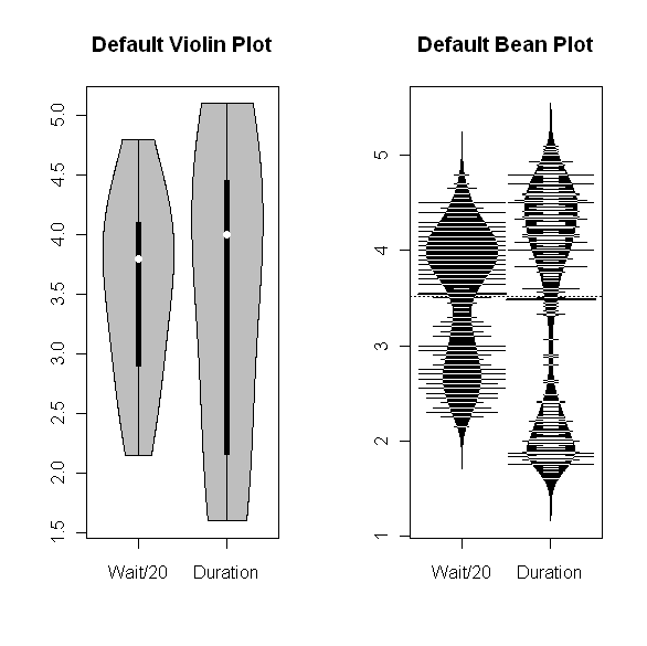
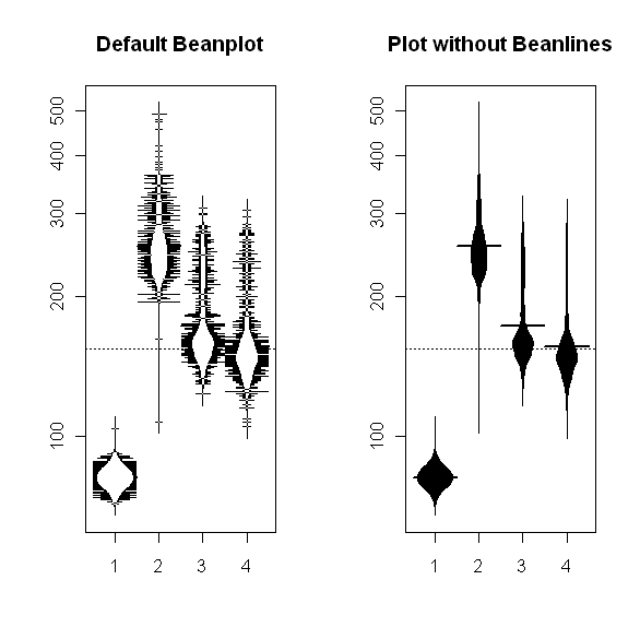
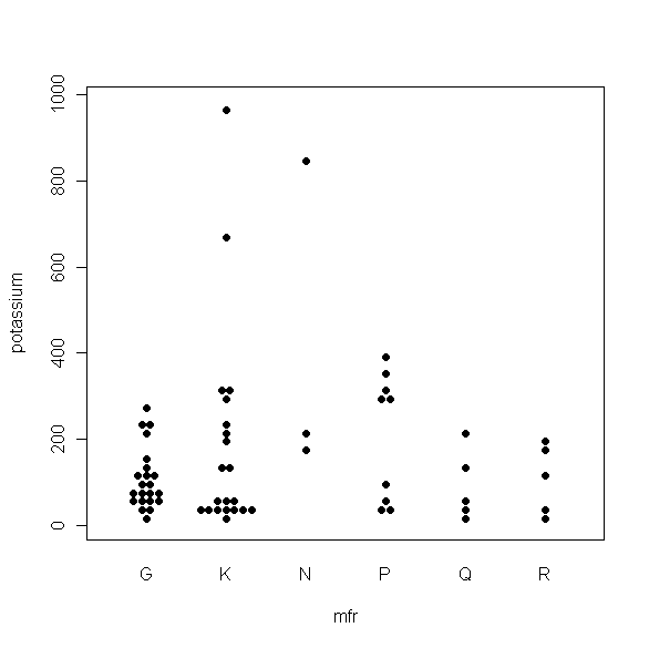
My last four posts have dealt with boxplots and some useful variations on that theme.  Just after I finished the series, Tal Galili, who maintains the R-bloggers website, pointed me to a variant I hadn’t seen before.  It's called a beeswarm plot, and it's produced by the beeswarm package in R.  I haven’t played with this package a lot yet, but it does appear to be useful for datasets that aren’t too large and that you want to examine across a moderate number of different segments.  The plot shown below provides a typical illustration: it shows the beeswarm plot comparing the potassium content of different cereals, broken down by manufacturer, from the UScereal dataset included in the MASS package in R.  I discussed this data example in my first couple of boxplot posts and I think this is a case where the beeswarm plot gives you a more useful picture of how the data points are distributed than the boxplots do.  For more information about the beeswarm package, I recommend Tal's post.  More generally, anyone interested in learning more about what you can do with the R software package should find the R-blogger website extremely useful.

Besides boxplots, one of the other useful graphical data characterizations I discuss in Exploring Data in Engineering, the Sciences, and Medicine is the quantile-quantile (Q-Q) plot.  The most common form of this characterization is the normal Q-Q plot, which represents an informal graphical test of the hypothesis that a data sequence is normally distributed.  That is, if the points on a normal Q-Q plot are reasonably well approximated by a straight line, the popular Gaussian data hypothesis is plausible, while marked deviations from linearity provide evidence against this hypothesis.  The utility of normal Q-Q plots goes well beyond this informal hypothesis test, however, which is the main point of this post.  In particular, the shape of a normal Q-Q plot can be extremely useful in highlighting distributional asymmetry, heavy tails, outliers, multi-modality, or other data anomalies.  The specific objective of this post is to illustrate some of these ideas, expanding on the discussion presented in Exploring Data.

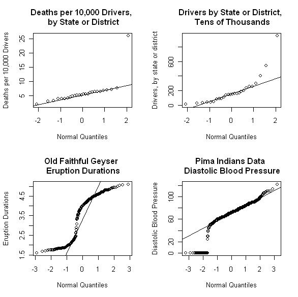
The above figure shows four different normal Q-Q plots that illustrate some of the different data characteristics these plots can emphasize.  The upper left plot demonstrates that normal Q-Q plots can be extremely effective in highlighting glaring outliers in a data sequence.  This plot shows the annual number of traffic deaths per ten thousand drivers over an unspecified time period, for 25 of the 50 states in the U.S., plus the District of Columbia.  This plot was constructed from the road dataset included in the MASS package in R, which gives the numbers of deaths, the numbers of drivers (in tens of thousands), and several other characteristics for each of these regions.  Based on the interpretation of normal Q-Q plots offered above, the normal distribution hypothesis appears fairly reasonable for this data sequence, in all cases except the point in the extreme upper right.  This point corresponds to the state of Maine, which exhibited 26 deaths per ten thousand drivers, well above the average of approximately 5 for all other regions considered.  

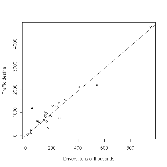
It is not clear why the reported traffic death rate is so high for Maine.  The scatterplot above shows the reported traffic deaths for each state or district against the number of drivers, in tens of thousands.  The dashed line in the plot corresponds to the average traffic death rate for all regions except Maine, and it is clear that this line fits most of the data points reasonably well, with Maine (the solid point) representing the most glaring exception.  Although it still leaves us wanting to know more, this plot suggests that the number of deaths for Maine is unusually high, rather than the number of drivers being unusually low, which might be a more tempting explanation.

The Q-Q plot for this denominator variable – i.e., for the number of drivers – is shown as the upper right plot in the original set of four shown above.  There, the fact that both tails of the distribution lie above the reference line is suggestive of distributional asymmetry, a point examined further below using Q-Q plots for other reference distributions.  Also, note that both of the upper Q-Q plots shown above are based on only 26 data values, which is right at the lower limit on sample size that various authors have suggested for normal Q-Q plots to be useful (see the discussion of normal Q-Q plots in Section 6.3.3 of Exploring Data for details).  The tricky issues of separating outliers, asymmetry, and other potentially interesting data characteristics in samples this small is greatly facilitated using the Q-Q plot confidence intervals discussed below.

The lower left Q-Q plot in the above sequence is that for the Old Faithful geyser dataset faithful included with the base R package.  As I have discussed previously, the eruption duration data exhibits a pronounced bimodal distribution, which may be seen clearly in nonparametric density estimates computed from these data values.  Normal Q-Q plots constructed from bimodal data typically exhibit a “kink” like the one seen in this plot.  A crude way of explaining this behavior is the following: the lower portion of the Q-Q plot is very roughly linear, suggesting a very approximate Gaussian distribution, corresponding to the first mode of the eruption data distribution (i.e., the durations of the shorter group of eruptions).  Similarly, the upper portion of the Q-Q plot is again very roughly linear, but with a much different intercept that corresponds to the larger mean of the second peak in the distribution (i.e., the durations of the longer group of eruptions).  To connect these two “roughly linear” local segments, the curve must exhibit a “kink” or rapid transition region between them.  By the same reasoning, more general multi-modal distributions will exhibit more than one such “kink” in their Q-Q plots.  Finally, the lower right Q-Q plot in the collection above was constructed from the Pima Indians diabetes dataset available from the UCI Machine Learning Repository.  This dataset includes a number of clinical measurements for 768 female members of the Pima tribe of Native Americans, including their diastolic blood pressure.  The lower right Q-Q plot was constructed from this blood pressure data, and its most obvious feature is the prominent lower tail anomaly.  In fact, careful examination of this plot reveals that these points correspond to the value zero, which is not realistic for any living person.  What has happened here is that zero has been used to code missing values, both for this variable and several others in this dataset.  This observation is important because the metadata associated with this dataset indicates that there is no missing data, and a number of studies in the classification literature have proceeded under the assumption that this is true.  Unfortunately, this assumption can lead to badly biased results, a point discussed in detail in a paper I published in SIGKDD Explorations (Disguised Missing Data paper PDF).  The point of the example presented here is to show that normal Q-Q plots can be extremely effective in highlighting this kind of data anomaly.

The normal Q-Q plots considered so far were constructed using the qqnorm procedure available in base R, and the reference lines shown in these plots were constructed using the qqline command.  It is not difficult to construct Q-Q plots for other reference distributions using procedures in base R, but a much simpler alternative is to use the qqPlot command in the optional car package.  This R add-on package was developed in association with the book An R Companion to Applied Regression, by Fox and Weisberg, and it includes a number of very useful procedures.  The default options of the qqPot procedure automatically generate a reference line, along with upper and lower 95% confidence intervals for the plot, which are particularly useful for small samples like the road dataset.  The figure below shows a normal Q-Q plot for the number of traffic deaths per 10,000 drivers generated using the qqPlot package.   The fact that all of the points but the one obvious outlier fall within the 95% confidence limits suggest that the scatter around the reference line seen for these 25 observations is small enough to be consistent with a normal reference distribution.  Further, these confidence limits also emphasize how much the outlying result for the state of Maine violates this normality assumption.

Another advantage of the qqPlot command is that it provides the basis for very easy generation of Q-Q plots for essentially any reference distribution that is available in R, including those available in add-on packages like gamlss.dist, which supports an extremely wide range of distributions (generalized inverse Gaussian distributions, anyone?).  This capability is illustrated in the four Q-Q plots shown below, all generated with the qqPlot command for non-Gaussian distributions.  In all of these plots, the data corresponds to the driver counts for the 26 states and districts summarized in the road dataset.  Motivation for the specific Q-Q plots shown here is that the four distributions represented by these plots are all better suited to capturing the asymmetry seen in the normal Q-Q plot for this data sequence than the symmetric Gaussian distribution is.  The upper left plot shows the results obtained for the exponential distribution which, like the Gaussian distribution, does not require the specification of a shape parameter.  Comparing this plot with the normal Q-Q plot shown above for this data sequence, it is clear that the exponential distribution is more consistent with the driver data than the Gaussian distribution is.  The data point in the extreme upper right does fall just barely outside the 95% confidence limits shown on this plot, and careful inspection reveals that the points in the lower left fall slightly below these confidence limits, which become quite narrow at this end of the plot. 

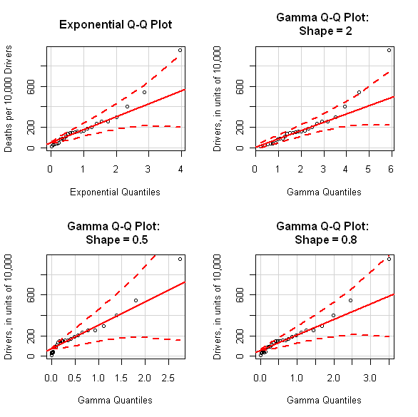
The exponential distribution represents a special case of the gamma distribution, with a shape parameter equal to 1.  In fact, the exponential distribution exhibits a J-shaped density, decaying from a maximum value at zero, and it corresponds to a “dividing line” within the gamma family: members with shape parameters larger than 1 exhibit unimodal densities with a single maximum at some positive value, while gamma distributions with shape parameters less than 1 are J-shaped like the exponential distribution.  To construct Q-Q plots for general members of the gamma family, it is necessary to specify a particular value for this shape parameter, and the other three Q-Q plots shown above have done this using the qqPlot command.  Comparing these plots, it appears that increasing the shape parameter causes the points in the upper tail to fall farther outside the 95% confidence limits, while decreasing the shape parameter better accommodates these upper tail points.  Conversely, decreasing the shape parameter causes the cluster of points in the lower tail to fall farther outside the confidence limits.  It is not obvious that any of the plots shown here suggest a better fit than the exponential distribution, but the point of this example was to show the flexibility of the qqPlot procedure in being able to pose the question and examine the results graphically.  Alternatively, the Weibull distribution – which also includes the exponential distribution as a special case – might describe these data values better than any member of the gamma distribution family, and these plots can also be easily generated using the qqPlot command (just specify dist = “weibull” instead of dist = “gamma”, along with shape = a for some positive value of a other than 1).

Finally, one cautionary note is important here for those working with very large datasets.  Q-Q plots are based on sorting data, something that can be done quite efficiently, but which can still take a very long time for a really huge dataset.  As a consequence, while you can attempt to construct Q-Q plots for sequences of hundreds of thousands of points or more, you may have to wait a long time to get your plot.  Further, it is often true that plots made up of a very large number of points reduce to ugly-looking dark blobs that can use up a lot of toner if you make the further mistake of trying to print them.  So, if you are working with really enormous datasets, my suggestion is to construct Q-Q plots from a representative random sample of a few hundred or a few thousand points, not hundreds of thousands or millions of points.  It will make your life a lot easier.


Saturday, March 5, 2011

Boxplots & Beyond IV: Beanplots

This post is the last in a series of four on boxplots and some of their extensions.  Previous posts in this series have discussed basic boxplots, modified boxplots based on a robust asymmetry measure, and violin plots, an alternative that essentially combines boxplots with nonparametric density estimates.  This post introduces beanplots, a boxplot extension similar to violin plots but with some added features.  These plots are generated by the beanplot command in the R package of the same name and the purpose of this post is to introduce beanplots and briefly discuss their advantages and disadvantages relative to the basic boxplot and the other variants discussed in previous posts.

One of the examples discussed in Chapter 13 of Exploring Data is based on a dataset from the book Data by D.F. Andrews and A.M. Herzberg that summarizes the prevalence of bitter pit in 42 apple trees, including information on supplemental nitrogen treatments applied to the trees and further chemical composition data.  Essentially, bitter pit is a cosmetic defect in apples that makes them unattractive to consumers, and the intent of the study that generated this dataset was to better understand how various factors influence the prevalence of bitter pit.  Four supplemental nitrogen treatments are compared in this dataset, labeled A through D, including the control case of “no supplemental nitrogen treatment applied” (treatment A).  To quantify the relationship between the prevalence of bitter pit and the other variables in the dataset, the discussion given in Exploring Data applies both classical analysis of variance (ANOVA) and logistic regression, but much can be seen by simply looking at a sufficiently informative representation of the data.  The figure above shows four different visualizations of the percentage of apples with bitter pit observed in the apples harvested from each tree, broken down by the four treatments considered.  The upper left plot gives side-by-side boxplot summaries of the bitter pit percentage for each tree, with one boxplot for each treatment.  These summaries were generated by the boxplot command in base R with its default settings, and they suggest that the choice of treatment strongly influences the prevalence of bitter pit; indeed, they suggest that all of the “non-control” treatments considered here are harmful with respect to bitter pit, increasing its prevalence.  (In fact, this is only part of the story here, since two of these treatments substantially increase the average apple weight, another important commercial consideration.)  The upper right plot in the above figure was generated using the adjbox command in the robustbase package that I discussed in the second post in this series.  In this modified display, the boxplots themselves are generally the same as in the standard representation (i.e., the heavy line still represents the median and the box in the center of the plot is still defined by the upper and lower quartiles), but outliers are flagged differently.  As noted, this difference can lead to substantially different boxplots in cases where the data distribution is markedly asymmetric, but here, the adjbox plots shown in the upper right are identical to the standard boxplots shown in the upper left.

The lower left plot in the above figure was generated by the wvioplot command in the R package of the same name, using its default parameters.  Arguably, this display is less informative than the boxplots shown above it, but – as discussed in conjunction with the Old Faithful geyser data in my last post and illustrated further in the next figure - the problem here is not an inherent limitation of the violin plot itself, but rather a mismatch between the default parameters for the wvioplot procedure and this particular dataset.  Finally, the lower right plot shows the corresponding results obtained using the beanplot command from the beanplot package, again with the default parameters.  Like the violin plot, the beanplot may be regarded as an enhanced boxplot where the box is replaced with a shape generated from a nonparametric density estimate, but there are some important differences, as these two plots demonstrate.  First and foremost, the beanplot procedure permits the use of a variety of different kernel functions for density estimation, and it provides a variety of data-based bandwidth estimation procedures; in contrast, the wvioplot procedure uses a fixed kernel and a constant bandwidth parameter that may be specified by the user.  Second, the beanplot procedure automatically includes a dashed horizontal line at the average overall response value for the dataset, along with heavy, solid horizontal lines at the average for each subset, and “beanlines” corresponding to the values of each individual observation within each “bean” of the beanplot.  As the following examples illustrate, these beanlines can become an annoying distraction in large datasets, but they are easily excluded from the plot, as discussed below.  Finally, another extremely useful feature of the beanplot procedure is that it has a built-in procedure to automatically determine whether a log transformation of the response axis is appropriate or not, although this option fails if the dataset contains more than 5000 observations, a point discussed further at the end of this post.  For the bitter pit example, the beanplot in the lower right portion of the above figure gives the most detailed view of the dataset of any of the plots shown here, suggesting that the prevalence of bitter pit is very low for treatment A (i.e., the control case of no applied supplemental nitrogen treatment), as noted before, but also that many of the trees receiving treatment C exhibit very low levels of bitter pit as well, a conclusion that is not obvious from any of the other plots, but which is supported by a careful examination of the numbers in the dataset. 

As I showed in my last post, the default parameter settings for the wvioplot procedure do not reveal the pronounced bimodal character of either the Old Faithful eruption durations or the waiting times between eruptions, although this can be seen clearly if the smoothing bandwidth parameter adjust is changed from its default value of 3 to something smaller (e.g., 1).  The above figure shows the results obtained for these two data sequences – specifically, for the eruption durations and the waiting times between eruptions divided by 20 to make them numerically comparable with the duration values – using default parameter values for both the wvioplot procedure (left-hand plot) and the beanplot procedure (right-hand plot).  As noted, the violin plot on the left gives no indication of these bimodal data distributions, while the beanplot on the right clearly shows the bimodal character of both data distributions.  This difference reflects the advantages of the data-driven bandwidth selection feature incorporated into the beanplot package, although this feature can fail, a point discussed further at the end of this post.  The above beanplots also demonstrate that the beanlines can become annoying in large datasets: in this case, the dataset contains 272 observations for each variable.

The above figure illustrates this difficulty even more clearly.  The beanplot on the left shows the results obtained when the default beanplot procedure is applied to compare the four industrial pressure data sequences discussed in Chapter 1 of Exploring Data.  In this example, each pressure dataset contains 1,024 observations, and the presence of this many beanlines in the left-hand beanplot results in a display that is ugly enough to be distracting.  A much better view of the data is obtained by omitting the beanlines, easily done in the beanplot command by specifying the option what=c(1,1,1,0) – this retains the dashed line for the mean of all four pressure sequences (the first “1”), the beanplots themselves (the second “1”), and the heavy lines at the average for each bean (the third “1”), but it omits the individual beanlines (the final “0”).  In particular, note that the bean averages are not even visible in the left-hand display, since they are completely obscured by the individual beanlines.  Also, note that this example illustrates the automatic log scaling option mentioned above: here, the beanplot command generates a plot with logarithmic scaling of the pressure values automatically, without having to specify log = “y” as in the other displays considered here.

Finally, the plot above demonstrates the ability of the beanplot procedure to give insight into the dependence of a response variable on two different explanatory categories.  This example is based on the mtcars dataset from the data collection included with the base R installation.  This dataset characterizes 32 automobiles based on results presented in 1974 in Motor Trend magazine, and the beanplots shown here summarize the dependence of the horsepower of these automobiles on the number of cylinders in the engine (4, 6, or 8) and the type of transmission (“A” for automatic, or “M” for manual).  Here, the dashed line corresponds to the average horsepower for all 32 cars, which is just under 150.  Because this dataset is small (32 observations), the beanlines are quite informative in this case; for example, it is clear that all of the 4-cylinder engines and almost all of the 6-cylinder engines generate less than this average horsepower, while all of the 8-cylinder engines generate more than this average horsepower.  These beanplots also show clearly that, while the mtcars collection includes few manual-transmission, 8-cylinder cars, these few exhibit the highest horsepower seen.  The real point of this example is that, in favorable cases, beanplots can give us a great deal of insight into the underlying structure of a dataset.  That said, it is also important to emphasize that beanplots can fail in ways that simpler data characterizations like boxplots can’t.  As a specific example, a situation that arises commonly in practice – both for small datasets and for large ones – is that one of the subsets we want to characterize exhibits a single response value (this is obviously the case when the subset consists of a single observation, but larger data segments can also exhibit this behavior).  Unfortunately, this situation causes a failure of the nonparametric density estimator on which the beanplot procedure is based; in contrast, boxplots remain well-defined, simply collapsing to a single line.  Other potential difficulties with the beanplot package include the complication of too many beanlines in large datasets discussed above, and the fact that the automatic log scaling procedure fails for datasets with more than 5000 observations, but both of these difficulties are easily overcome by specifying the appropriate parameter options (to turn off automatic log scaling, specify log= “”). 

Historically, boxplot summaries have been quite popular – and they remain so – largely because they represent a simple, universally applicable way of visualizing certain key features of how the distribution of a continuous-valued variable changes across groups defined by essentially any explanatory variable of interest.  In its simplest form, this characterization is based on Tukey’s 5-number summary (i.e., the minimum, lower quartile, median, upper quartile, and maximum) and it remains well-defined for any continuous-valued variable.  Like all simple, universally-applicable data characterizations, however, the boxplot cannot be complete and it can hide details that may be extremely important (e.g., bimodal distributions).  For this reason, various extensions have been developed, aimed at conveying more details.  Some of these extensions – like the variable-width boxplots discussed in the first post in this sequence – are also essentially always applicable, but others may not be appropriate for all datasets.  In particular, strong distributional asymmetry may cause standard boxplot outlier detection rules – which treat upper and lower outliers equivalently – to perform poorly, and this has led to the development of extensions like the adjbox procedure in the robustbase package in R, discussed in the second post in this sequence.  Although they are more complicated to compute, nonparametric density estimates can be much more informative than boxplots, and this has motivated the development of techniques like the violin plot discussed in my previous post and the beanplots discussed here, which both attempt to combine the simple interpretability of boxplots with the additional information available from nonparametric density estimates.  Besides computational complexity issues, these more complicated visualization techniques can fail to yield any results at all, something that never happens with boxplots.  For these reasons, I typically like to start with beanplot characterizations because, if beanplots can be constructed, they are potentially the most informative of the characterizations considered here.  For large datasets, I try to remember to turn off the beanlines so I get informative beanplots and, if the dataset contains more than 5000 observations, to specify log = “” ( or log = “y” if I want a log-transformed display) so that I get any beanplots at all.  In cases where the beanplot procedure fails, I go back to either a standard or adjusted boxplot, or else I construct both and compare them to see whether they are suggesting different sets of points as outliers.  In any case, I typically use the variable width option in generating boxplots to see how well balanced the data subsets are that I am comparing.  Generally, I find that by constructing a few plots I can get a useful idea of how a continuous-valued response variable behaves with respect to a variety of potential explanatory variables.