This blog is a companion to my recent book, Exploring Data in Engineering, the Sciences, and Medicine, published by Oxford University Press. The blog expands on topics discussed in the book, and the content is heavily example-based, making extensive use of the open-source statistical software package R.

Saturday, February 4, 2012

Measuring associations between non-numeric variables

It is often useful to know how strongly or weakly two variables are associated: do they vary together or are they essentially unrelated?  In the case of numerical variables, the best-known measure of association is the product-moment correlation coefficient introduced by Karl Pearson at the end of the nineteenth century.  For variables that are ordered but not necessarily numeric (e.g., Likert scale responses with levels like “strongly agree,” “agree,” “neither agree nor disagree,” “disagree” and “strongly disagree”), association can be measured in terms of the Spearman rank correlation coefficient.  Both of these measures are discussed in detail in Chapter 10 of Exploring Data in Engineering, the Sciences, and Medicine.  For unordered categorical variables (e.g., country, state, county, tumor type, literary genre, etc.), neither of these measures are applicable, but applicable alternatives do exist.  One of these is Goodman and Kruskal’s tau measure, discussed very briefly in Exploring Data (Chapter 10, page 492).  The point of this post is to give a more detailed discussion of this association measure, illustrating some of its advantages, disadvantages, and peculiarities.

A more complete discussion of Goodman and Kruskal’s tau measure is given in Agresti’s book Categorical Data Analysis, on pages 68 and 69.  It belongs to a family of categorical association measures of the general form:

            a(x,y) = [V(y) – E{V(y|x)}]/V(y)

where V(y) is a measure of the overall (i.e., marginal) variability of y and E{V(y|x)} is the expected value of the conditional variability V(y|x) of y given a fixed value of x, where the expectation is taken over all possible values of x.  These variability measures can be defined in different ways, leading to different association measures, including Goodman and Kruskal’s tau as a special case.  Agresti’s book gives detailed expressions for several of these variability measures, including the one on which Goodman and Kruskal’s tau is based, and an alternative expression for the overall association measure a(x,y) is given in Eq. (10.178) on page 492 of Exploring Data.  This association measure does not appear to be available in any current R package, but it is easily implemented as the following function:


GKtau <- function(x,y){
  #
  #  First, compute the IxJ contingency table between x and y
  #
  Nij = table(x,y,useNA="ifany")
  #
  #  Next, convert this table into a joint probability estimate
  #
  PIij = Nij/sum(Nij)
  #
  #  Compute the marginal probability estimates
  #
  PIiPlus = apply(PIij,MARGIN=1,sum)
  PIPlusj = apply(PIij,MARGIN=2,sum)
  #
  #  Compute the marginal variation of y
  #
  Vy = 1 - sum(PIPlusj^2)
  #
  #  Compute the expected conditional variation of y given x
  #
  InnerSum = apply(PIij^2,MARGIN=1,sum)
  VyBarx = 1 - sum(InnerSum/PIiPlus)
  #
  #  Compute and return Goodman and Kruskal's tau measure
  #
  tau = (Vy - VyBarx)/Vy
  tau
}

An important feature of this procedure is that it allows missing values in either of the variables x or y, treating “missing” as an additional level.  In practice, this is sometimes very important since missing values in one variable may be strongly associated with either missing values in another variable or specific non-missing levels of that variable.

An important characteristic of Goodman and Kruskal’s tau measure is its asymmetry: because the variables x and y enter this expression differently, the value of a(y,x) is not the same as the value of a(x,y), in general.  This stands in marked contrast to either the product-moment correlation coefficient or the Spearman rank correlation coefficient, which are both symmetric, giving the same association between x and y as that between y and x.  The fundamental reason for the asymmetry of the general class of measures defined above is that they quantify the extent to which the variable x is useful in predicting y, which may be very different than the extent to which the variable y is useful in predicting x.  Specifically, if x and y are statistically independent, then E{V(y|x)} = V(y) – i.e., knowing x does not help at all in predicting y – and this implies that a(x,y) = 0.  At the other extreme, if y is perfectly predictable from x, then E{V(y|x)} = 0, which implies that a(x,y) = 1.  As the examples presented next demonstrate, it is possible that y is extremely predictable from x, but x is only slightly predictable from y.

Specifically, consider the sequence of 400 random numbers, uniformly distributed between 0 and 1 generated by the following R code:

            set.seed(123)
            u = runif(400)

(Here, I have used the “set.seed” command to initialize the random number generator so repeated runs of this example will give exactly the same results.)  The second sequence is obtained by quantizing the first, rounding the values of u to a single digit:

            x = round(u,digits=1)

The plot below shows the effects of this coarse quantization: values of u vary continuously from 0 to 1, but values of x are restricted to 0.0, 0.1, 0.2, … , 1.0.  Although this example is simulation-based, it is important to note that this type of grouping of variables is often encountered in practice (e.g., the use of age groups instead of ages in demographic characterizations, blood pressure characterizations like “normal,” “borderline hypertensive,” etc. in clinical data analysis, or the recording of industrial process temperatures to the nearest 0.1 degree, in part due to measurement accuracy considerations and in part due to memory limitations of early data collection systems). 


In this particular case, because the variables x and u are both numeric, we could compute either the product-moment correlation coefficient or the Spearman rank correlation, obtaining the very large value of approximately 0.995 for either one, showing that these variables are strongly associated.  We can also apply Goodman and Kruskal’s tau measure here, and the result is much more informative.  Specifically, the value of a(u,x) is 1 in this case, correctly reflecting the fact that the grouped variable x is exactly computable from the original variable u.  In contrast, the value of a(x,u) is approximately 0.025, suggesting – again correctly – that the original variable u cannot be well predicted from the grouped variable x. 

To illustrate a case where the product-moment and rank correlation measures are not applicable at all, consider the following alphabetic re-coding of the variable x into an unordered categorical variable c:

            letters = c(“A”, “B”, “C”, “D”, “E”, “F”, “G”, “H”, “I”, “J”, “K”)
            c = letters[10*x+1]

In this case, both of the Goodman and Kruskal tau measures, a(x,c) and a(c,x), are equal to 1, reflecting the fact that these two variables are effectively identical, related via the non-numeric transformation given above. 

Being able to detect relationships like these can be extremely useful in exploratory data analysis where such relationships may be unexpected, particularly in the early stages of characterizing a dataset whose metadata – i.e., detailed descriptions of the variables included in the dataset – is absent, incomplete, ambiguous, or suspect.  As a real data illustration, consider the rent data frame from the R package gamlss.data, which has 1,969 rows, each corresponding to a rental property in Munich, and 9 columns, each giving a characteristic of that unit (e.g., the rent, floor space, year of construction, etc.).  Three of these variables are Sp, a binary variable indicating whether the location is considered above average (1) or not (0), Sm, another binary variable indicating whether the location is considered below average (1) or not (0), and loc, a three-level variable combining the information in these other two, taking the values 1 (below average), 2 (average), or 3 (above average).  The Goodman and Kruskal tau values between all possible pairs of these three variables are:

            a(Sm,Sp) = a(Sp,Sm) = 0.037
            a(Sm,loc) = 0.245 vs. a(loc,Sm) = 1
            a(Sp,loc) = 0.701 vs. a(loc,Sp) = 1

The first of these results – the symmetry of Goodman and Kruskal’s tau for the variables Sm and Sp – is a consequence of the fact that this measure is symmetric for any pair of binary variables.  In fact, the odds ratio that I have discussed in previous posts represents a much better way of characterizing the relationship between binary variables (here, the odds ratio between Sm and Sp is zero, reflecting the fact that a location cannot be both “above average” and “below average” at the same time).  The real utility of the tau measure here is that the second and third lines above show that the variables Sm and Sp are both re-groupings of the finer-grained variable loc. 


Finally, a more interesting exploratory application to this dataset is the following one.  Computing Goodman and Kruskal’s tau measure between the location variable loc and all of the other variables in the dataset – beyond the cases of Sm and Sp just considered – generally yields small values for the associations in either direction.  As a specific example, the association a(loc,Fl) is 0.001, suggesting that location is not a good predictor of the unit’s floor space in meters, and although the reverse association a(Fl,loc) is larger (0.057), it is not large enough to suggest that the unit’s floor space is a particularly good predictor of its location quality.  The same is true of most of the other variables in the dataset: they are neither well predicted by nor good predictors of location quality.  The one glaring exception is the rent variable R: although the association a(loc,R) is only 0.001, the reverse association a(R,loc) is 0.907, a very large value suggesting that location quality is quite well predicted by the rent.  The beanplot above shows what is happening here: because the variation in rents for all three location qualities is substantial, knowledge of the loc value is not sufficient to accurately predict the rent R, but these rent values do generally increase in going from below-average locations (loc = 1) to average locations (loc = 2) to above-average locations (loc = 3).  For comparison, the beanplots below show why the association with floor space is so much weaker: both the mean floor space in each location quality group and the overall range of these values are quite comparable, implying that neither location quality can be well predicted from floor space nor vice versa.


The asymmetry of Goodman and Kruskal’s tau measure is disconcerting at first because it has no counterpart in better-known measures like the product-moment correlation coefficient between numerical variables, Spearman’s rank correlation coefficient between ordinal variables, or the odds ratio between binary variables.  One of the points of this post has been to demonstrate how this unusual asymmetry can be useful in practice, distinguishing between the ability of one variable x to predict another variable y, and the reverse case.

Saturday, January 14, 2012

Moving window filters and the pracma package

In my last post, I discussed the Hampel filter, a useful moving window nonlinear data cleaning filter that is available in the R package pracma.  In this post, I briefly discuss this moving window filter in a little more detail, focusing on two important practical points: the choice of the filter’s local outlier detection threshold, and the question of how to initialize moving window filters.  This second point is particularly important here because the pracma package initializes the Hampel filter in a particularly appropriate way, but doesn’t do such a good job of initializing the Savitzky-Golay filter, a linear smoothing filter that is popular in physics and chemistry.  Fortunately, this second difficulty is easy to fix, as I demonstrate here.

Recall from my last post that the Hampel filter is a moving window implementation of the Hampel identifier, discussed in Chapter 7 of Exploring Data in Engineering, the Sciences, and Medicine.  In particular, this procedure – implemented as outlierMAD in the pracma package – is a nonlinear data cleaning filter that looks for local outliers in a time-series or other streaming data sequence, replacing them with a more reasonable alternative value when it finds them.  Specifically, this filter may be viewed as a more effective alternative to a “local three-sigma edit rule” that would replace any data point lying more than three standard deviations from the mean of its neighbors with that mean value.  The difficulty with this simple strategy is that both the mean and especially the standard deviation are badly distorted by the presence of outliers in the data, causing this data cleaning procedure to often fail completely in practice.  The Hampel filter instead uses the median of neighboring observations as a reference value, and the MAD scale estimator as an alternative measure of distance: that is, a data point is declared an outlier and replaced if it lies more than some number t of MAD scale estimates from the median of its neighbors; the replacement value used in this procedure is the median.


More specifically, for each observation in the original data sequence, the Hampel filter constructs a moving window that includes the K prior points, the data point of primary interest, and the K subsequent data points.  The reference value used for the central data point is the median of these 2K+1 successive observations, and the MAD scale estimate is computed from these same observations to serve as a measure of the “natural local spread” of the data sequence.  If the central data point lies more than t MAD scale estimate values from the median, it is replaced with the median; otherwise, it is left unchanged.  To illustrate the performance of this filter, the top plot above shows the sequence of 1024 successive physical property measurements from an industrial manufacturing process that I also discussed in my last post.  The bottom plot in this pair shows the results of applying the Hampel filter with a window half-width parameter K=5 and a threshold value of t = 3 to this data sequence.  Comparing these two plots, it is clear that the Hampel filter has removed the glaring outlier – the value zero – at observation k = 291, yielding a cleaned data sequence that varies over a much narrower (and, at least in this case, much more reasonable) range of possible values.  What is less obvious is that this filter has also replaced 18 other data points with their local median reference values.


The above plot shows the original data sequence, but on approximately the same range as the cleaned data sequence so that the glaring outlier at k = 291 no longer dominates the figure.  The large solid circles represent the 18 additional points that the Hampel filter has declared to be outliers and replaced with their local median values.  This plot was generated using the Hampel filter implemented in the outlierMAD command in the pracma package, which has the following syntax:

                        outlierMAD(x,k)

where x is the data sequence to be cleaned and k is the half-width that defines the moving data window on which the filter is based.  Here, specifying k = 5 results in an 11-point moving data window.  Unfortunately, the threshold parameter t is hard-coded as 3 in this pracma procedure, which has the following code:

outlierMAD <- function (x, k){
    n <- length(x)
    y <- x
    ind <- c()
    L <- 1.4826
    t0 <- 3
    for (i in (k + 1):(n - k)) {
        x0 <- median(x[(i - k):(i + k)])
        S0 <- L * median(abs(x[(i - k):(i + k)] - x0))
        if (abs(x[i] - x0) > t0 * S0) {
            y[i] <- x0
            ind <- c(ind, i)
        }
    }
    list(y = y, ind = ind)
}

Note that it is a simple matter to create your own version of this filter, specifying the threshold (here, the variable t0) to have a default value of 3, but allowing the user to modify it in the function call.  Specifically, the code would be:

HampelFilter <- function (x, k,t0=3){
    n <- length(x)
    y <- x
    ind <- c()
    L <- 1.4826
    for (i in (k + 1):(n - k)) {
        x0 <- median(x[(i - k):(i + k)])
        S0 <- L * median(abs(x[(i - k):(i + k)] - x0))
        if (abs(x[i] - x0) > t0 * S0) {
            y[i] <- x0
            ind <- c(ind, i)
        }
    }
    list(y = y, ind = ind)
}

The advantage of this modification is that it allows you to explore the influence of varying the threshold parameter.  Note that increasing t0 makes the filter more forgiving, allowing more extreme local fluctuations to pass through the filter unmodified, while decreasing t0 makes the filter more aggressive, declaring more points to be local outliers and replacing them with the appropriate local median.  In fact, this filter remains well-defined even for t0 = 0, where it reduces to the median filter, popular in nonlinear digital signal processing.  John Tukey – the developer or co-developer of many useful things, including the fast Fourier transform (FFT) – introduced the median filter at a technical conference in 1974, and it has profoundly influenced subsequent developments in nonlinear digital filtering.  It may be viewed as the most aggressive limit of the Hampel filter and, although it is quite effective in removing local outliers, it is often too aggressive in practice, introducing significant distortions into the original data sequence.  This point may be seen in the plot below, which shows the results of applying the median filter (i.e., the HampelFilter procedure defined above with t0=0) to the physical property dataset.  In particular, the heavy solid line in this plot shows the behavior of the first 250 points of the median filtered sequence, while the lighter dotted line shows the corresponding results for the Hampel filter with t0=3.  Note the “clipped” or “blocky” appearance of the median filtered results, compared with the more irregular local variation seen in the Hampel filtered results.  In many applications (e.g., fitting time-series models), the less aggressive Hampel filter gives much better overall results.


The other main issue I wanted to discuss in this post is that of initializing moving window filters.  The basic structure of these filters – whether they are nonlinear types like the Hampel and median filters discussed above, or linear types like the Savitzky-Golay filter discussed briefly below – is built on a moving data window that includes a central point of interest, prior observations and subsequent observations.  For a symmetric window that includes K prior and K subsequent observations, this window is not well defined for the first K or the last K observations in the data sequence.  These points must be given special treatment, and a very common approach in the digital signal processing community is to extend the original sequence by appending K additional copies of the first element to the beginning of the sequence and K additional copies of the last element to the end of the sequence.  The pracma implementation of the Hampel filter procedure (outlierMAD) takes an alternative approach, one that is particularly appropriate for data cleaning filters.  Specifically, procedure outlierMAD simply passes the first and last K observations unmodified from the original data sequence to the filter output.  This would also seem to be a reasonable option for smoothing filters like the linear Savitzky-Golay filter discussed next.


As noted, this linear smoothing filter is popular in chemistry and physics, and it is implemented in the pracma package as procedure savgol.  For a more detailed discussion of this filter, refer to the treatment in the book Numerical Recipes, which the authors of the pracma package cite for further details (Section 14.8).  Here, the key point is that this filter is a linear smoother, implemented as the convolution of the input sequence with an impulse response function (i.e., a smoothing kernel) that is constructed by the savgol procedure.  The above two plots show the effects of applying this filter with a total window width of 11 points (i.e., the same half-width K = 5 used with the Hampel and median filters), first to the raw physical property data sequence (upper plot), and then to the sequence after it has been cleaned by the Hampel filter (lower plot).  The large downward spike at k = 291 in the upper plot reflects the impact of the glaring outlier in the original data sequence, illustrating the practical importance of removing these artifacts from a data sequence before applying smoothing procedures like the Savitzky-Golay filter.  Both the upper and lower plots exhibit similarly large spikes at the beginning and end of the data sequence, however, and these artifacts are due to the moving window problem noted above for the first K and the last K elements of the original data sequence.  In particular, the filter implementation in the savgol procedure does not apply the sequence extension procedure discussed above, and this fact is responsible for these artifacts appearing at the beginning and end of the smoothed data sequence.

It is extremely easy to correct this problem, adopting the same philosophy the package uses for the outlierMAD procedure: simply retain the first and last K elements of the original sequence unmodified.  The procedure SGwrapper listed below does this after the fact, calling the savgol procedure and then replacing the first and last K elements of the filtered sequence with the original sequence values:

SGwrapper <- function(x,K,forder=4,dorder=0){
  #
  n = length(x)
  fl = 2*K+1
  y = savgol(x,fl,forder,dorder)
  if (dorder == 0){
    y[1:K] = x[1:K]
    y[(n-K):n] = x[(n-K):n]
  }
  else{
    y[1:K] = 0
    y[(n-K):n] = 0
  }
  y
}

Before showing the results obtained with this procedure, it is important to note two points.  First, the moving window width parameter fl required for the savgol procedure corresponds to fl = 2K+1 for a half-width parameter K.  The procedure SGwrapper instead requires K as its passing parameter, constructing fl from this value of K.  Second, note that in addition to serving as a smoother, the Savitzky-Golay filter family can also be used to estimate derivatives (this is tricky since differentiation filters are incredible noise amplifiers, but I’ll talk more about that in another post).  In the savgol procedure, this is accomplished by specifying the parameter dorder, which has a default value of zero (implying smoothing), but which can be set to 1 to estimate the first derivative of a sequence, 2 for the second derivative, etc.  In these cases, replacing the first and last K elements of the filtered sequence with the original data sequence elements is not reasonable: in the absence of any other knowledge, a better default derivative estimate is zero, and the SGwrapper procedure listed above does this.


The four plots shown above illustrate the differences between the original savgol procedure (the left-hand plots) and those obtained with the SGwrapper procedure listed above (the right-hand plots).  In all cases, the data sequence used to generate these plots was the physical property data sequence cleaned using the Hampel filter with t0 = 3.  The upper left plot repeats the lower of the two previous plots, corresponding to the savgol smoother output, while the upper right plot applies the SGwrapper function to remove the artifacts at the beginning and end of the smoothed data sequence.  Similarly, the lower two plots give the corresponding second-derivative estimates, obtained by applying the savgol procedure with fl = 11 and dorder = 2 (lower left plot) or the SGwrapper procedure with K = 5 and dorder = 2 (lower right plot). 

Sunday, November 27, 2011

Cleaning time-series and other data streams

The need to analyze time-series or other forms of streaming data arises frequently in many different application areas.  Examples include economic time-series like stock prices, exchange rates, or unemployment figures, biomedical data sequences like electrocardiograms or electroencephalograms, or industrial process operating data sequences like temperatures, pressures or concentrations.  As a specific example, the figure below shows four data sequences: the upper two plots represent hourly physical property measurements, one made at the inlet of a product storage tank (the left-hand plot) and the other made at the same time at the outlet of the tank (the right-hand plot).  The lower two plots in this figure show the results of applying the data cleaning filter outlierMAD from the R package pracma discussed further below.  The two main points of this post are first, that isolated spikes like those seen in the upper two plots at hour 291 can badly distort the results of an otherwise reasonable time-series characterization, and second, that the simple moving window data cleaning filter described here is often very effective in removing these artifacts.


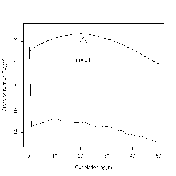
This example is discussed in more detail in Section 8.1.2 of my book Discrete-Time Dynamic Models, but the key observations here are the following.  First, the large spikes seen in both of the original data sequences were caused by the simultaneous, temporary loss of both measurements and the subsequent coding of these missing values as zero by the data collection system.  The practical question of interest was to determine how long, on average, the viscous, polymeric material being fed into and out of the product storage tank was spending there.  A standard method for addressing such questions is the use of cross-correlation analysis, where the expected result is a broad peak like the heavy dashed line in the plot shown below.  The location of this peak provides an estimate of the average time spent in the tank, which is approximately 21 hours in this case, as indicated in the plot.  This result was about what was expected, and it was obtained by applying standard cross-correlation analysis to the cleaned data sequences shown in the bottom two plots above.  The lighter solid curve in the plot below shows the results of applying exactly the same analysis, but to the original data sequences instead of the cleaned data sequences.  This dramatically different plot suggests that the material is spending very little time in the storage tank: accepted uncritically, this result would imply severe fouling of the tank, suggesting a need to shut the process down and clean out the tank, an expensive and labor-intensive proposition.  The main point of this example is that the difference in these two plots is entirely due to the extreme data anomalies present in the original time-series.  Additional examples of problems caused by time-series outliers are discussed in Section 4.3 of my book Mining Imperfect Data. 


One of the primary features of the analysis of time-series and other streaming data sequences is the need for local data characterizations.  This point is illustrated in the plot below, which shows the first 200 observations of the storage tank inlet data sequence discussed above.  All of these observations but one are represented as open circles in this plot, but the data point at k = 110 is shown as a solid circle, to emphasize how far it lies from its immediate neighbors in the data sequence.  It is important to note that this point is not anomalous with respect to the overall range of this data sequence – it is, for example, well within the normal range of variation seen for the points from about k = 150 to k = 200 – but it is clearly anomalous with respect to those points that immediately precede and follow it.  A general strategy for automatically detecting and removing such spikes from a data sequence like this one is to apply a moving window data cleaning filter which characterizes each data point with respect to a local neighborhood of prior and subsequent samples.  That is, for each data point k in the original data sequence, this type of filter forms a cleaned data estimate based on some number J of prior data values (i.e., points k-J through k-1 in the sequence) and, in the simplest implementations, the same number of subsequent data values (i.e., points k+1 through k+J in the sequence).


The specific data cleaning filter considered here is the Hampel filter, which applies the Hampel identifier discussed in Chapter 7 of Exploring Data in Engineering, the Sciences and Medicine to this moving data window.  If the kth data point is declared to be an outlier, it is replaced by the median value computed from this data window; otherwise, the data point is not modified.  The results of applying the Hampel filter with a window width of J = 5 to the above data sequence are shown in the plot below.  The effect is to modify three of the original data points – those at k = 43, 110, and 120 – and the original values of these modified points are shown as solid circles at the appropriate locations in this plot.  It is clear that the most pronounced effect of the Hampel filter is to remove the local outlier indicated in the above figure and replace it with a value that is much more representative of the other data points in the immediate vicinity.


As I noted above, the Hampel filter implementation used here is that available in the R package pracma as procedure outlierMAD.  I will discuss this R package in more detail in my next post, but for those seeking a more detailed discussion of the Hampel filter in the meantime, one is freely available on-line in the form of an EDN article I wrote in 2002, Scrub data with scale-invariant nonlinear digital filters.  Also, comparisons with alternatives like the standard median filter (generally too aggressive, introducing unwanted distortion into the “cleaned” data sequence) and the center-weighted median filter (sometimes quite effective) are presented in Section 4.2 of the book Mining Imperfect Data  mentioned above.

Friday, November 11, 2011

Harmonic means, reciprocals, and ratios of random variables

In my last few posts, I have considered “long-tailed” distributions whose probability density decays much more slowly than standard distributions like the Gaussian.  For these slowly-decaying distributions, the harmonic mean often turns out to be a much better (i.e., less variable) characterization than the arithmetic mean, which is generally not even well-defined theoretically for these distributions.  Since the harmonic mean is defined as the reciprocal of the mean of the reciprocal values, it is intimately related to the reciprocal transformation.  The main point of this post is to show how profoundly the reciprocal transformation can alter the character of a distribution, for better or worse.   One way that reciprocal transformations sneak into analysis results is through attempts to characterize ratios of random numbers.  The key issue underlying all of these ideas is the question of when the denominator variable in either a reciprocal transformation or a ratio exhibits non-negligible probability in a finite neighborhood of zero.  I discuss transformations in Chapter 12 of Exploring Data in Engineering, the Sciences and Medicine, with a section (12.7) devoted to reciprocal transformations, showing what happens when we apply them to six different distributions: Gaussian, Laplace, Cauchy, beta, Pareto, and lognormal. 

In the general case, if a random variable x has the density p(x), the distribution g(y) of the reciprocal y = 1/x has the density:

            g(y) = p(1/y)/y2

As I discuss in greater detail in Exploring Data, the consequence of this transformation is typically (though not always) to convert a well-behaved distribution into a very poorly behaved one.  As a specific example, the plot below shows the effect of the reciprocal transformation on a Gaussian random variable with mean 1 and standard deviation 2.  The most obvious characteristic of this transformed distribution is its strongly asymmetric, bimodal character, but another non-obvious consequence of the reciprocal transformation is that it takes a distribution that is completely characterized by its first two moments into a new distribution with Cauchy-like tails, for which none of the integer moments exist.


The implications of the reciprocal transformation for many other distributions are equally non-obvious.  For example, both the badly-behaved Cauchy distribution (no moments exist) and the well-behaved lognormal distribution (all moments exist, but interestingly, do not completely characterize the distribution, as I have discussed in a previous post) are invariant under the reciprocal transformation.  Also, applying the reciprocal transformation to the long-tailed Pareto type I distribution (which exhibits few or no finite moments, depending on its tail decay rate) yields a beta distribution, all of whose moments are finite.  Finally, it is worth noting that the invariance of the Cauchy distribution under the reciprocal transformation lies at the heart of the following result, presented in the book Continuous Univariate Distributions by Johnson, Kotz, and Balakrishnan (Volume 1, 2nd edition, Wiley, 1994, page 319).  They note that if the density of x is positive, continuous, and differentiable at x = 0 – all true for the Gaussian case – the distribution of the harmonic mean of N samples approaches a Cauchy limit as N becomes infinitely large.

As noted above, the key issue responsible for the pathological behavior of the reciprocal transformation is the question of whether the original data distribution exhibits nonzero probability of taking on values within a neighborhood around zero.  In particular, note that if x can only assume values larger than some positive lower limit L, it follows that 1/x necessarily lies between 0 and 1/L, which is enough to guarantee that all moments of the transformed distribution exist.  For the Gaussian distribution, even if the mean is large enough and the standard deviation is small enough that the probability of observing values less than some limit L > 0 is negligible, the fact that this probability is not zero means that the moments of any reciprocally-transformed Gaussian distribution are not finite.  As a practical matter, however, reciprocal transformations and related characterizations – like harmonic means and ratios – do become better-behaved as the probability of observing values near zero become negligibly small.

To see this point, consider two reciprocally-transformed Gaussian examples.  The first is the one considered above: the reciprocal transformation of a Gaussian random variable with mean 1 and standard deviation 2.  In this case, the probability that x assumes values smaller than or equal to zero is non-negligible.  Specifically, this probability is simply the cumulative distribution function for the distribution evaluated at zero, easily computed in R as approximately 31%:

> pnorm(0,mean=1,sd=2)
[1] 0.3085375

In contrast, for a Gaussian random variable with mean 1 and standard deviation 0.1, the corresponding probability is negligibly small:

> pnorm(0,mean=1,sd=0.1)
[1] 7.619853e-24

If we consider the harmonic means of these two examples, we see that the first one is horribly behaved, as all of the results presented here would lead us to expect.  In fact, the qqPlot command in the car package  in R allows us to compute quantile-quantile plots for the Student’s t-distribution with one degree of freedom, corresponding to the Cauchy distribution, yielding the plot shown below.  The Cauchy-like tail behavior expected from the results presented by Johnson, Kotz and Balakrishnan is seen clearly in this Cauchy Q-Q plot, constructed from 1000 harmonic means, each computed from statistically independent samples drawn from a Gaussian distribution with mean 1 and standard deviation 2.  The fact that almost all of the observations fall within the – very wide – 95% confidence interval around the reference line suggest that the Cauchy tail behavior is appropriate here.


To further confirm this point, compare the corresponding normal Q-Q plot for the same sequence of harmonic means, shown below.  There, the extreme non-Gaussian character of these harmonic means is readily apparent from the pronounced outliers evident in both the upper and lower tails.


In marked contrast, for the second example with the mean of 1 as before but the much smaller standard deviation of 0.1, the harmonic mean is much better behaved, as the normal Q-Q plot below illustrates.  Specifically, this plot is identical in construction to the one above, except it was computed from samples drawn from the second data distribution.  Here, most of the computed harmonic mean values fall within the 95% confidence limits around the Gaussian reference line, suggesting that it is not unreasonable in practice to regard these values as approximately normally distributed, in spite of the pathologies of the reciprocal transformation.


One reason the reciprocal transformation is important in practice – particularly in connection with the Gaussian distribution – is that the desire to characterize ratios of uncertain quantities does arise from time to time.  In particular, if we are interested in characterizing the ratio of two averages, the Central Limit Theorem would lead us to expect that, at least approximately, this ratio should behave like the ratio of two Gaussian random variables.  If these component averages are statistically independent, the expected value of the ratio can be re-written as the product of the expected value of the numerator average and the expected value of the reciprocal of the denominator average, leading us directly to the reciprocal Gaussian transformation discussed here.  In fact, if these two averages are both zero mean, it is a standard result that the ratio has a Cauchy distribution (this result is presented in the same discussion from Johnson, Kotz and Balakrishnan noted above).  As in the second harmonic mean example presented above, however, it turns out to be true that if the mean and standard deviation of the denominator variable are such that the probability of a zero or negative denominator are negligible, the distribution of the ratio may be approximated reasonably well as Gaussian.  A very readable and detailed discussion of this fact is given in the paper by George Marsaglia in the May 2006 issue of Journal of Statistical Software.

Finally, it is important to note that the “reciprocally-transformed Gaussian distribution” I have been discussing here is not the same as the inverse Gaussian distribution, to which Johnson, Kotz and Balakrishnan devote a 39-page chapter (Chapter 15).  That distribution takes only positive values and exhibits moments of all orders, both positive and negative, and as a consequence, it has the interesting characteristic that it remains well-behaved under reciprocal transformations, in marked contrast to the Gaussian case.


Sunday, October 23, 2011

The Zipf and Zipf-Mandelbrot distributions

In my last few posts, I have been discussing some of the consequences of the slow decay rate of the tail of the Pareto type I distribution, along with some other, closely related notions, all in the context of continuously distributed data.  Today’s post considers the Zipf distribution for discrete data, which has come to be extremely popular as a model for phenomena like word frequencies, city sizes, or sales rank data, where the values of these quantities associated with randomly selected samples can vary by many orders of magnitude.

More specifically, the Zipf distribution is defined by a probability pi of observing the ith element of an infinite sequence of objects in a single random draw from that sequence, where the probability is given by:

           
pi = A/ia

Here, a is a positive number greater than 1 that determines the rate of the distribution’s tail decay, and A is a normalization constant, chosen so that these probabilities sum to 1.  Like the continuous-valued Pareto type I distribution, the Zipf distribution exhibits a “long tail,” meaning that its tail decays slowly enough that in a random sample of objects Oi drawn from a Zipf distribution, some very large values of the index i will be observed, particularly for relatively small values of the exponent a.  In one of the earliest and most common applications of the Zipf distribution, the objects considered represent words in a document and i represents their rank, ranging from most frequent (for i = 1) to rare (for large i ).   In a more business-oriented application, the objects might be products for sale (e.g., books listed on Amazon), with the index i corresponding to their sales rank.  For a fairly extensive collection of references to many different applications of the Zipf distribution, the website (originally) from Rockefeller University is an excellent source.

In Exploring Data in Engineering, the Sciences, and Medicine, I give a brief discussion of both the Zipf distribution and the closely related Zipf-Mandelbrot distribution discussed by Beniot Mandelbrot in his book The Fractal Geometry of Nature.  The probabilities defining this distribution may be parameterized in several ways, and the one given in Exploring Data is:

           
pi = A/(1+Bi)a

where again a is an exponent that determines the rate at which the tail of the distribution decays, and B is a second parameter with a value that is strictly positive but no greater than 1.  For both the Zipf distribution and the Zipf-Mandelbrot distribution, the exponent a must be greater than 1 for the distribution to be well-defined, it must be greater than 2 for the mean to be finite, and it must be greater than 3 for the variance to be finite.

So far, I have been unable to find an R package that supports the generation of random samples drawn from the Zipf distribution, but the package zipfR includes the command rlnre, which generates random samples drawn from the Zipf-Mandelbrot distribution.  As I noted, this distribution can be parameterized in several different ways and, as Murphy’s law would have it, the zipfR parameterization is not the same as the one presented above and discussed in Exploring Data.  Fortunately, the conversion between these parameters is simple.  The zipfR package defines the distribution in terms of a parameter alpha that must lie strictly between 0 and 1, and a second parameter B that I will call BzipfR to avoid confusion with the parameter B in the above definition.  These parameters are related by:

           
alpha = 1/a    and    BzipfR = (a-1) B

Since the a parameter (and thus the alpha parameter in the zipfR package) determines the tail decay rate of the distribution, it is of the most interest here, and the rest of this post will focus on three examples: a = 1.5 (alpha = 2/3), for which both the distribution’s mean and variance are infinite, a = 2.5 (alpha = 2/5), for which the mean is finite but the variance is not, and a = 3.5 (alpha = 2/7), for which both the mean and variance are finite.  The value of the parameter B in the Exploring Data definition of the distribution will be fixed at 0.2 in all of these examples, corresponding to values of BzipfR = 0.1, 0.3, and 0.5 for the three examples considered here.

To generate Zipf-Mandelbrot random samples, the zipfR package uses the procedure rlnre in conjunction with the procedure lnre (the abbreviation “lnre” stands for “large number of rare events” and it represents a class of data models that includes the Zipf-Mandelbrot distribution).  Specifically, to generate a random sample of size N = 100 for the first case considered here, the following R code is executed:

> library(zipfR)
> ZM = lnre(“zm”, alpha = 2/3, B = 0.1)
> zmsample = rlnre(ZM, n=100)

The first line loads the zipfR library (which must first be installed, of course, using the install.packages command), the second line invokes the lnre command to set up the distribution with the desired parameters, and the last line invokes the rlnre command to generate 100 random samples from this distribution.  (As with all R random number generators, the set.seed command should be used first to initialize the random number generator seed if you want to get repeatable results; for the results presented here, I used set.seed(101).)  The sample returned by the rlnre command is a vector of 100 observations, which have the “factor” data type, although their designations are numeric (think of the factor value “1339” as meaning “1 sample of object number 1339”).  In the results I present here, I have converted these factor responses to numerical ones so I can interpret them as numerical ranks.  This conversion is a little subtle: simply converting from factor to numeric values via something like “zmnumeric = as.numeric(zmsample)” almost certainly doesn’t give you what you want: this will convert the first-ocurring factor value (which has a numeric label, say “1339”) into the number 1, convert the second-occurring value (since this is a random sequence, this might be “73”) into the number 2, etc.  To get what you want (e.g., the labels “1339” and “73” assigned to the numbers 1339 and 73, respectively), you need to first convert the factors in zmsample into characters and then convert these characters into numeric values:

           
zmnumeric = as.numeric(as.character(zmsample))


The three plots below show random samples drawn from each of the three Zipf-Mandelbrot distributions considered here.  In all cases, the y-axis corresponds to the number of times the object labeled i was observed in a random sample of size N = 100 drawn from the distribution with the indicated exponent.  Since the range of these indices can be quite large in the slowly-decaying members of the Zipf-Mandelbrot distribution family, the plots are drawn with logarithmic x-axes, and to facilitate comparisons, the x-axes have the same range in all three plots, as do the y-axes.  In all three plots, object i = 1 occurs most often – about a dozen times in the top plot, two dozen times in the middle plot, and three dozen times in the bottom plot – and those objects with larger indices occur less frequently.  The major difference between these three examples lies in the largest indices of the objects seen in the samples: we never see an object with index greater than 50 in the bottom plot, we see only two such objects in the middle plot, while more than a third of the objects in the top plot meet this condition, with the most extreme object having index i = 115,116. 


As in the case of the Pareto type I distributions I discussed in several previous posts – which may be regarded as the continuous analog of the Zipf distribution – the mean is generally not a useful characterization for the Zipf distribution.  This point is illustrated in the boxplot comparison presented below, which summarizes the means computed from 1000 statistically independent random samples drawn from each of the three distributions considered here, where the object labels have been converted to numerical values as described above.  Thus, the three boxplots on the left represent the means – note the logarithmic scale on the y-axis – of these index values i generated for each random sample.  The extreme variability seen for Case 1 (a = 1.5) reflects the fact that neither the mean nor the variance are finite for this case, and the consistent reduction in the range of variability for Cases 2 (a = 2.5, finite mean but infinite variance) and 3 (a = 3.5, finite mean and variance) reflects the “shortening tail” of this distribution with increasing exponent a.  As I discussed in my last post, a better characterization than the mean for distributions like this is the “95% tail length,” corresponding to the 95% sample quantile. Boxplots summarizing these values for the three distributions considered here are shown to the right of the dashed vertical line in the plot below.  In each case, the range of variation seen here is much less extreme for the 95% tail length than it is for the mean, supporting the idea that this is a better characterization for data described by Zipf-like discrete distributions.


Other alternatives to the (arithmetic) mean that I discussed in conjunction with the Pareto type I distribution were the sample median, the geometric mean, and the harmonic mean.  The plot below compares these four characterizations for 1000 random samples, each of size N = 100, drawn from the Zipf-Mandelbrot distribution with a = 3.5 (the third case), for which the mean is well-defined.  Even here, it is clear that the mean is considerably more variable than these other three alternatives.


Finally, the plot below shows boxplot comparisons of these alternative characterizations – the median, the geometric mean, and the harmonic mean – for all three of the distributions considered here.  Not surprisingly, Case 1 (a = 1.5) exhibits the largest variability seen for all three characterizations, but the harmonic mean is much more consistent for this case than either the geometric mean or the median.  In fact, the same observation holds – although less dramatically – for Case 2 (a = 2.5), and the harmonic mean appears more consistent than the geometric mean for all three cases.  This observation is particularly interesting in view of the connection between the harmonic mean and the reciprocal transformation, which I will discuss in more detail next time.


Wednesday, September 28, 2011

Is the “Long Tail” a Useless Concept?

In response to my last post, “The Long Tail of the Pareto Distribution,” Neil Gunther had the following comment:

           
Unfortunately, you've fallen into the trap of using the ‘long tail’ misnomer. If you think about it, it can't possibly be the length of the tail that sets distributions like Pareto and Zipf apart; even the negative exponential and Gaussian have infinitely long tails.”

He goes on to say that the relevant concept is the “width” or the “weight” of the tails that is important, and that a more appropriate characterization of these “Long Tails” would be “heavy-tailed” or “power-law” distributions.

Neil’s comment raises an important point: while the term “long tail” appears a lot in both the on-line and hard-copy literature, it is often somewhat ambiguously defined.  For example, in his book, The Long Tail, Chris Anderson offers the following description (page 10):

           
“In statistics, curves like that are called ‘long-tailed distributions’ because the tail of the curve is very long relative to the head.”

The difficulty with this description is that it is somewhat ambiguous since it says nothing about how to measure “tail length,” forcing us to adopt our own definitions.  It is clear from Neil’s comments that the definition he adopts for “tail length” is the width of the distribution’s support set.  Under this definition, the notion of a “long-tailed distribution” is of extremely limited utility: the situation is exactly as Neil describes it, with “long-tailed distributions” corresponding to any distribution with unbounded support, including both distributions like the Gaussian and gamma distribution where the mean is a reasonable characterization, and those like the Cauchy and Pareto distribution where the mean doesn’t even exist. 

The situation is analogous to that of confidence intervals, which characterize the uncertainty inherited by any characterization computed from a collection of uncertain (i.e., random) data values.  As a specific example consider the mean: the sample mean is the arithmetic average of N observed data samples, and it is generally intended as an estimate of the population mean, defined as the first moment of the data distribution.  A q% confidence interval around the sample mean is an interval that contains the population mean with probability at least q%.  These intervals can be computed in various ways for different data characterizations, but the key point here is that they are widely used in practice, with the most popular choices being the 90%, 95% and 99% confidence intervals, which necessarily become wider as this percentage q increases.  (For a more detailed discussion of confidence intervals, refer to Chapter 9 of Exploring Data in Engineering, the Sciences, and Medicine.)  We can, in principle, construct 100% confidence intervals, but this leads us directly back to Neil’s objection: the 100% confidence interval for the mean is entire support set of the distribution (e.g., for the Gaussian distribution, this 100% confidence interval is the whole real line, while for any gamma distribution, it is the set of all positive numbers).  These observations suggest the following notion of “tail length” that addresses Neil’s concern while retaining the essential idea of interest in the business literature: we can compare the “q% tail length” of different distributions for some q less than 100.

In particular, consider the case of J-shaped distributions, defined as those like the Pareto type I distribution whose distribution p(x) decays monotonically with increasing x, approaching zero as x goes to infinity.  The plot below shows two specific examples to illustrate the idea: the solid line corresponds to the (shifted) exponential distribution:

            p(x) = e–(x-1)

for all x greater than or equal to 1 and zero otherwise, while the dotted line represents the Pareto type I distribution with location parameter k = 1 and shape parameter a = 0.5 discussed in my last post.  Initially, as x increases from 1, the exponential density is greater than the Pareto density, but for x larger than about 3.5, the opposite is true: the exponential distribution rapidly becomes much smaller, reflecting its much more rapid rate of tail decay.


For these distributions, define the q% tail length to be the distance from the minimum possible value of x (the “head” of the distribution; here, x = 1) to the point in the tail where the cumulative probability reaches q% (i.e., the value xq where x < xq with probability q%).  In practical terms, the q% tail length tells us how far out we have to go in the tail to account for q% of the possible cases.  In R, this value is easy to compute using the quantile function included in most families of available distribution functions.  As a specific example, for the Pareto type I distribution, the function qparetoI in the VGAM package gives us the desired quantiles for the distribution with specified values of the parameters k (designated “scale” in the qparetoI call) and a (designated “shape” in the qparetoI call).  Thus, for the case k = 1 and a = 0.5 (i.e., the dashed curve in the above plot), the “90% tail length” is given by:

> qparetoI(p=0.9,scale=1,shape=0.5)
[1] 100
>

For comparison, the corresponding shifted exponential distribution has the 90% tail length given by:

> 1 + qexp(p = 0.9)
[1] 3.302585
>

(Note that here, I added 1 to the exponential quantile to account for the shift in its domain from “all positive numbers” – the domain for the standard exponential distribution – to the shifted domain “all numbers greater than 1”.)  Since these 90% tail lengths differ by a factor of 30, they provide a sound basis for declaring the Pareto type I distribution to be “longer tailed” than the exponential distribution.

These results also provide a useful basis for assessing the influence of the decay parameter a for the Pareto distribution.  As I noted last time, two of the examples I considered did not have finite means (a = 0.5 and 1.0), and none of the four had finite variances (i.e., also a = 1.5 and 2.0), rendering moment characterizations like the mean and standard deviation fundamentally useless.  Comparing the 90% tail lengths for these distributions, however, leads to the following results:

            a = 0.5: 90% tail length = 100.000
            a = 1.0: 90% tail length =   10.000
            a = 1.5: 90% tail length =     4.642
            a = 2.0: 90% tail length =     3.162

It is clear from these results that the shape parameter a has a dramatic effect on the 90% tail length (in fact, on the q% tail length for any q less than 100).  Further, note that the 90% tail length for the Pareto type I distribution with a = 2.0 is actually a little bit shorter than that for the exponential distribution.  If we move further out into the tail, however, this situation changes.  As a specific example, suppose we compare the 98% tail lengths. For the exponential distribution, this yields the value 4.912, while for the four Pareto shape parameters we have the following results:

            a = 0.5: 98% tail length = 2,500.000
            a = 1.0: 98% tail length =      50.000
            a = 1.5: 98% tail length =      13.572
            a = 2.0: 98% tail length =        7.071

This value (i.e., the 98% tail length) seems a particularly appropriate choice to include here since in his book, The Long Tail, Chris Anderson notes that his original presentations on the topic were entitled “The 98% Rule,” reflecting the fact that he was explicitly considering how far out you had to go into the tail of a distribution of goods (e.g., the books for sale by Amazon) to account for 98% of the sales.

Since this discussion originally began with the question, “when are averages useless?” it is appropriate to note that, in contrast to the much better-known average, the “q% tail length” considered here is well-defined for any proper distribution.   As the examples discussed here demonstrate, this characterization also provides a useful basis for quantifying the “Long Tail” behavior that is of increasing interest in business applications like Internet marketing.  Thus, if we adopt this measure for any q value less than 100%, the answer to the title question of this post is, “No: The Long Tail is a useful concept.”

The downside of this minor change is that – as the results shown here illustrate – the results obtained using the q% tail length depend on the value of q we choose.  In my next post, I will explore the computational issues associated with that choice.