This blog is a companion to my recent book, Exploring Data in Engineering, the Sciences, and Medicine, published by Oxford University Press. The blog expands on topics discussed in the book, and the content is heavily example-based, making extensive use of the open-source statistical software package R.

Showing posts with label moving window data characterizations. Show all posts

Sunday, November 27, 2011

Cleaning time-series and other data streams

The need to analyze time-series or other forms of streaming data arises frequently in many different application areas.  Examples include economic time-series like stock prices, exchange rates, or unemployment figures, biomedical data sequences like electrocardiograms or electroencephalograms, or industrial process operating data sequences like temperatures, pressures or concentrations.  As a specific example, the figure below shows four data sequences: the upper two plots represent hourly physical property measurements, one made at the inlet of a product storage tank (the left-hand plot) and the other made at the same time at the outlet of the tank (the right-hand plot).  The lower two plots in this figure show the results of applying the data cleaning filter outlierMAD from the R package pracma discussed further below.  The two main points of this post are first, that isolated spikes like those seen in the upper two plots at hour 291 can badly distort the results of an otherwise reasonable time-series characterization, and second, that the simple moving window data cleaning filter described here is often very effective in removing these artifacts.


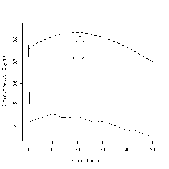
This example is discussed in more detail in Section 8.1.2 of my book Discrete-Time Dynamic Models, but the key observations here are the following.  First, the large spikes seen in both of the original data sequences were caused by the simultaneous, temporary loss of both measurements and the subsequent coding of these missing values as zero by the data collection system.  The practical question of interest was to determine how long, on average, the viscous, polymeric material being fed into and out of the product storage tank was spending there.  A standard method for addressing such questions is the use of cross-correlation analysis, where the expected result is a broad peak like the heavy dashed line in the plot shown below.  The location of this peak provides an estimate of the average time spent in the tank, which is approximately 21 hours in this case, as indicated in the plot.  This result was about what was expected, and it was obtained by applying standard cross-correlation analysis to the cleaned data sequences shown in the bottom two plots above.  The lighter solid curve in the plot below shows the results of applying exactly the same analysis, but to the original data sequences instead of the cleaned data sequences.  This dramatically different plot suggests that the material is spending very little time in the storage tank: accepted uncritically, this result would imply severe fouling of the tank, suggesting a need to shut the process down and clean out the tank, an expensive and labor-intensive proposition.  The main point of this example is that the difference in these two plots is entirely due to the extreme data anomalies present in the original time-series.  Additional examples of problems caused by time-series outliers are discussed in Section 4.3 of my book Mining Imperfect Data. 
           

One of the primary features of the analysis of time-series and other streaming data sequences is the need for local data characterizations.  This point is illustrated in the plot below, which shows the first 200 observations of the storage tank inlet data sequence discussed above.  All of these observations but one are represented as open circles in this plot, but the data point at k = 110 is shown as a solid circle, to emphasize how far it lies from its immediate neighbors in the data sequence.  It is important to note that this point is not anomalous with respect to the overall range of this data sequence – it is, for example, well within the normal range of variation seen for the points from about k = 150 to k = 200 – but it is clearly anomalous with respect to those points that immediately precede and follow it.  A general strategy for automatically detecting and removing such spikes from a data sequence like this one is to apply a moving window data cleaning filter which characterizes each data point with respect to a local neighborhood of prior and subsequent samples.  That is, for each data point k in the original data sequence, this type of filter forms a cleaned data estimate based on some number J of prior data values (i.e., points k-J through k-1 in the sequence) and, in the simplest implementations, the same number of subsequent data values (i.e., points k+1 through k+J in the sequence).


The specific data cleaning filter considered here is the Hampel filter, which applies the Hampel identifier discussed in Chapter 7 of Exploring Data in Engineering, the Sciences and Medicine to this moving data window.  If the kth data point is declared to be an outlier, it is replaced by the median value computed from this data window; otherwise, the data point is not modified.  The results of applying the Hampel filter with a window width of J = 5 to the above data sequence are shown in the plot below.  The effect is to modify three of the original data points – those at k = 43, 110, and 120 – and the original values of these modified points are shown as solid circles at the appropriate locations in this plot.  It is clear that the most pronounced effect of the Hampel filter is to remove the local outlier indicated in the above figure and replace it with a value that is much more representative of the other data points in the immediate vicinity.


As I noted above, the Hampel filter implementation used here is that available in the R package pracma as procedure outlierMAD.  I will discuss this R package in more detail in my next post, but for those seeking a more detailed discussion of the Hampel filter in the meantime, one is freely available on-line in the form of an EDN article I wrote in 2002, Scrub data with scale-invariant nonlinear digital filters.  Also, comparisons with alternatives like the standard median filter (generally too aggressive, introducing unwanted distortion into the “cleaned” data sequence) and the center-weighted median filter (sometimes quite effective) are presented in Section 4.2 of the book Mining Imperfect Data  mentioned above.

Saturday, August 27, 2011

Some Additional Thoughts on Useless Averages

In my last post, I described three situations where the average of a sequence of numbers is not representative enough to be useful: in the presence of severe outliers, in the face of multimodal data distributions, and in the face of infinite-variance distributions.  The post generated three interesting comments that I want to respond to here.

First and foremost, I want to say thanks to all of you for giving me something to think about further, leading me in some interesting new directions.  First, chrisbeeleyimh had the following to say:

           
“I seem to have rather abandoned means and medians in favor of drawing the distribution all the time, which baffles my colleagues somewhat.”

Chris also maintains a collection of data examples where the mean is the same but the shape is very different.  In fact, one of the points I illustrate in Section 4.4.1 of Exploring Data in Engineering, the Sciences, and Medicine is that there are cases where not only the means but all of the moments (i.e., variance, skewness, kurtosis, etc.) are identical but the distributions are profoundly different.  A specific example is taken from the book Counterexamples in Probability, 2nd Edition by J.M. Stoyanov, who shows that if the lognormal density is multiplied by the following function:

                       
f(x) = 1 + A sin(2 pi ln x),

for any constant A between -1 and +1, the moments are unchanged.  The character of the distribution is changed profoundly, however, as the following plot illustrates (this plot is similar to Fig. 4.8 in Exploring Data, which shows the same two distributions, but for A = 0.5 instead of A = 0.9, as shown here).  To be sure, this behavior is pathological – distributions that have finite support, for example, are defined uniquely by their complete set of moments – but it does make the point that moment characterizations are not always complete, even if an infinite number of them are available.  Within well-behaved families of distributions (such as the one proposed by Karl Pearson in 1895), a complete characterization is possible on the basis of the first few moments, which is one reason for the historical popularity of the method of moments for fitting data to distributions.  It is important to recognize, however, that moments do have their limitations and that the first moment alone – i.e., the mean by itself – is almost never a complete characterization.  (I am forced to say “almost” here because if we impose certain very strong distributional assumptions – e.g., the Poisson or binomial distributions – the specific distribution considered may be fully characterized by its mean.  This begs the question, however, of whether this distributional assumption is adequate.  My experience has been that, no matter how firmly held the belief in a particular distribution is, exceptions do arise in practice … overdispersion, anyone?) 


The plot below provides a further illustration of the inadequacy of the mean as a sole data characterization, comparing four different members of the family of beta distributions.  These distributions – in the standard form assumed here – describe variables whose values range from 0 to 1, and they are defined by two parameters, p and q, that determine the shape of the density function and all moments of the distribution.  The mean of the beta distribution is equal to p/(p+q), so if p = q – corresponding to the class of symmetric beta distributions – the mean is ½, regardless of the common value of these parameters.  The four plots below show the corresponding distributions when both parameters are equal to 0.5 (upper left, the arcsin distribution I discussed last time), 1.0 (upper right, the uniform distribution), 1.5 (lower left), and 8.0 (lower right). 


The second comment on my last post was from Efrique, who suggested the Student’s t-distribution with 2 degrees of freedom as a better infinite-variance example than the Cauchy example I used (corresponding to Student’s t-distribution with one degree of freedom), because the first moment doesn’t even exist for the Cauchy distribution (“there’s nothing to converge to”).  The figure below expands the boxplot comparison I presented last time, comparing the means, medians, and modes (from the modeest package), for both of these infinite-variance examples: the Cauchy distribution I discussed last time and the Student’s t-distribution with two degrees of freedom that Efrique suggested.  Here, the same characterization (mean, median, or mode) is summarized for both distributions in side-by-side boxplots to facilitate comparisons.  It is clear from these boxplots that the results for the median and the mode are essentially identical for these distributions, but the results for the mean differ dramatically (recall that these results are truncated for the Cauchy distribution: 13.6% of the 1000 computed means fell outside the +/- 5 range shown here, exhibiting values approaching +/- 1000).  This difference illustrates Efrique’s further point that the mean of the data values is a consistent estimator of the (well-defined) population mean of the Student’s t-distribution with 2 degrees of freedom, while it is not a consistent estimator for the Cauchy distribution.  Still, it also clear from this plot that the mean is substantially more variable for the Student’s t-distribution with 2 degrees of freedom than either the median or the modeest mode estimate.


Another example of an infinite-variance distribution where the mean is well-defined but highly variable is the Pareto type I distribution, discussed in Section 4.5.8 of Exploring Data.  My favorite reference on distributions is the two volume set by Johnson, Kotz, and Balakrishnan (Continuous Univariate Distributions, Vol. 1 (Wiley Series in Probability and Statistics) and Continuous Univariate Distributions, Vol. 2 (Wiley Series in Probability and Statistics)), who devote an entire 55 page chapter (Chapter 20 in Volume 1) to the Pareto distribution, noting that it is named after Vilafredo Pareto, a mid nineteenth- to early twentieth-century Swiss professor of economics, who proposed it as a description of the distribution of income over a population.  In fact, there are several different distributions named after Pareto, but the type I distribution considered here exhibits a power-law decay like the Student’s t-distributions, but it is a J-shaped distribution whose mode is equal to its minimum value.  More specifically, this distribution is defined by a location parameter that determines this minimum value and a shape parameter that determines how rapidly the tail decays for values larger than this minimum.  The example considered here takes this minimum value as 1 and the shape parameter as 1.5, giving a distribution with a finite mean but an infinite variance.  As in the above example, the boxplot summary shown below characterizes the mean, median, and mode for 1000 statistically independent random samples drawn from this distribution, each of size N = 100.  As before, it is clear from this plot that the mean is much more highly variable than either the median or the mode. 


In this case, however, we have the added complication that since this distribution is not symmetric, its mean, median and mode do not coincide.  In fact, the population mode is the minimum value (which is 1 here), corresponding to the solid line at the bottom of the plot.  The narrow range of the boxplot values around this correct value suggest that the modeest package is reliably estimating this mode value, but as I noted in my last post, this characterization is not useful here because it tells us nothing about the rate at which the density decays.  The theoretical median value can also be calculated easily for this distribution, and here it is approximately equal to 1.587, corresponding to the dashed horizontal line in the plot.  As with the mode, it is clear from the boxplot that the median estimated from the data is in generally excellent agreement with this value.  Finally, the mean value for this particular distribution is 3, corresponding to the dotted horizontal line in the plot.  Since this line lies fairly close to the upper quartile of the computed means (i.e., the top of the “box” in the boxplot), it follows that the estimated mean falls below the correct value almost 75% of the time, but it is also clear that when the mean is overestimated, the extent of this overestimation can be very large.  Motivated in part by the fact that the mean doesn’t always exist for the Pareto distribution, Johnson, Kotz and Balakrishnan note in their chapter on these distributions that alternative location measures have been considered, including both the geometric and harmonic means.  I will examine these ideas further in a future post.

Finally, klr mentioned my post on useless averages in his blog TimelyPortfolio, where he discusses alternatives to the moving average in characterizing financial time-series.  For the case he considers, klr compares a 10-month moving average, the corresponding moving median, and a number of the corresponding mode estimators from the modeest package.  This is a very interesting avenue of exploration for me since it is closely related to the median filter and other nonlinear digital filters that can be very useful in cleaning noisy time-series data.  I discuss a number of these ideas – including moving-window extensions of other data characterizations like skewness and kurtosis – in my book Mining Imperfect Data: Dealing with Contamination and Incomplete Records

Again, thanks to all of you for your comments.  You have given me much to think about and investigate further, which is one of the joys of doing this blog.