This blog is a companion to my recent book, Exploring Data in Engineering, the Sciences, and Medicine, published by Oxford University Press. The blog expands on topics discussed in the book, and the content is heavily example-based, making extensive use of the open-source statistical software package R.

Saturday, April 23, 2011

Measuring association using odds ratios

In my last two posts, I have used the UCI mushroom dataset to illustrate two things.  The first was the use of interestingness measures to characterize categorical variables, and the second was the use of binary confidence intervals to visualize the relationship between a categorical predictor variable and a binary response variable.  This second approach can be applied to categorical predictors having any number of levels, but in the case of a binary (i.e., two-level) predictor, an attractive alternative is to measure their association with odds ratios.  The objective of this post is to illustrate this idea and highlight a few important details.


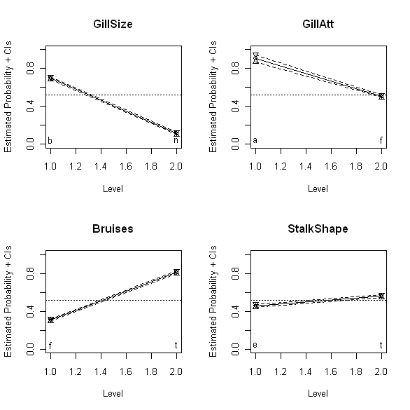
The above plots show the binomial confidence intervals discussed last time for four different binary mushroom characteristics: GillSize (upper left), GillAtt (upper right), Bruises (lower left), and StalkShape (lower right).  Specifically, these plots show the estimated probability that mushrooms with each of the two possible values for these variables are edible.  Thus, the upper left plot shows that mushrooms with GillSize characteristic “b” (“broad”) are much more likely to be edible than mushrooms with GillSize characteristic “n” (“narrow”).  The other three plots have analogous interpretations: mushrooms with GillAtt value “a” (“attached”) are more likely to be edible than those with value “f” (“free”), mushrooms with bruises (Bruises value “t”) are more likely to be edible than those without (Bruises value “f”), and mushrooms with StalkShape value “t” (“tapering”) are slightly more likely to be edible than those with value “e” (“enlarging”).   Also, while the smaller slopes for GillAtt and StalkShape suggest this association is weaker for these variables than for GillSize, where the slope appears much larger, it would be nice to have a quantitative measure of this degree of association that we could compare directly.  This is particularly the case for GillSize and Bruises, where both associations appear to be reasonably strong, but since the reference lines run in opposite directions on the plots, it is difficult to reliably compare the slopes on the basis of appearance alone.

The odds ratio provides a simple quantitative association measure for these variables that allows us to make these comparisons directly.  I discuss the odds ratio in Chapter 13 of  Exploring Data in Engineering, the Sciences, and Medicine in connection with the practical implications of data type (e.g., numerical versus categorical data).  The odds ratio may be viewed as an association measure between binary variables, and it is defined as follows.  For simplicity, suppose x and y are two binary variables of interest and assume that they are coded so that they each take the values 0 or 1 – this assumption is easily relaxed, as discussed below, but it simplifies the basic description of the odds ratio.  Next, define the following four numbers:

            N00 = the number of data records with x = 0 and y = 0
            N01 = the number of data records with x = 0 and y = 1
            N10 = the number of data records with x = 1 and y = 0
            N11 = the number of data records with x = 1 and y = 1

The odds ratio is defined in terms of these four numbers as

OR = N00 N11 / N01 N10

Since all of the four numbers appearing in this ratio are nonnegative, it follows that the odds ratio is also nonnegative and can assume any value between 0 and positive infinity.  Further, if x and y are two statistically independent binary random variables, it can be shown that the odds ratio is equal to 1.  Values greater than 1 imply that records with y = 1 are more likely to have x = 1 than x = 0, and similarly, that records with y = 0 are more likely to have x = 0 than x = 1; in other words, OR > 1 implies that the variables x and y are more likely to agree than they are to disagree.  Conversely, odds ratio values less than 1 imply that the variables x and y are more likely to disagree: records with y = 1 are more likely to have x = 0 than x = 1, and those with y = 0 are more likely to have x = 1 than x = 0.

Often – as in the mushroom dataset – the binary variables are not coded as 0 or 1, but instead as two different categorical values.  As a specific example, the binary response variable considered last time – the edibility variable EorP – assumes the values “e” (for “edible”) or “p” (for “poisonous” or “non-edible”).  In the results presented here, we recode EorP to have the values 1 for edible mushrooms and 0 for non-edible mushrooms.  For the mushroom characteristic GillSize shown in the upper left plot above, suppose we initially code the value “b” (“broad”) as 0 and the value “n” (“narrow”) as 1.  This choice is arbitrary – we could equally well code “b” as 1 and “n” as zero – and its practical consequences are explored further below.  For the coding just described, the odds ratio between mushroom edibility (EorP) and gill size (GillSize) is 0.056.  Since this number is substantially smaller than 1, it suggests that edible mushrooms (y = 1) are unlikely to be associated with narrow gills (x = 1), a result that is consistent with the appearance of the upper left plot above. 

An important practical issue in interpreting odds ratios is that of how much smaller or larger than 1 the computed odds ratio should be to be regarded as evidence for a “significant” association between the variables x and y.  That is, since we are computing this ratio from uncertain data, we need a measure of precision for the odds ratio, like the binomial confidence intervals discussed in my last post: e.g., how much does the odds ratio change if some mushrooms previously declared edible is reclassified as poisonous, or if some additional mushrooms are added to our dataset?  Fortunately, confidence intervals for the odds ratio are easily constructed.  In his book Categorical Data Analysis (Wiley Series in Probability and Statistics), Alan Agresti notes that confidence intervals for the odds ratio can be computed directly by appealing to the fact that the odds ratio estimator is asymptotically normal, approaching a Gaussian distribution in the limit of large sample sizes.  He does not give explicit results for these direct confidence intervals, however, because he does not recommend them.  Instead, Agresti advocates the construction of confidence intervals for the log of the odds ratio and transforming them back to get upper and lower confidence limits for the odds ratio itself.  This recommendation rests primarily on three practical points: first, that the log of the odds ratio approaches normality faster than the odds ratio itself does, so this approach yields more accurate confidence intervals; second, this approach guarantees a positive lower confidence limit for the odds ratio, which is not the case for the direct approach; and, third, the same result can be used to compute confidence intervals for both the odds ratio and its reciprocal, a result that is again not true for the direct approach and that will be useful in the discussion presented below. 

For the gill size example, Agresti’s recommended procedure yields a 95% confidence interval between 0.049 and 0.064.  Since this interval does not include the value 1, we conclude that there is evidence to support an association between a mushroom’s gill size and its edibility, at least for mushrooms in the UCI dataset. Applying this procedure to the GillAtt characteristic shown in the upper right plot above yields an estimated odds ratio of 0.097 with a 95% confidence interval between 0.059 and 0.157.  Again, the fact that this interval does not include 1 supports the idea that the GillAtt characteristic is associated with edibility (again, for the mushrooms considered here), but the fact that this odds ratio is larger (i.e., closer to the neutral value 1) also suggests that this association is weaker than that between edibility and the GillShape characteristic.  Again, this result is in agreement with the visual appearance of the upper right plot above, relative to that of the upper left plot.  The advantage of the odds ratio over these plots is that it provides a quantitative measure that can be used to make more objective comparisons, removing the subjective visual judgment required in comparing plots.

Applying this procedure to the Bruises variable yields an odds ratio of 9.972, with a 95% confidence interval from 8.963 to 11.093.  The fact that these values are larger than 1 implies that mushrooms whose bruise characteristics have been coded as 1 (here, “t” for “true” or “bruised”) are more likely to be edible than those whose characteristics have been coded as 0 (here, “f” for “false” or “not bruised”).  As noted above, this coding is arbitrary, as were the earlier assignments.  An extremely useful observation is that if we reverse this assignment – i.e., for this example, if we code “bruised” as 0 and “not bruised” as 1 – we simply exchange the numbers N00 with N10 and also the numbers N11 with N01.  The effect of these exchanges on the odds ratio is a reciprocal transformation:

            OR = N00N11/N01N10 -> N10N01/N11N00 = 1/OR

This observation provides a simple basis for comparing results like those for GillSize where the odds ratio is less than 1 with those for Bruises where the odds ratio is greater than 1.  As with the visual comparisons discussed above, it is not obvious from the odds ratios computed so far which of these variables is more strongly associated with mushroom edibility.  Reversing the coding for GillSize so that “b” is coded as 1 and “n” is coded as 0 changes the odds ratio from 0.059 to 1/0.059 = 17.857.  Since this number is larger than the odds ratio of 9.972 for Bruises, we can conclude that GillSize is more strongly associated with edibility – i.e., it is a better predictor of edibility for the mushrooms considered here – than Bruises, at least for this dataset. 

In fact, the same trick can be applied to the confidence intervals, illustrating the third advantage noted above for Agresti’s preferred approach to constructing these intervals.  Specifically, the asymptotically normal approximation says that the log of the odds ratio has a mean of log OR and a standard deviation S that can be simply computed from the four numbers N00, N01, N10, and N11.  Since the Gaussian distribution is symmetric about its mean and log(1/OR) = - log(OR), it follows that the log of the reciprocal odds ratio has the same approximate standard deviation S as log(OR).  In practical terms, this means that if we reverse the coding of our binary predictor variables, it is a simple matter to compute new confidence intervals as follows:

            New lower CI = 1/Old upper CI
            New odds ratio = 1/Old odds ratio
            New upper CI = 1/Old lower CI

(Note here that because the reciprocal transformation is order-reversing, the transformation of the lower confidence limit yields the new upper confidence limit, and vice-versa; for a more detailed discussion of order-preserving and order-reversing transformations in general and the reciprocal transformation in particular, refer to Chapter 12 of Exploring Data.)

Applying these transformation results to the odds ratio for Bruises yields a new odds ratio of 0.100, with a 95% confidence interval from 0.090 to 0.112, which we can now compare with the earlier results for GillSize and GillAtt.  Alternatively, if we reverse the coding of the results for GillSize and GillAtt, we obtain odds ratios that are larger than 1 between edibility and “the more edible value” of each of these mushroom characteristics.  This has the advantage of giving us a sequences of odds ratios, all larger than 1, with the largest value suggestive of the strongest association between each mushroom characteristic variable and edibility.  For the four mushroom characteristics shown in the above four plots, this approach yields the following odds ratios and their 95% confidence intervals:

            GillSize:       Lower CI = 15.625,  OR = 17.857,  Upper CI = 20.408
            GillAtt:        Lower CI =   6.369,  OR = 10.309,  Upper CI = 16.949
            Bruises:       Lower CI =   8.963,  OR =  9.972,   Upper CI = 11.093
            StalkShape: Lower CI =   1.384,  OR = 1.512,    Upper Ci = 1.651

These results suggest that, of these four variables, the best predictor of mushroom edibility is GillSize, followed by GillAtt as second-best, then Bruises, and finally StalkShape as least predictive.  These conclusions are probably the same as we would draw based on a careful comparison of the plots shown above, but the odds ratios computed in the way just described lead us to these conclusions much more directly.

Finally, it is important to make three points.  First, as I have noted before – but the point is important enough to bear repeating – the associations described here between these binary mushroom characteristics and edibility are based entirely on the UCI mushroom dataset.  Thus, these conclusions are only as representative of mushrooms in general or in any particular setting as the UCI mushroom dataset is representative of this larger and/or different mushroom population.  In particular, mushrooms from other locales or unusual environments may exhibit different relationships between edibility and gill size or other characteristics than the UCI mushrooms do.  The second key point is that the results presented here only attempt to assess the predictability of a single binary mushroom characteristic in isolation.  To get a more complete picture of the relationship between mushroom characteristics and edibility, it is necessary to explore more general multivariate analysis techniques like logistic regression.  More about that later.  Last but not least, the third point is that I realized in reviewing this post before I issued it that I hadn't included any actual R code to compute odds ratios.  In my next post, I will remedy this problem, giving a detailed view of how the numbers presented here were obained.

Tuesday, April 12, 2011

Screening for predictive characteristics … and a mea culpa

In my last post, I considered the UCI mushroom dataset and characterized the variables included there using four different interestingness measures.  When I began drafting this post, my intention was to consider the question of how the different mushroom characteristics included in this dataset relate to each mushroom’s classification as edible or poisonous.  In fact, I do consider this problem here, but in the process of working out the example, I discovered a minor typographical error in Exploring Data in Engineering, the Sciences, and Medicine that has somewhat less minor consequences.  Specifically, in Eq. (9.67) on page 413, two square roots were omitted, making the result incorrect as stated.  (More specifically, the term in curly brackets that appears twice should have an exponent of ½, like the different term that appears twice in curly brackets in Eq. (9.66) just above it on the same page.)  The consequence of this omission is that the confidence intervals defined by Eq. (9.67) are too narrow; further, since this equation was used to implement the R procedure binomCI.proc available from the companion website, the results generated by this procedure are also incorrect.  I have brought these errors to Oxford’s attention and have asked them to replace the original R procedure with a corrected update, but if you have already downloaded this procedure, you need to be aware of the missing square root.  The rest of this post carries out my original plan – which was to show how binomial confidence intervals can be useful in screening categorical variables for their ability to predict a binary outcome like edibility. 

Recall that the UCI mushroom dataset gives 23 characteristics for each of 8,124 mushrooms, including a binary classification of each mushroom as “edible” or “poisonous.”  The question considered here is which – if any – of the 22 mushroom attributes included in the dataset is potentially useful in predicting edibility.  The basic idea is the following: each of these predictors is a categorical variable that can take on any one of a fixed set of possible values, so we can examine the groups of mushrooms defined by each of these values and estimate the probability that the mushrooms in the group are edible.  As a specific example, the mushroom characteristic CapSurf has four possible values: “f” (fibrous), “g” (grooves), “s” (smooth), or “y” (scaly).  In this case, we want to estimate the probability that mushrooms with CapSurf = f are edible, the probability that those with CapSurf = g are edible, and similarly for CapSurf = s and y.  The most common approach to this problem is to estimate these probabilities as the fractions of edible mushrooms in each group: Pedible = nedible/ngroup.  The difficulty with this number, taken by itself, is that it doesn’t tell us how much weight to give the final result: if we have one edible mushroom in a group of five, we get Pedible = 0.200, and we get the same result if we have 200 edible mushrooms in a group of 1,000.  We are likely to put more faith in the second result than in the first, however, because it has a lot more weight of evidence behind it.  For example, if we add a single edible mushroom to each group, our probability estimate for the first case increases from Pedible = 0.200 to Pedible = 0.333, while in the second case, the estimated probability only increases to Pedible = 0.201.  Even worse, if we remove one edible mushroom from the first group, Pedible drops to 0.000, while in the second case, it only drops to 0.199. 

This is where statistics can come to our rescue: in addition to computing the point estimate Pedible of the probability that a mushroom is edible, we can also compute confidence intervals, which quantify the uncertainty in this result.  That is, a confidence interval is defined as a set of values that has at least some specified probability of containing the true but unknown value of Pedible.  A common choice is 95% confidence limits: the true value of Pedible lies between some lower limit P- and some upper limit P+ with probability at least 95%.  One of the key points of this post is that these intervals can be computed in more than one way, and the way that was widely adopted as “the standard method” for a long time has been found to be inadequate.  Fortunately, a simple alternative is available that gives much better results, at least if you implement it correctly.  The details follow, all based on the material presented in Section 9.7 of Exploring Data.

This standard method relies on the assumption of asymptotic normality: for a “sufficiently large” group (i.e., for “large enough” values of ngroup and possibly nedible), the estimator Pedible should approaches a Gaussian limiting distribution with variance Pedible(1 – Pedible)/ngroup.  If we assume our sample is large enough for this to be a good approximation, we can rely on known results for the Gaussian distribution to construct our confidence intervals.  As a specific example, the 95% confidence interval would be centered at Pedible with upper and lower limits lying approximately plus or minus 1.96 standard deviations from this value, where the standard deviation is just the square root of the variance given above.  The plot below shows the results obtained by applying this strategy to the groups of mushrooms defined by the four possible values of the CapSurf variable.  Specifically, the open circles in this plot correspond to the estimated probability Pedible that a mushroom from the group defined by each CapSurf value is edible.  The downward-pointing triangles represent the upper 95% confidence limit for this value, and the upward-pointing triangles represent the lower 95% confidence limit for this value.  The horizontal dotted line corresponds to the average fraction of edible mushrooms in the UCI dataset, giving us a frame of reference for assessing the edibility results for each individual CapSurf value.  That is, points lying well above this average line represent groups of mushrooms that are more edible than average, while points lying well below this average line represent groups of mushrooms that are less edible than average.  The result obtained for level “g” clearly illustrates one difficulty with this approach: this group is extremely small, containing only four mushrooms, none of which are classified as edible.  Thus, not only is Pedible zero, its associated variance is also zero, giving us zero-width confidence intervals.  In words, this result is suggesting that mushrooms with grooved cap surfaces are never edible and that we are quite certain of this, despite the fact that this conclusion is only based on four mushrooms.  In contrast, we seem to be less certain about the probability that scaly (“y”) or smooth (“s”) mushrooms are edible, despite the fact that these results are based on groups of 3,244 and 2,556 mushrooms, respectively.


An alternative approach that gives more accurate confidence intervals and also overcomes this particular difficulty is one proposed by Brown, Cai, and DasGupta.  The details are given in Exploring Data (with the exception of the error noted at the beginning of this post, I believe they are correct), and they are somewhat messy, so I won’t repeat them here, but the basic ideas are, first, to add positive offsets to both nedible and ngroup in computing the probability that a mushroom is edible, and second, to modify the expression for the variance.  Both of these modifications depend explicitly on the confidence level considered (i.e., the offsets are different for 95% confidence intervals than they are for 99%  confidence intervals, as are the variance modifications), and they become negligible in the limit as both nedible and ngroup become very large.  To see the impact of these modifications, the plot below gives the modified 95% confidence intervals for the CapSurf data, in the same general format as before.  Comparing this plot with the one above, it is clear that the most dramatic difference is that for level “g,” the grooved cap mushrooms: whereas the asymptotic result suggested the mushrooms in this group were poisonous with absolute certainty, the very wide confidence intervals for this group in the plot below reflect the fact that this result is only based on four mushrooms and, while none of these four are edible, the confidence intervals extend from essentially zero probability of being edible to almost the average probability for the complete dataset.  Thus, while we can conclude from this plot that mushrooms with grooved cap surfaces appear less likely than average to be edible, the available evidence isn’t enough to make this argument too strongly.  In contrast, the results for the mushrooms with scaly cap surfaces (“y”) or smooth cap surfaces (“s”) are essentially identical to those presented above, consistent with the much larger groups on which these results are based.


Before leaving this example, it is worth showing how the results are changed in light of my typographical error in Eq. (9.67) of Exploring Data.  The missing square roots were omitted from terms that define the width of the confidence intervals, and these terms are numerically smaller than 1.  Since if x is smaller than 1, the square root of x is larger than x but still smaller than 1, the effect of these omitted square roots is to make the resulting confidence intervals too narrow (i.e., we are using the value x rather than the larger square root of x that we should be using to determine the width of the confidence intervals).  This error causes our results to appear more precise than they really are.  This effect may be seen clearly in the plot below, which corresponds to the two plots discussed above, but with the confidence intervals based on the erroneous implementation of the estimator of Brown et al.


Finally, the figure below shows four plots, each in the same format as those discussed above, corresponding to the Pedible estimates obtained by applying the method of Brown et al. to four different mushroom characteristics.  The upper left plot shows the results obtained for the mushroom characteristic “Odor,” which appears to be highly predictive of edibility. Careful examination of these results reveals that, for the mushrooms in the UCI dataset, those with odors characterized as “a” (almond) or “l” (anise) are always edible, those with odors characterized as “c” (creosote), “f” (foul), “m” (musty), “p” (pungent), “s” (spicy), or “y” (fishy) are always poisonous, and those with no odor are more likely to be edible than not, but they can still be poisonous.  In contrast, CapShape (upper right plot) appears much less predictive: some values seem to be strongly associated with edibility (“b” or “s”), while the levels “f” and “x” seem to convey no information at all: the likelihood that these mushrooms are edible is essentially the same as that of the complete collection, without regard to CapShape.  The lower left plot shows the corresponding results for StalkRoot, which suggest that levels “c,” “e,” and “r” are more likely to be edible than average, level “b” conveys no information, and mushrooms where StalkRoot values are missing are somewhat more likely to be poisonous (the class “?”).  This result is somewhat distressing, raising the possibility that the missing values for this variable are not missing at random, but that there may be some systematic mechanism at work (e.g., is the StalkRoot characterization somehow more difficult for poisonous mushrooms?).  Finally, the lower right plot shows the results for the binary characteristic GillSize: it appears that mushrooms with GillSize “n” (narrow) are much more likely to be poisonous than those with GillSize “b” (broad).  Because both the response (i.e., edibility) and the candidate predictor GillSize are binary in this case, an alternative – and arguably better – approach to characterizing their relationship is in terms of odds ratios, which I will take up in my next post.


Sunday, April 3, 2011

Interestingness Measures


Probably because I first encountered them somewhat late in my professional life, I am fascinated by categorical data types.  Without question, my favorite book on the subject is Alan Agresti’s Categorical Data Analysis (Wiley Series in Probability and Statistics), which provides a well-integrated, comprehensive treatment of the analysis of categorical variables.  One of the topics that Agresti does not discuss, however, is that of interestingness measures, a useful quantitative characterization of categorical variables that comes from the computer science literature rather than the statistics literature.  As I discuss in Chapter 3 of Exploring Data in Engineering, the Sciences, and Medicine, interestingness measures are essentially numerical characterizations of the extent to which a categorical variable is uniformly distributed over its range of possible values: variables where the levels are equally represented are deemed “less interesting” than those whose distribution varies widely across these levels.  Many different interestingness measures have been proposed, and Hilderman and Hamilton give an excellent survey, describing 13 different measures in detail.  (I have been unable to find a PDF version on-line, but the reference is R.J. Hilderman and H.J. Hamilton, “Evaluation of interestingness measures for ranking discovered knowledge,” in Proceedings of the 5th Asia-Pacific Conference on Knowledge Discovery and Data Mining, D. Chueng, G.J. Williams, and Q. Li, eds., Hong Kong, April, 2001, pages 247 to 259.)  In addition, the authors present five behavioral axioms for characterizing interestingness measures.  In Exploring Data, I consider four normalized interestingness measures that satisfy the following three of Hilderman and Hamilton’s axioms:

1.   The minimum value principle: the measure exhibits its minimum value when the variable is uniformly distributed over its range of possible values.  For the normalized measures considered here, this means the measure takes the value 0.
2.   The maximum value principle: the measure exhibits its maximum value when the variable is completely concentrated on one of its several possible values.  For the normalized measures considered here, this means the measure takes the value 1.
3.   The permutation-invariance principle: re-labeling the levels of the variable does not change the value of the interestingness measure.

To compute the interestingness measures considered here, it is necessary to first compute the empirical probabilities that a variable assumes each of its possible values.  To be specific, assume that the variable x can take any one of M possible values, and let pi denote the fraction of the N observed samples of x that assume the ith possible value.  All of the interestingness measures considered here attempt to characterize the extent to which these empirical probabilities are constant, i.e. the extent to which pi is approximately equal to 1/M for all i.  Probably the best known of the four interestingness measures I consider is the Shannon entropy from information theory, which is based on the average of the product pi log pi over all i.  A second measure is the normalized version of Gini’s mean difference from statistics, which is the average distance that pi lies from pj for all i distinct from j, and a third – Simpson’s measure – is a normalized version of the variance of the pi values.  The fourth characterization considered in Exploring Data is Bray’s measure, which comes from ecology and is based on the average of the smaller of pi and 1/M.  The key point here is that, because these measures are computed in different ways, they are sensitive to different aspects of the distributional heterogeneity of a categorical variable over its range of possible values.  Specifically, since all four of these measures assume the value 0 for uniformly distributed variables and 1 for variables completely concentrated on a single value, they can only differ for intermediate degrees of heterogeneity.

The R procedures bray.proc, gini.proc, shannon.proc, and simpson.proc are all available from the Exploring Data  companion website, each implementing the corresponding interestingness measure.  To illustrate the use of these procedures, they are applied here to the UCI Machine Learning Repository Mushroom dataset, which gives 23 categorical characterizations of 8,124 different species of mushrooms, taken from The Audubon Society Field Guide to North American Mushrooms (G.H. Lincoff, Pres., published by Alfred A. Knopf, New York, 1981).  A typical characterization is gill color, which exhibits 12 distinct values, each corresponding to a one-character color code (e.g., “p” for pink, “u” for purple, etc.).  To evaluate the four interestingness measures for any of these attributes, it is necessary to first compute its associated empirical probability vector.  This is easily done with the following R function:

                        ComputePvalues <- function(x){
                                    xtab <- table(x)
                                    pvect <- xtab/sum(xtab)
                                    pvect
                        }

Given this empirical probability vector, the four R procedures listed above can be used to compute the corresponding interestingness measure.  As a specific example, the following sequence gives the values for the four interestingness measures for the seven-level variable “Habitat” from the mushroom dataset:

>      x <- mushroom$Habitat
>      pvect <- ComputePvector(x)
>      bray.proc(pvect)
>      0.427212
>      gini.proc(pvect)
>      0.548006
>      shannon.proc(pvect)
>      0.189719
>      simpson.proc(pvect)
>      0.129993

These results illustrate the point noted above, that while all of these measures span the same range – from 0 for completely uniform level distributions to 1 for variables completely concentrated on one level – in general, the values of the four measures are different.  These differences arise from the fact that the different interestingness measures weight specific types of deviations from uniformity differently.  To see this, note that the seven levels of the habitat variable considered here have the following distribution:

>    table(mushroom$Habitat)
>            d         g           l       m         p          u       w
>   3148   2148   832   292   1144   368   192

It is clear from looking at these numbers that the seven different habitat levels are not all equally represented in this dataset, with the most common level (“d”) occurring about 15 times as often as the rarest level (“w”).  The average representation is approximately 1160, so the two most populous levels occur much more frequently than average, one level occurs with about average frequency (“p”), and the other four levels occur anywhere between half as often as average and one tenth as often.  It is clear that the Gini measure is the most sensitive to these deviations from homogeneity, at least for this example, while the Simpson measure is the least sensitive.  These observations raise the following question: to what extent is this behavior typical, and to what extent is it specific to this particular example?  The rest of this post examines this question further.


The four plots shown above compare these different interestingness measures for all of the variables included in the UCI mushroom dataset.  The upper left plot shows the Gini measure plotted against the Shannon measure for all 23 of these categorical variables.  The dashed line in the plot is the equality reference line: if both measures were identical, all points would lie along this line.  The fact that all points lie above this line means that – at least for this dataset – the Gini measure is always larger than the Shannon measure.  The upper right plot shows the Simpson measure plotted against the Shannon measure, and here it is clear that the Simpson measure is generally smaller than the Shannon measure, but there are exceptions.  Further, it is also clear from this plot that the differences between the Shannon and Simpson measures are substantially less than those between the Shannon and Gini measures, again, at least for this dataset.  The lower left plot shows the Bray measure plotted against the Shannon measure, and this plot has the same general shape as the one above for the Gini versus Shannon measures.  The differences between the Bray and Shannon measures appear slightly less than those between the Gini and Shannon measures, suggesting that the Bray measure is slightly smaller than the Gini measure.  The lower right plot of the Bray versus the Gini measures shows that this is generally true: some of the points on this plot appear to fall exactly on the reference line, while the others fall slightly below this line, implying that the Bray measure is generally approximately equal to the Gini measure, but where they differ, the Bray measure is consistently smaller.  Again, it is important to emphasize that the results presented here are based on a single dataset, and they may not hold in general, but these observations do what a good exploratory analysis should: they raise the question. 


Another question raised by these results is whether there is anything special about the few points that violate the general rule that the Simpson measure is less than the Shannon measure.  The above figure repeats the upper right plot from the four shown earlier, with the Simpson measure plotted against the Shannon measure.  Here, the six points that correspond to binary characterizations are represented as solid circles, and they correspond to six of the eight points that fall above the line, implying that the Simpson measure is greater than the Shannon measure for these points.  The fact that these are the only binary variables in the dataset suggests – but does not prove – that the Simpson measure tends to be greater than the Shannon measure for binary variables.  Of the other two points above the reference line, one represents the only three-level characterization in the mushroom dataset (specifically, the point corresponding to “RingNum,” a categorical variable based on the number of rings on the mushroom, labeled on the plot).  The last remaining point above the equality reference line corresponds to one of four four-level characterizations in the dataset; the other three four-level characterizations fall below the reference line, as do all of those with more than four levels.  Taken together, these results suggest that the number of levels in a categorical variable influences the Shannon and Simpson measures differently.  In particular, it appears that those cases where the Simpson measure exceeds the Shannon measure tend to be variables with relatively few levels.

In fact, these observations raise a subtle but extremely important point in dealing with categorical variables.  The metadata describing the mushroom dataset indicates that the variable VeilType is binary, with levels universal (“u”) and partial (“p”), but the type listed for all 8,124 mushrooms in the dataset is “p.”  As a consequence, VeilType appears in this analysis as a one-level variable.  Since the basic numerical expressions for all four of the interestingness measures considered here all become indeterminate for one-level variables, this case is tested for explicitly in the R procedures used here, and it is assigned a value of 0: this seems reasonable, representing a classification of “fully homogeneous, evenly spread over the range of possible values,” as it is difficult to imagine declaring a one-level variable to be strongly heterogeneous or “interesting.”  Here, this result is a consequence of defining the number of levels for this categorical variable from the data alone, neglecting the possibility of other values that could be present but are not.  In particular, if we regard this variable as binary – in agreement with the metadata – all four of the interestingness measures would yield the value 1, corresponding to the fact that the observed values are fully concentrated in one of two possible levels.  This example illustrates the difference between internal categorization – i.e., determination of the number of levels for a categorical variable from the observed data alone – and external categorization, where the number of levels is specified by the metadata.  As this example illustrates, the difference can have important consequences for both numerical data characterizations and their interpretation.


Finally, the above figure shows the Gini measure plotted against the Shannon measure for all 23 of the mushroom characteristics, corresponding to the upper left plot in the first figure, but with three additions.  First, the solid curve represents the result of applying the lowess nonparametric smoothing procedure to the scatterplot of Gini versus Shanon measures.  Essentially, this curve fills in the line that your eye suggests is present, approximating the nonlinear relationship between these two measures that is satisfied by most of the points on the plot.  Second, the solid circle represents the variable whose results lie farthest from this curve, which is CapSurf, a four-level categorical variable describing the surface of the mushroom cap as fibrous (“f”), grooved (“g”), scaly (“y”), or smooth (“s”), distributed as follows: 2,320 “f,” 4 “g,” 2,556 “y,” and 3224 “s.”  Note that if the rare cagetory “g” were omitted from consideration, this variable would be almost uniformly distributed over the remaining three values, and this modified result (i.e., with the rare level "g" omitted from the analysis) corresponds to the solid square point that falls on the lowess curve at the lower left end.  Thus, the original CapSurf result appears to represent a specific type of deviation from uniformity that violates the curvilinear relationship that seems to generally hold – at least approximately – between the Gini and Shannon interestingness measures.

The real point of these examples has been two-fold.  First, I wanted to introduce the notion of an interestingness measure and illustrate the application of these numerical summaries to categorical variables, something that is not covered in typical introductory statistics or data analysis courses.  Second, I wanted to show that – in common with most other summary statistics – different data characteristics influence alternative measures differently.  Thus, while it appears that the Simpson measure is generally slightly smaller than the Shannon measure – at least for the examples considered here – this behavior depends strongly on the number of levels the categorical variable can assume, with binary variables consistently violating this rule of thumb (again, at least for the examples considered here).  Similarly, while it appears that the Gini measure always exceeds the Shannon measure, often substantially so, there appear to be certain types of heterogeneous data distributions for which this difference is substantially smaller than normal.  Thus, as is often the case, it can be extremely useful to compute similar characterizations of the same type and comapre them, since unexpected differences can illuminate features of the data that are not initially apparent and which may turn out to be interesting.

Wednesday, March 23, 2011

The Many Uses of Q-Q Plots

My last four posts have dealt with boxplots and some useful variations on that theme.  Just after I finished the series, Tal Galili, who maintains the R-bloggers website, pointed me to a variant I hadn’t seen before.  It's called a beeswarm plot, and it's produced by the beeswarm package in R.  I haven’t played with this package a lot yet, but it does appear to be useful for datasets that aren’t too large and that you want to examine across a moderate number of different segments.  The plot shown below provides a typical illustration: it shows the beeswarm plot comparing the potassium content of different cereals, broken down by manufacturer, from the UScereal dataset included in the MASS package in R.  I discussed this data example in my first couple of boxplot posts and I think this is a case where the beeswarm plot gives you a more useful picture of how the data points are distributed than the boxplots do.  For more information about the beeswarm package, I recommend Tal's post.  More generally, anyone interested in learning more about what you can do with the R software package should find the R-blogger website extremely useful.

Besides boxplots, one of the other useful graphical data characterizations I discuss in Exploring Data in Engineering, the Sciences, and Medicine is the quantile-quantile (Q-Q) plot.  The most common form of this characterization is the normal Q-Q plot, which represents an informal graphical test of the hypothesis that a data sequence is normally distributed.  That is, if the points on a normal Q-Q plot are reasonably well approximated by a straight line, the popular Gaussian data hypothesis is plausible, while marked deviations from linearity provide evidence against this hypothesis.  The utility of normal Q-Q plots goes well beyond this informal hypothesis test, however, which is the main point of this post.  In particular, the shape of a normal Q-Q plot can be extremely useful in highlighting distributional asymmetry, heavy tails, outliers, multi-modality, or other data anomalies.  The specific objective of this post is to illustrate some of these ideas, expanding on the discussion presented in Exploring Data.

The above figure shows four different normal Q-Q plots that illustrate some of the different data characteristics these plots can emphasize.  The upper left plot demonstrates that normal Q-Q plots can be extremely effective in highlighting glaring outliers in a data sequence.  This plot shows the annual number of traffic deaths per ten thousand drivers over an unspecified time period, for 25 of the 50 states in the U.S., plus the District of Columbia.  This plot was constructed from the road dataset included in the MASS package in R, which gives the numbers of deaths, the numbers of drivers (in tens of thousands), and several other characteristics for each of these regions.  Based on the interpretation of normal Q-Q plots offered above, the normal distribution hypothesis appears fairly reasonable for this data sequence, in all cases except the point in the extreme upper right.  This point corresponds to the state of Maine, which exhibited 26 deaths per ten thousand drivers, well above the average of approximately 5 for all other regions considered.  

It is not clear why the reported traffic death rate is so high for Maine.  The scatterplot above shows the reported traffic deaths for each state or district against the number of drivers, in tens of thousands.  The dashed line in the plot corresponds to the average traffic death rate for all regions except Maine, and it is clear that this line fits most of the data points reasonably well, with Maine (the solid point) representing the most glaring exception.  Although it still leaves us wanting to know more, this plot suggests that the number of deaths for Maine is unusually high, rather than the number of drivers being unusually low, which might be a more tempting explanation.

The Q-Q plot for this denominator variable – i.e., for the number of drivers – is shown as the upper right plot in the original set of four shown above.  There, the fact that both tails of the distribution lie above the reference line is suggestive of distributional asymmetry, a point examined further below using Q-Q plots for other reference distributions.  Also, note that both of the upper Q-Q plots shown above are based on only 26 data values, which is right at the lower limit on sample size that various authors have suggested for normal Q-Q plots to be useful (see the discussion of normal Q-Q plots in Section 6.3.3 of Exploring Data for details).  The tricky issues of separating outliers, asymmetry, and other potentially interesting data characteristics in samples this small is greatly facilitated using the Q-Q plot confidence intervals discussed below.

The lower left Q-Q plot in the above sequence is that for the Old Faithful geyser dataset faithful included with the base R package.  As I have discussed previously, the eruption duration data exhibits a pronounced bimodal distribution, which may be seen clearly in nonparametric density estimates computed from these data values.  Normal Q-Q plots constructed from bimodal data typically exhibit a “kink” like the one seen in this plot.  A crude way of explaining this behavior is the following: the lower portion of the Q-Q plot is very roughly linear, suggesting a very approximate Gaussian distribution, corresponding to the first mode of the eruption data distribution (i.e., the durations of the shorter group of eruptions).  Similarly, the upper portion of the Q-Q plot is again very roughly linear, but with a much different intercept that corresponds to the larger mean of the second peak in the distribution (i.e., the durations of the longer group of eruptions).  To connect these two “roughly linear” local segments, the curve must exhibit a “kink” or rapid transition region between them.  By the same reasoning, more general multi-modal distributions will exhibit more than one such “kink” in their Q-Q plots.  Finally, the lower right Q-Q plot in the collection above was constructed from the Pima Indians diabetes dataset available from the UCI Machine Learning Repository.  This dataset includes a number of clinical measurements for 768 female members of the Pima tribe of Native Americans, including their diastolic blood pressure.  The lower right Q-Q plot was constructed from this blood pressure data, and its most obvious feature is the prominent lower tail anomaly.  In fact, careful examination of this plot reveals that these points correspond to the value zero, which is not realistic for any living person.  What has happened here is that zero has been used to code missing values, both for this variable and several others in this dataset.  This observation is important because the metadata associated with this dataset indicates that there is no missing data, and a number of studies in the classification literature have proceeded under the assumption that this is true.  Unfortunately, this assumption can lead to badly biased results, a point discussed in detail in a paper I published in SIGKDD Explorations (Disguised Missing Data paper PDF).  The point of the example presented here is to show that normal Q-Q plots can be extremely effective in highlighting this kind of data anomaly.

The normal Q-Q plots considered so far were constructed using the qqnorm procedure available in base R, and the reference lines shown in these plots were constructed using the qqline command.  It is not difficult to construct Q-Q plots for other reference distributions using procedures in base R, but a much simpler alternative is to use the qqPlot command in the optional car package.  This R add-on package was developed in association with the book An R Companion to Applied Regression, by Fox and Weisberg, and it includes a number of very useful procedures.  The default options of the qqPot procedure automatically generate a reference line, along with upper and lower 95% confidence intervals for the plot, which are particularly useful for small samples like the road dataset.  The figure below shows a normal Q-Q plot for the number of traffic deaths per 10,000 drivers generated using the qqPlot package.   The fact that all of the points but the one obvious outlier fall within the 95% confidence limits suggest that the scatter around the reference line seen for these 25 observations is small enough to be consistent with a normal reference distribution.  Further, these confidence limits also emphasize how much the outlying result for the state of Maine violates this normality assumption.

Another advantage of the qqPlot command is that it provides the basis for very easy generation of Q-Q plots for essentially any reference distribution that is available in R, including those available in add-on packages like gamlss.dist, which supports an extremely wide range of distributions (generalized inverse Gaussian distributions, anyone?).  This capability is illustrated in the four Q-Q plots shown below, all generated with the qqPlot command for non-Gaussian distributions.  In all of these plots, the data corresponds to the driver counts for the 26 states and districts summarized in the road dataset.  Motivation for the specific Q-Q plots shown here is that the four distributions represented by these plots are all better suited to capturing the asymmetry seen in the normal Q-Q plot for this data sequence than the symmetric Gaussian distribution is.  The upper left plot shows the results obtained for the exponential distribution which, like the Gaussian distribution, does not require the specification of a shape parameter.  Comparing this plot with the normal Q-Q plot shown above for this data sequence, it is clear that the exponential distribution is more consistent with the driver data than the Gaussian distribution is.  The data point in the extreme upper right does fall just barely outside the 95% confidence limits shown on this plot, and careful inspection reveals that the points in the lower left fall slightly below these confidence limits, which become quite narrow at this end of the plot. 

The exponential distribution represents a special case of the gamma distribution, with a shape parameter equal to 1.  In fact, the exponential distribution exhibits a J-shaped density, decaying from a maximum value at zero, and it corresponds to a “dividing line” within the gamma family: members with shape parameters larger than 1 exhibit unimodal densities with a single maximum at some positive value, while gamma distributions with shape parameters less than 1 are J-shaped like the exponential distribution.  To construct Q-Q plots for general members of the gamma family, it is necessary to specify a particular value for this shape parameter, and the other three Q-Q plots shown above have done this using the qqPlot command.  Comparing these plots, it appears that increasing the shape parameter causes the points in the upper tail to fall farther outside the 95% confidence limits, while decreasing the shape parameter better accommodates these upper tail points.  Conversely, decreasing the shape parameter causes the cluster of points in the lower tail to fall farther outside the confidence limits.  It is not obvious that any of the plots shown here suggest a better fit than the exponential distribution, but the point of this example was to show the flexibility of the qqPlot procedure in being able to pose the question and examine the results graphically.  Alternatively, the Weibull distribution – which also includes the exponential distribution as a special case – might describe these data values better than any member of the gamma distribution family, and these plots can also be easily generated using the qqPlot command (just specify dist = “weibull” instead of dist = “gamma”, along with shape = a for some positive value of a other than 1).

Finally, one cautionary note is important here for those working with very large datasets.  Q-Q plots are based on sorting data, something that can be done quite efficiently, but which can still take a very long time for a really huge dataset.  As a consequence, while you can attempt to construct Q-Q plots for sequences of hundreds of thousands of points or more, you may have to wait a long time to get your plot.  Further, it is often true that plots made up of a very large number of points reduce to ugly-looking dark blobs that can use up a lot of toner if you make the further mistake of trying to print them.  So, if you are working with really enormous datasets, my suggestion is to construct Q-Q plots from a representative random sample of a few hundred or a few thousand points, not hundreds of thousands or millions of points.  It will make your life a lot easier.


Saturday, March 5, 2011

Boxplots & Beyond IV: Beanplots

This post is the last in a series of four on boxplots and some of their extensions.  Previous posts in this series have discussed basic boxplots, modified boxplots based on a robust asymmetry measure, and violin plots, an alternative that essentially combines boxplots with nonparametric density estimates.  This post introduces beanplots, a boxplot extension similar to violin plots but with some added features.  These plots are generated by the beanplot command in the R package of the same name and the purpose of this post is to introduce beanplots and briefly discuss their advantages and disadvantages relative to the basic boxplot and the other variants discussed in previous posts.

One of the examples discussed in Chapter 13 of Exploring Data is based on a dataset from the book Data by D.F. Andrews and A.M. Herzberg that summarizes the prevalence of bitter pit in 42 apple trees, including information on supplemental nitrogen treatments applied to the trees and further chemical composition data.  Essentially, bitter pit is a cosmetic defect in apples that makes them unattractive to consumers, and the intent of the study that generated this dataset was to better understand how various factors influence the prevalence of bitter pit.  Four supplemental nitrogen treatments are compared in this dataset, labeled A through D, including the control case of “no supplemental nitrogen treatment applied” (treatment A).  To quantify the relationship between the prevalence of bitter pit and the other variables in the dataset, the discussion given in Exploring Data applies both classical analysis of variance (ANOVA) and logistic regression, but much can be seen by simply looking at a sufficiently informative representation of the data.  The figure above shows four different visualizations of the percentage of apples with bitter pit observed in the apples harvested from each tree, broken down by the four treatments considered.  The upper left plot gives side-by-side boxplot summaries of the bitter pit percentage for each tree, with one boxplot for each treatment.  These summaries were generated by the boxplot command in base R with its default settings, and they suggest that the choice of treatment strongly influences the prevalence of bitter pit; indeed, they suggest that all of the “non-control” treatments considered here are harmful with respect to bitter pit, increasing its prevalence.  (In fact, this is only part of the story here, since two of these treatments substantially increase the average apple weight, another important commercial consideration.)  The upper right plot in the above figure was generated using the adjbox command in the robustbase package that I discussed in the second post in this series.  In this modified display, the boxplots themselves are generally the same as in the standard representation (i.e., the heavy line still represents the median and the box in the center of the plot is still defined by the upper and lower quartiles), but outliers are flagged differently.  As noted, this difference can lead to substantially different boxplots in cases where the data distribution is markedly asymmetric, but here, the adjbox plots shown in the upper right are identical to the standard boxplots shown in the upper left.

The lower left plot in the above figure was generated by the wvioplot command in the R package of the same name, using its default parameters.  Arguably, this display is less informative than the boxplots shown above it, but – as discussed in conjunction with the Old Faithful geyser data in my last post and illustrated further in the next figure - the problem here is not an inherent limitation of the violin plot itself, but rather a mismatch between the default parameters for the wvioplot procedure and this particular dataset.  Finally, the lower right plot shows the corresponding results obtained using the beanplot command from the beanplot package, again with the default parameters.  Like the violin plot, the beanplot may be regarded as an enhanced boxplot where the box is replaced with a shape generated from a nonparametric density estimate, but there are some important differences, as these two plots demonstrate.  First and foremost, the beanplot procedure permits the use of a variety of different kernel functions for density estimation, and it provides a variety of data-based bandwidth estimation procedures; in contrast, the wvioplot procedure uses a fixed kernel and a constant bandwidth parameter that may be specified by the user.  Second, the beanplot procedure automatically includes a dashed horizontal line at the average overall response value for the dataset, along with heavy, solid horizontal lines at the average for each subset, and “beanlines” corresponding to the values of each individual observation within each “bean” of the beanplot.  As the following examples illustrate, these beanlines can become an annoying distraction in large datasets, but they are easily excluded from the plot, as discussed below.  Finally, another extremely useful feature of the beanplot procedure is that it has a built-in procedure to automatically determine whether a log transformation of the response axis is appropriate or not, although this option fails if the dataset contains more than 5000 observations, a point discussed further at the end of this post.  For the bitter pit example, the beanplot in the lower right portion of the above figure gives the most detailed view of the dataset of any of the plots shown here, suggesting that the prevalence of bitter pit is very low for treatment A (i.e., the control case of no applied supplemental nitrogen treatment), as noted before, but also that many of the trees receiving treatment C exhibit very low levels of bitter pit as well, a conclusion that is not obvious from any of the other plots, but which is supported by a careful examination of the numbers in the dataset. 

As I showed in my last post, the default parameter settings for the wvioplot procedure do not reveal the pronounced bimodal character of either the Old Faithful eruption durations or the waiting times between eruptions, although this can be seen clearly if the smoothing bandwidth parameter adjust is changed from its default value of 3 to something smaller (e.g., 1).  The above figure shows the results obtained for these two data sequences – specifically, for the eruption durations and the waiting times between eruptions divided by 20 to make them numerically comparable with the duration values – using default parameter values for both the wvioplot procedure (left-hand plot) and the beanplot procedure (right-hand plot).  As noted, the violin plot on the left gives no indication of these bimodal data distributions, while the beanplot on the right clearly shows the bimodal character of both data distributions.  This difference reflects the advantages of the data-driven bandwidth selection feature incorporated into the beanplot package, although this feature can fail, a point discussed further at the end of this post.  The above beanplots also demonstrate that the beanlines can become annoying in large datasets: in this case, the dataset contains 272 observations for each variable.

The above figure illustrates this difficulty even more clearly.  The beanplot on the left shows the results obtained when the default beanplot procedure is applied to compare the four industrial pressure data sequences discussed in Chapter 1 of Exploring Data.  In this example, each pressure dataset contains 1,024 observations, and the presence of this many beanlines in the left-hand beanplot results in a display that is ugly enough to be distracting.  A much better view of the data is obtained by omitting the beanlines, easily done in the beanplot command by specifying the option what=c(1,1,1,0) – this retains the dashed line for the mean of all four pressure sequences (the first “1”), the beanplots themselves (the second “1”), and the heavy lines at the average for each bean (the third “1”), but it omits the individual beanlines (the final “0”).  In particular, note that the bean averages are not even visible in the left-hand display, since they are completely obscured by the individual beanlines.  Also, note that this example illustrates the automatic log scaling option mentioned above: here, the beanplot command generates a plot with logarithmic scaling of the pressure values automatically, without having to specify log = “y” as in the other displays considered here.

Finally, the plot above demonstrates the ability of the beanplot procedure to give insight into the dependence of a response variable on two different explanatory categories.  This example is based on the mtcars dataset from the data collection included with the base R installation.  This dataset characterizes 32 automobiles based on results presented in 1974 in Motor Trend magazine, and the beanplots shown here summarize the dependence of the horsepower of these automobiles on the number of cylinders in the engine (4, 6, or 8) and the type of transmission (“A” for automatic, or “M” for manual).  Here, the dashed line corresponds to the average horsepower for all 32 cars, which is just under 150.  Because this dataset is small (32 observations), the beanlines are quite informative in this case; for example, it is clear that all of the 4-cylinder engines and almost all of the 6-cylinder engines generate less than this average horsepower, while all of the 8-cylinder engines generate more than this average horsepower.  These beanplots also show clearly that, while the mtcars collection includes few manual-transmission, 8-cylinder cars, these few exhibit the highest horsepower seen.  The real point of this example is that, in favorable cases, beanplots can give us a great deal of insight into the underlying structure of a dataset.  That said, it is also important to emphasize that beanplots can fail in ways that simpler data characterizations like boxplots can’t.  As a specific example, a situation that arises commonly in practice – both for small datasets and for large ones – is that one of the subsets we want to characterize exhibits a single response value (this is obviously the case when the subset consists of a single observation, but larger data segments can also exhibit this behavior).  Unfortunately, this situation causes a failure of the nonparametric density estimator on which the beanplot procedure is based; in contrast, boxplots remain well-defined, simply collapsing to a single line.  Other potential difficulties with the beanplot package include the complication of too many beanlines in large datasets discussed above, and the fact that the automatic log scaling procedure fails for datasets with more than 5000 observations, but both of these difficulties are easily overcome by specifying the appropriate parameter options (to turn off automatic log scaling, specify log= “”). 

Historically, boxplot summaries have been quite popular – and they remain so – largely because they represent a simple, universally applicable way of visualizing certain key features of how the distribution of a continuous-valued variable changes across groups defined by essentially any explanatory variable of interest.  In its simplest form, this characterization is based on Tukey’s 5-number summary (i.e., the minimum, lower quartile, median, upper quartile, and maximum) and it remains well-defined for any continuous-valued variable.  Like all simple, universally-applicable data characterizations, however, the boxplot cannot be complete and it can hide details that may be extremely important (e.g., bimodal distributions).  For this reason, various extensions have been developed, aimed at conveying more details.  Some of these extensions – like the variable-width boxplots discussed in the first post in this sequence – are also essentially always applicable, but others may not be appropriate for all datasets.  In particular, strong distributional asymmetry may cause standard boxplot outlier detection rules – which treat upper and lower outliers equivalently – to perform poorly, and this has led to the development of extensions like the adjbox procedure in the robustbase package in R, discussed in the second post in this sequence.  Although they are more complicated to compute, nonparametric density estimates can be much more informative than boxplots, and this has motivated the development of techniques like the violin plot discussed in my previous post and the beanplots discussed here, which both attempt to combine the simple interpretability of boxplots with the additional information available from nonparametric density estimates.  Besides computational complexity issues, these more complicated visualization techniques can fail to yield any results at all, something that never happens with boxplots.  For these reasons, I typically like to start with beanplot characterizations because, if beanplots can be constructed, they are potentially the most informative of the characterizations considered here.  For large datasets, I try to remember to turn off the beanlines so I get informative beanplots and, if the dataset contains more than 5000 observations, to specify log = “” ( or log = “y” if I want a log-transformed display) so that I get any beanplots at all.  In cases where the beanplot procedure fails, I go back to either a standard or adjusted boxplot, or else I construct both and compare them to see whether they are suggesting different sets of points as outliers.  In any case, I typically use the variable width option in generating boxplots to see how well balanced the data subsets are that I am comparing.  Generally, I find that by constructing a few plots I can get a useful idea of how a continuous-valued response variable behaves with respect to a variety of potential explanatory variables.