This blog is a companion to my recent book, Exploring Data in Engineering, the Sciences, and Medicine, published by Oxford University Press. The blog expands on topics discussed in the book, and the content is heavily example-based, making extensive use of the open-source statistical software package R.

Showing posts with label UCI mushroom dataset. Show all posts

Saturday, May 21, 2011

The distribution of interestingness

On April 22, David Landy posed a question about the distribution of interestingness values in response to my April 3rd post on “Interestingness Measures.”  He noted that the survey paper by Hilderman and Hamilton that I cited there makes the following comment:

“Our belief is that a useful measure of interestingness should generate index values that are reasonably distributed throughout the range of possible values (such as in a SND)”

David's question was whether there is a way of showing that interestingness measures should be normally distributed.  In fact, this question raises a number of important issues, and this post explores a few of them.

First, as I noted in my comment in response to this question, the short answer is that the “standard behavior” we expect from most estimators – i.e., most characterizations computed from a set of uncertain data values – is asymptotic normality.  That is, for sufficiently large data samples, we expect most of the standard characterizations we might compute – variance estimates, correlation estimates, least squares regression coefficients, or linear model parameters computed using robust estimators like Least Trimmed Squares (LTS) – to be approximately normally distributed.  I discuss this idea in Chapter 6 of Exploring Data in Engineering, the Sciences, and Medicine, beginning with the Central Limit Theorem (CLT), which says, very roughly, that “averages of N numbers tend to Gaussian limits as N becomes infinitely large.”  There are exceptions – cases where asymptotic normality does not hold – but the phenomenon is common enough to make violations noteworthy.  In fact, one of the reasons the conceptually simpler least median of squares (LMS) estimator was dropped in favor of the more complex least trimmed squares (LTS) estimator is that the LMS estimator is not asymptotically normal, approaching a non-normal limiting distribution at an anomalously slow rate.  In contrast, the LTS estimator is asymptotically normal, with the standard convergence rate (i.e., the standard deviation of the estimator approaches zero inversely with the square root of the sample size as the sample becomes infinitely large).

The longer – and far less satisfying – answer to the question of how interestingness measures should be distributed is, “it depends,” as the following discussion illustrates.

One of the many cases where asymptotic normality has been shown to hold is Gini’s mean difference, which forms the basis for one of the four interestingness measures I discussed in my earlier post.  While this result appears to provide a reasonably specific answer to the question of how this interestingness measure is distributed, there are two closely related issues that greatly complicate the matter.  The first is a question that plagues many applications of asymptotic normality, which is quite commonly used for constructing approximate confidence intervals: how large must the sample be for this asymptotic approximation to be reasonable?  (The confidence intervals described in my first post on odds ratios, for example, were derived on the basis of asymptotic normality.)  Once again, the answer is, “it depends,” as the examples discussed here demonstrate.  The second issue is that the interestingness measures that I describe in Exploring Data and that I discussed in my previous post are normalized measures.  In particular, the Gini interestingness measure is defined as Gini’s mean difference divided by its maximum possible value, giving a measure that is bounded between 0 and 1.  An important aspect of the Gaussian distribution is that it assigns a nonzero probability to any real value, although the probability associated with values more than a few standard deviations from the mean rapidly becomes very small.  Thus, for a bounded quantity like the Gini interestingness measure, a Gaussian approximation can only be reasonable if the standard deviation is small enough that the probability of exhibiting values less than 0 or greater than 1 is acceptably small.  Further, this “maximum reasonable standard deviation” will depend on the mean value of the estimator: if the computed interestingness measure is approximately 0.5, the maximum feasible standard deviation for a reasonable Gaussian approximation is considerably larger than if the computed interestingness measure is 0.01 or 0.99.  As a practical matter, this usually means that, for a fixed sample size, the shape of the empirical distribution of normalized interestingness values for sequences exhibiting a given degree of heterogeneity (i.e., a specified “true” interestingness value) will vary significantly in shape (specifically, symmetry) as this “true” interestingness value varies from near 0 to approximately 0.5, to near 1.  This idea is easily demonstrated in R on the basis of simulated examples.

The essential idea behind this simulation study is the following.  Suppose we have a categorical variable that can assume any one of L distinct levels, and suppose we want to generate random samples of this variable where each level i has a certain probability pi of occurring in our sample.  The multinomial distribution discussed in Sec. 10.2.1 of Exploring Data is appropriate here, characterizing the number of times ni we observe each of these levels in a random sample of size N, given the probability of observing each level i.  The simulation strategy considered here then proceeds by specifying the number of levels (here, I take L = 4) and the probability of observing each level.  Then, I generate a large number B of random samples (here, I take B = 1000), each generated from the appropriate multinomial distribution.  In what follows, I consider the following four cases:

  1. Case A: four equally-represented levels, each with probability 0.25;
  2. Case B: one dominant level (p1 = 0.97) and three rare levels (p2 = p3 = p4 = 0.01);
  3. Case C: three equally-represented majority levels (p1 = p2 = p3 = 0.33) and one rare minority level (p4 = 0.01);
  4. Case D: four distinct probabilities (p1 = 0.05, p2 = 0.10, p3 = 0.25, p4 = 0.60).

To generate these sequences, I use R’s built-in multinomial random number generator, rmultinom, with parameters n = 1000 (this corresponds to B in the above discussion: I want to generate 1000 multinomial random vectors), size = 100 (initially, I take each vector to be of length N = 100; later, I consider larger vectors), and, for Case A, I specify prob = c(0.25, 0.25, 0.25, 0.25), corresponding to the four pi values specified above (for the other three cases, I specify the prob parameter appropriately).  The value returned by this procedure is a matrix, with one row for each level and one column for each simulation; for each column, the number in the ith row is ni, the number of times the ith level is observed in that simulated response.  Dividing these counts by the sample size gives the fractional representation of each level, from which the normalized interestingness measures are then computed.  For the Gini interestingness measure and Case A, these steps are accomplished using the following R code:

set.seed(101)
pvectA <- c(0.25, 0.25, 0.25, 0.25)
CountsA <- rmultinom(n = 1000, size = 100, prob = pvectA)
FractionsA <- CountsA/100
GiniA <- apply(FractionsA, MARGIN=2, gini.proc)
                                                                                                                                    
The first line of this sequence sets the seed value to initialize the random number generator: if you don’t do this, running the same procedure again will give you results that are statistically similar but not exactly the same as before; specifying the seed guarantees you get exactly the same results the next time you execute the command sequence.  The second line defines the “true” heterogeneity of each sequence (i.e., the underlying probability of observing each level that the random number generator uses to simulate the data).  The third line invokes the multinomial random number generator to return the desired matrix of counts, where each column represents an independent simulation and the rows correspond to the four possible levels of the response.  The fourth line converts these counts to fractions by dividing by the size of each sample, and the last line uses the R function apply to invoke the Gini interestingness procedure gini.proc for each column of the fractions matrix: setting MARGIN = 2 tells R to “apply the indicated function gini.proc to the columns of FractionsA.”  (It would also be possible to write this procedure as a loop in R, but the apply function is much faster.)  Replacing gini.proc by bray.proc in the above sequence of commands would generate the Bray interestingness measures, using shannon.proc would generate the Shannon interestingness measures, and using simpson.proc would generate the Simpson interestingness measures (note that all of these procedures are available from the companion website for Exploring Data). 

For this first example – i.e., Case A, where all four levels are equally represented – note that the “true” value for any of the four normalized interestingness measures I discussed in my earlier post is 0, the smallest possible value.  Since the random samples generated by the multinomial random number generator rarely have identical counts for the four levels, the interestingness measure computed from each sample is generally larger than 0, but it can never be smaller than this value.  This observation suggests two things.  The first is that the average of these interestingness values is larger than 0, implying that any of the normalized measures I considered exhibit a positive bias for this case.  The second consequence of this observation is that the distribution of any of these interestingness values is probably asymmetric.  The first of these conclusions is evident in the plot below, which shows nonparametric density estimates for the Gini measure computed from the 1000 random simulations generated for each case.  The left-most peak corresponds to Case A and it is clear from this plot that the average value is substantially larger than zero (specifically, the mean of these simulations is 0.114).  This plot also suggests asymmetry, although the visual evidence is not overwhelming. 


The right-most peak in the above plot corresponds to Case B, for which the “true” Gini interestingness value is 0.96.  Here, the peak is much narrower, although again the average of the simulation values (0.971) is slightly larger than the true value, which is represented by the right-most vertical dashed line.  Case C is modeled on the CapSurf variable from the UCI mushroom dataset that I discussed in my earlier post on interestingness measures: the first three levels are equally distributed, but there is also an extremely rare fourth level.  The “true” Gini measure for this case is 0.32, corresponding to the second-from-left dashed vertical line in the above plot, and – as with the previous two cases –  the distribution of Gini values computed from the multinomial random samples is biased above this correct value.  Here, however, the shape of the distribution is more symmetric, suggesting possible conformance with the Gaussian expectations suggested above.  Finally, Case D is the third peak from the left in the above plot, and here the distribution appears reasonably symmetric around the correct value of 0.6, again indicated by a vertical dashed line.


The above plot shows the corresponding results for the Shannon interestingness measure for the same four cases.  Here, the distributions for the different cases exhibit a much wider range of variation than they did for the Gini measure.  As before, Case D (the smoothest of the four peaks) appears reasonably symmetric in its distribution around the “true” value of 0.255, possibly consistent with a normal distribution, but this is clearly not true for any of the other three cases.  The asymmetry seen for Case A (the left-most peak) appears fairly pronounced, the density for Case C (the second-from-left peak) appears to be multi-modal, and the right-most peak (Case B) exhibits both asymmetry and multimodal character.  The key point here is that the observed distribution of interestingness values depends on both the specific simulation case considered (i.e., the true probability distribution of the levels), and the particular interestingness measure chosen. 


As noted above, if we expect approximate normality for a data characterization on the basis of its asymptotic behavior, an important practical question is whether we are working with large enough samples for asymptotic approximations to be at all reasonable.  Here, the sample size is N = 100: we are generating and characterizing a lot more sequences than this, but each characterization is based on 100 data observations.  In the UCI mushroom example I discussed in my previous post, the sample size was much larger: that dataset characterizes 8,124 different mushrooms, so the interestingness measures considered there were based on a sample size of N = 8124.  In fact, this can make an important difference, as the following example demonstrates.  The above plot compares the Gini measure density estimates obtained from 1000 random samples, each of length N = 100 (the dashed curve), with those obtained from 1000 random samples, each of length N = 8124 (the solid curve), for Case D.  The vertical dotted line corresponds to the true Gini value of 0.6 for this case.  Note that both of these densities appear to be symmetrically distributed around this correct value, but the distribution of values is much narrower when they are computed from the larger samples.

These results are consistent with our expectations of asymptotic normality for the Gini measure, at least for cases that are not too near either extreme.  Further confirmation of these general expectations for a “well-behaved interestingness measure” is provided by the four Q-Q plot shown below, generated using the qqPlot command in the car package in R that I discussed in a previous post.  These plots compare the Shannon measures computed from Cases C (upper two plots) and D (lower two plots), for the smaller sample size N = 100 (left-hand plots) and the larger sample size N = 8124 (right-hand plots).  In particular, in the upper left Q-Q plot (Case C, N = 100), compelling evidence of non-normality is given by both the large number of points falling outside the 95% confidence intervals for this Q-Q plot, and the “kinks” in the plot that reflect the multimodality seen in the second peak in the second plot above.  In contrast, all of the points in the upper right Q-Q plot (Case C, N = 8124) fall within the 95% confidence limits for this plot, suggesting that the approximate normality assumption is reasonable for the larger sample.  Qualitatively similar behavior is seen for Case D in the two lower plots: the results computed for N = 100 exhibit some evidence for asymmetry, with both the lower and upper tails lying above the upper 95% confidence limit for the Q-Q plot, while the results computed for N = 8124 show no such deviations.


It is important to emphasize, however, that approximate normality is not always to be expected.  The plot below shows Q-Q plots for the Gini measure (upper plots) and the Shannon measure (lower plots) for Case A, computed from both the smaller samples (N = 100, left-hand plots) and the larger samples (N = 8124, right-hand plots).  Here, all of these plots provide strong evidence for distributional asymmetry, consistent with the point made above that, while the computed interestingness value can exceed the true value of 0 for this case, it can never fall below this value.  Thus, we expect both a positive bias and a skewed distribution of values, even for large sample sizes, and we see both of these features here.


To conclude, then, I reiterate what I said at the beginning: the answer to the question of what distribution we should expect for a “good” interestingness measure is, “it depends.”  But now I can be more specific.  The answer depends, first, on the sample size from which we compute the interestingness measure: the larger the sample, the more likely this distribution is to be approximately normal.  This is, essentially, a restatement of the definition of asymptotic normality, but it raises the key practical question of how large N must be for this approximation to be reasonable.  That answer also depends, on at least two things: first, the specific interestingness measure we consider, and second, the true heterogeneity of the data sample from which we compute it.  Both of these points were illustrated in the first two plots shown above: the shape of the estimated densities varied significantly both with the case considered (i.e., the “true” heterogeneity) and whether we considered the Gini measure or the Shannon measure.  Analogous comments apply to the other interestingness measures I discussed in my previous post.

Saturday, April 23, 2011

Measuring association using odds ratios

In my last two posts, I have used the UCI mushroom dataset to illustrate two things.  The first was the use of interestingness measures to characterize categorical variables, and the second was the use of binary confidence intervals to visualize the relationship between a categorical predictor variable and a binary response variable.  This second approach can be applied to categorical predictors having any number of levels, but in the case of a binary (i.e., two-level) predictor, an attractive alternative is to measure their association with odds ratios.  The objective of this post is to illustrate this idea and highlight a few important details.


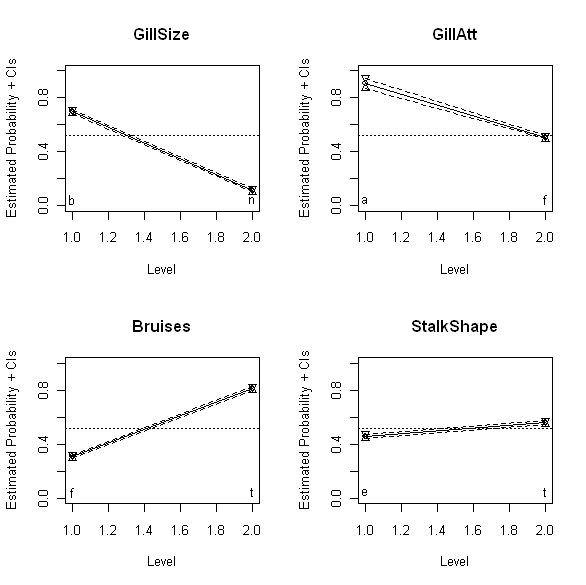
The above plots show the binomial confidence intervals discussed last time for four different binary mushroom characteristics: GillSize (upper left), GillAtt (upper right), Bruises (lower left), and StalkShape (lower right).  Specifically, these plots show the estimated probability that mushrooms with each of the two possible values for these variables are edible.  Thus, the upper left plot shows that mushrooms with GillSize characteristic “b” (“broad”) are much more likely to be edible than mushrooms with GillSize characteristic “n” (“narrow”).  The other three plots have analogous interpretations: mushrooms with GillAtt value “a” (“attached”) are more likely to be edible than those with value “f” (“free”), mushrooms with bruises (Bruises value “t”) are more likely to be edible than those without (Bruises value “f”), and mushrooms with StalkShape value “t” (“tapering”) are slightly more likely to be edible than those with value “e” (“enlarging”).   Also, while the smaller slopes for GillAtt and StalkShape suggest this association is weaker for these variables than for GillSize, where the slope appears much larger, it would be nice to have a quantitative measure of this degree of association that we could compare directly.  This is particularly the case for GillSize and Bruises, where both associations appear to be reasonably strong, but since the reference lines run in opposite directions on the plots, it is difficult to reliably compare the slopes on the basis of appearance alone.

The odds ratio provides a simple quantitative association measure for these variables that allows us to make these comparisons directly.  I discuss the odds ratio in Chapter 13 of  Exploring Data in Engineering, the Sciences, and Medicine in connection with the practical implications of data type (e.g., numerical versus categorical data).  The odds ratio may be viewed as an association measure between binary variables, and it is defined as follows.  For simplicity, suppose x and y are two binary variables of interest and assume that they are coded so that they each take the values 0 or 1 – this assumption is easily relaxed, as discussed below, but it simplifies the basic description of the odds ratio.  Next, define the following four numbers:

            N00 = the number of data records with x = 0 and y = 0
            N01 = the number of data records with x = 0 and y = 1
            N10 = the number of data records with x = 1 and y = 0
            N11 = the number of data records with x = 1 and y = 1

The odds ratio is defined in terms of these four numbers as

OR = N00 N11 / N01 N10

Since all of the four numbers appearing in this ratio are nonnegative, it follows that the odds ratio is also nonnegative and can assume any value between 0 and positive infinity.  Further, if x and y are two statistically independent binary random variables, it can be shown that the odds ratio is equal to 1.  Values greater than 1 imply that records with y = 1 are more likely to have x = 1 than x = 0, and similarly, that records with y = 0 are more likely to have x = 0 than x = 1; in other words, OR > 1 implies that the variables x and y are more likely to agree than they are to disagree.  Conversely, odds ratio values less than 1 imply that the variables x and y are more likely to disagree: records with y = 1 are more likely to have x = 0 than x = 1, and those with y = 0 are more likely to have x = 1 than x = 0.

Often – as in the mushroom dataset – the binary variables are not coded as 0 or 1, but instead as two different categorical values.  As a specific example, the binary response variable considered last time – the edibility variable EorP – assumes the values “e” (for “edible”) or “p” (for “poisonous” or “non-edible”).  In the results presented here, we recode EorP to have the values 1 for edible mushrooms and 0 for non-edible mushrooms.  For the mushroom characteristic GillSize shown in the upper left plot above, suppose we initially code the value “b” (“broad”) as 0 and the value “n” (“narrow”) as 1.  This choice is arbitrary – we could equally well code “b” as 1 and “n” as zero – and its practical consequences are explored further below.  For the coding just described, the odds ratio between mushroom edibility (EorP) and gill size (GillSize) is 0.056.  Since this number is substantially smaller than 1, it suggests that edible mushrooms (y = 1) are unlikely to be associated with narrow gills (x = 1), a result that is consistent with the appearance of the upper left plot above. 

An important practical issue in interpreting odds ratios is that of how much smaller or larger than 1 the computed odds ratio should be to be regarded as evidence for a “significant” association between the variables x and y.  That is, since we are computing this ratio from uncertain data, we need a measure of precision for the odds ratio, like the binomial confidence intervals discussed in my last post: e.g., how much does the odds ratio change if some mushrooms previously declared edible is reclassified as poisonous, or if some additional mushrooms are added to our dataset?  Fortunately, confidence intervals for the odds ratio are easily constructed.  In his book Categorical Data Analysis (Wiley Series in Probability and Statistics), Alan Agresti notes that confidence intervals for the odds ratio can be computed directly by appealing to the fact that the odds ratio estimator is asymptotically normal, approaching a Gaussian distribution in the limit of large sample sizes.  He does not give explicit results for these direct confidence intervals, however, because he does not recommend them.  Instead, Agresti advocates the construction of confidence intervals for the log of the odds ratio and transforming them back to get upper and lower confidence limits for the odds ratio itself.  This recommendation rests primarily on three practical points: first, that the log of the odds ratio approaches normality faster than the odds ratio itself does, so this approach yields more accurate confidence intervals; second, this approach guarantees a positive lower confidence limit for the odds ratio, which is not the case for the direct approach; and, third, the same result can be used to compute confidence intervals for both the odds ratio and its reciprocal, a result that is again not true for the direct approach and that will be useful in the discussion presented below. 

For the gill size example, Agresti’s recommended procedure yields a 95% confidence interval between 0.049 and 0.064.  Since this interval does not include the value 1, we conclude that there is evidence to support an association between a mushroom’s gill size and its edibility, at least for mushrooms in the UCI dataset. Applying this procedure to the GillAtt characteristic shown in the upper right plot above yields an estimated odds ratio of 0.097 with a 95% confidence interval between 0.059 and 0.157.  Again, the fact that this interval does not include 1 supports the idea that the GillAtt characteristic is associated with edibility (again, for the mushrooms considered here), but the fact that this odds ratio is larger (i.e., closer to the neutral value 1) also suggests that this association is weaker than that between edibility and the GillShape characteristic.  Again, this result is in agreement with the visual appearance of the upper right plot above, relative to that of the upper left plot.  The advantage of the odds ratio over these plots is that it provides a quantitative measure that can be used to make more objective comparisons, removing the subjective visual judgment required in comparing plots.

Applying this procedure to the Bruises variable yields an odds ratio of 9.972, with a 95% confidence interval from 8.963 to 11.093.  The fact that these values are larger than 1 implies that mushrooms whose bruise characteristics have been coded as 1 (here, “t” for “true” or “bruised”) are more likely to be edible than those whose characteristics have been coded as 0 (here, “f” for “false” or “not bruised”).  As noted above, this coding is arbitrary, as were the earlier assignments.  An extremely useful observation is that if we reverse this assignment – i.e., for this example, if we code “bruised” as 0 and “not bruised” as 1 – we simply exchange the numbers N00 with N10 and also the numbers N11 with N01.  The effect of these exchanges on the odds ratio is a reciprocal transformation:

            OR = N00N11/N01N10 -> N10N01/N11N00 = 1/OR

This observation provides a simple basis for comparing results like those for GillSize where the odds ratio is less than 1 with those for Bruises where the odds ratio is greater than 1.  As with the visual comparisons discussed above, it is not obvious from the odds ratios computed so far which of these variables is more strongly associated with mushroom edibility.  Reversing the coding for GillSize so that “b” is coded as 1 and “n” is coded as 0 changes the odds ratio from 0.059 to 1/0.059 = 17.857.  Since this number is larger than the odds ratio of 9.972 for Bruises, we can conclude that GillSize is more strongly associated with edibility – i.e., it is a better predictor of edibility for the mushrooms considered here – than Bruises, at least for this dataset. 

In fact, the same trick can be applied to the confidence intervals, illustrating the third advantage noted above for Agresti’s preferred approach to constructing these intervals.  Specifically, the asymptotically normal approximation says that the log of the odds ratio has a mean of log OR and a standard deviation S that can be simply computed from the four numbers N00, N01, N10, and N11.  Since the Gaussian distribution is symmetric about its mean and log(1/OR) = - log(OR), it follows that the log of the reciprocal odds ratio has the same approximate standard deviation S as log(OR).  In practical terms, this means that if we reverse the coding of our binary predictor variables, it is a simple matter to compute new confidence intervals as follows:

            New lower CI = 1/Old upper CI
            New odds ratio = 1/Old odds ratio
            New upper CI = 1/Old lower CI

(Note here that because the reciprocal transformation is order-reversing, the transformation of the lower confidence limit yields the new upper confidence limit, and vice-versa; for a more detailed discussion of order-preserving and order-reversing transformations in general and the reciprocal transformation in particular, refer to Chapter 12 of Exploring Data.)

Applying these transformation results to the odds ratio for Bruises yields a new odds ratio of 0.100, with a 95% confidence interval from 0.090 to 0.112, which we can now compare with the earlier results for GillSize and GillAtt.  Alternatively, if we reverse the coding of the results for GillSize and GillAtt, we obtain odds ratios that are larger than 1 between edibility and “the more edible value” of each of these mushroom characteristics.  This has the advantage of giving us a sequences of odds ratios, all larger than 1, with the largest value suggestive of the strongest association between each mushroom characteristic variable and edibility.  For the four mushroom characteristics shown in the above four plots, this approach yields the following odds ratios and their 95% confidence intervals:

            GillSize:       Lower CI = 15.625,  OR = 17.857,  Upper CI = 20.408
            GillAtt:        Lower CI =   6.369,  OR = 10.309,  Upper CI = 16.949
            Bruises:       Lower CI =   8.963,  OR =  9.972,   Upper CI = 11.093
            StalkShape: Lower CI =   1.384,  OR = 1.512,    Upper Ci = 1.651

These results suggest that, of these four variables, the best predictor of mushroom edibility is GillSize, followed by GillAtt as second-best, then Bruises, and finally StalkShape as least predictive.  These conclusions are probably the same as we would draw based on a careful comparison of the plots shown above, but the odds ratios computed in the way just described lead us to these conclusions much more directly.

Finally, it is important to make three points.  First, as I have noted before – but the point is important enough to bear repeating – the associations described here between these binary mushroom characteristics and edibility are based entirely on the UCI mushroom dataset.  Thus, these conclusions are only as representative of mushrooms in general or in any particular setting as the UCI mushroom dataset is representative of this larger and/or different mushroom population.  In particular, mushrooms from other locales or unusual environments may exhibit different relationships between edibility and gill size or other characteristics than the UCI mushrooms do.  The second key point is that the results presented here only attempt to assess the predictability of a single binary mushroom characteristic in isolation.  To get a more complete picture of the relationship between mushroom characteristics and edibility, it is necessary to explore more general multivariate analysis techniques like logistic regression.  More about that later.  Last but not least, the third point is that I realized in reviewing this post before I issued it that I hadn't included any actual R code to compute odds ratios.  In my next post, I will remedy this problem, giving a detailed view of how the numbers presented here were obained.

Tuesday, April 12, 2011

Screening for predictive characteristics … and a mea culpa

In my last post, I considered the UCI mushroom dataset and characterized the variables included there using four different interestingness measures.  When I began drafting this post, my intention was to consider the question of how the different mushroom characteristics included in this dataset relate to each mushroom’s classification as edible or poisonous.  In fact, I do consider this problem here, but in the process of working out the example, I discovered a minor typographical error in Exploring Data in Engineering, the Sciences, and Medicine that has somewhat less minor consequences.  Specifically, in Eq. (9.67) on page 413, two square roots were omitted, making the result incorrect as stated.  (More specifically, the term in curly brackets that appears twice should have an exponent of ½, like the different term that appears twice in curly brackets in Eq. (9.66) just above it on the same page.)  The consequence of this omission is that the confidence intervals defined by Eq. (9.67) are too narrow; further, since this equation was used to implement the R procedure binomCI.proc available from the companion website, the results generated by this procedure are also incorrect.  I have brought these errors to Oxford’s attention and have asked them to replace the original R procedure with a corrected update, but if you have already downloaded this procedure, you need to be aware of the missing square root.  The rest of this post carries out my original plan – which was to show how binomial confidence intervals can be useful in screening categorical variables for their ability to predict a binary outcome like edibility. 

Recall that the UCI mushroom dataset gives 23 characteristics for each of 8,124 mushrooms, including a binary classification of each mushroom as “edible” or “poisonous.”  The question considered here is which – if any – of the 22 mushroom attributes included in the dataset is potentially useful in predicting edibility.  The basic idea is the following: each of these predictors is a categorical variable that can take on any one of a fixed set of possible values, so we can examine the groups of mushrooms defined by each of these values and estimate the probability that the mushrooms in the group are edible.  As a specific example, the mushroom characteristic CapSurf has four possible values: “f” (fibrous), “g” (grooves), “s” (smooth), or “y” (scaly).  In this case, we want to estimate the probability that mushrooms with CapSurf = f are edible, the probability that those with CapSurf = g are edible, and similarly for CapSurf = s and y.  The most common approach to this problem is to estimate these probabilities as the fractions of edible mushrooms in each group: Pedible = nedible/ngroup.  The difficulty with this number, taken by itself, is that it doesn’t tell us how much weight to give the final result: if we have one edible mushroom in a group of five, we get Pedible = 0.200, and we get the same result if we have 200 edible mushrooms in a group of 1,000.  We are likely to put more faith in the second result than in the first, however, because it has a lot more weight of evidence behind it.  For example, if we add a single edible mushroom to each group, our probability estimate for the first case increases from Pedible = 0.200 to Pedible = 0.333, while in the second case, the estimated probability only increases to Pedible = 0.201.  Even worse, if we remove one edible mushroom from the first group, Pedible drops to 0.000, while in the second case, it only drops to 0.199. 

This is where statistics can come to our rescue: in addition to computing the point estimate Pedible of the probability that a mushroom is edible, we can also compute confidence intervals, which quantify the uncertainty in this result.  That is, a confidence interval is defined as a set of values that has at least some specified probability of containing the true but unknown value of Pedible.  A common choice is 95% confidence limits: the true value of Pedible lies between some lower limit P- and some upper limit P+ with probability at least 95%.  One of the key points of this post is that these intervals can be computed in more than one way, and the way that was widely adopted as “the standard method” for a long time has been found to be inadequate.  Fortunately, a simple alternative is available that gives much better results, at least if you implement it correctly.  The details follow, all based on the material presented in Section 9.7 of Exploring Data.

This standard method relies on the assumption of asymptotic normality: for a “sufficiently large” group (i.e., for “large enough” values of ngroup and possibly nedible), the estimator Pedible should approaches a Gaussian limiting distribution with variance Pedible(1 – Pedible)/ngroup.  If we assume our sample is large enough for this to be a good approximation, we can rely on known results for the Gaussian distribution to construct our confidence intervals.  As a specific example, the 95% confidence interval would be centered at Pedible with upper and lower limits lying approximately plus or minus 1.96 standard deviations from this value, where the standard deviation is just the square root of the variance given above.  The plot below shows the results obtained by applying this strategy to the groups of mushrooms defined by the four possible values of the CapSurf variable.  Specifically, the open circles in this plot correspond to the estimated probability Pedible that a mushroom from the group defined by each CapSurf value is edible.  The downward-pointing triangles represent the upper 95% confidence limit for this value, and the upward-pointing triangles represent the lower 95% confidence limit for this value.  The horizontal dotted line corresponds to the average fraction of edible mushrooms in the UCI dataset, giving us a frame of reference for assessing the edibility results for each individual CapSurf value.  That is, points lying well above this average line represent groups of mushrooms that are more edible than average, while points lying well below this average line represent groups of mushrooms that are less edible than average.  The result obtained for level “g” clearly illustrates one difficulty with this approach: this group is extremely small, containing only four mushrooms, none of which are classified as edible.  Thus, not only is Pedible zero, its associated variance is also zero, giving us zero-width confidence intervals.  In words, this result is suggesting that mushrooms with grooved cap surfaces are never edible and that we are quite certain of this, despite the fact that this conclusion is only based on four mushrooms.  In contrast, we seem to be less certain about the probability that scaly (“y”) or smooth (“s”) mushrooms are edible, despite the fact that these results are based on groups of 3,244 and 2,556 mushrooms, respectively.


An alternative approach that gives more accurate confidence intervals and also overcomes this particular difficulty is one proposed by Brown, Cai, and DasGupta.  The details are given in Exploring Data (with the exception of the error noted at the beginning of this post, I believe they are correct), and they are somewhat messy, so I won’t repeat them here, but the basic ideas are, first, to add positive offsets to both nedible and ngroup in computing the probability that a mushroom is edible, and second, to modify the expression for the variance.  Both of these modifications depend explicitly on the confidence level considered (i.e., the offsets are different for 95% confidence intervals than they are for 99%  confidence intervals, as are the variance modifications), and they become negligible in the limit as both nedible and ngroup become very large.  To see the impact of these modifications, the plot below gives the modified 95% confidence intervals for the CapSurf data, in the same general format as before.  Comparing this plot with the one above, it is clear that the most dramatic difference is that for level “g,” the grooved cap mushrooms: whereas the asymptotic result suggested the mushrooms in this group were poisonous with absolute certainty, the very wide confidence intervals for this group in the plot below reflect the fact that this result is only based on four mushrooms and, while none of these four are edible, the confidence intervals extend from essentially zero probability of being edible to almost the average probability for the complete dataset.  Thus, while we can conclude from this plot that mushrooms with grooved cap surfaces appear less likely than average to be edible, the available evidence isn’t enough to make this argument too strongly.  In contrast, the results for the mushrooms with scaly cap surfaces (“y”) or smooth cap surfaces (“s”) are essentially identical to those presented above, consistent with the much larger groups on which these results are based.


Before leaving this example, it is worth showing how the results are changed in light of my typographical error in Eq. (9.67) of Exploring Data.  The missing square roots were omitted from terms that define the width of the confidence intervals, and these terms are numerically smaller than 1.  Since if x is smaller than 1, the square root of x is larger than x but still smaller than 1, the effect of these omitted square roots is to make the resulting confidence intervals too narrow (i.e., we are using the value x rather than the larger square root of x that we should be using to determine the width of the confidence intervals).  This error causes our results to appear more precise than they really are.  This effect may be seen clearly in the plot below, which corresponds to the two plots discussed above, but with the confidence intervals based on the erroneous implementation of the estimator of Brown et al.


Finally, the figure below shows four plots, each in the same format as those discussed above, corresponding to the Pedible estimates obtained by applying the method of Brown et al. to four different mushroom characteristics.  The upper left plot shows the results obtained for the mushroom characteristic “Odor,” which appears to be highly predictive of edibility. Careful examination of these results reveals that, for the mushrooms in the UCI dataset, those with odors characterized as “a” (almond) or “l” (anise) are always edible, those with odors characterized as “c” (creosote), “f” (foul), “m” (musty), “p” (pungent), “s” (spicy), or “y” (fishy) are always poisonous, and those with no odor are more likely to be edible than not, but they can still be poisonous.  In contrast, CapShape (upper right plot) appears much less predictive: some values seem to be strongly associated with edibility (“b” or “s”), while the levels “f” and “x” seem to convey no information at all: the likelihood that these mushrooms are edible is essentially the same as that of the complete collection, without regard to CapShape.  The lower left plot shows the corresponding results for StalkRoot, which suggest that levels “c,” “e,” and “r” are more likely to be edible than average, level “b” conveys no information, and mushrooms where StalkRoot values are missing are somewhat more likely to be poisonous (the class “?”).  This result is somewhat distressing, raising the possibility that the missing values for this variable are not missing at random, but that there may be some systematic mechanism at work (e.g., is the StalkRoot characterization somehow more difficult for poisonous mushrooms?).  Finally, the lower right plot shows the results for the binary characteristic GillSize: it appears that mushrooms with GillSize “n” (narrow) are much more likely to be poisonous than those with GillSize “b” (broad).  Because both the response (i.e., edibility) and the candidate predictor GillSize are binary in this case, an alternative – and arguably better – approach to characterizing their relationship is in terms of odds ratios, which I will take up in my next post.


Sunday, April 3, 2011

Interestingness Measures


Probably because I first encountered them somewhat late in my professional life, I am fascinated by categorical data types.  Without question, my favorite book on the subject is Alan Agresti’s Categorical Data Analysis (Wiley Series in Probability and Statistics), which provides a well-integrated, comprehensive treatment of the analysis of categorical variables.  One of the topics that Agresti does not discuss, however, is that of interestingness measures, a useful quantitative characterization of categorical variables that comes from the computer science literature rather than the statistics literature.  As I discuss in Chapter 3 of Exploring Data in Engineering, the Sciences, and Medicine, interestingness measures are essentially numerical characterizations of the extent to which a categorical variable is uniformly distributed over its range of possible values: variables where the levels are equally represented are deemed “less interesting” than those whose distribution varies widely across these levels.  Many different interestingness measures have been proposed, and Hilderman and Hamilton give an excellent survey, describing 13 different measures in detail.  (I have been unable to find a PDF version on-line, but the reference is R.J. Hilderman and H.J. Hamilton, “Evaluation of interestingness measures for ranking discovered knowledge,” in Proceedings of the 5th Asia-Pacific Conference on Knowledge Discovery and Data Mining, D. Chueng, G.J. Williams, and Q. Li, eds., Hong Kong, April, 2001, pages 247 to 259.)  In addition, the authors present five behavioral axioms for characterizing interestingness measures.  In Exploring Data, I consider four normalized interestingness measures that satisfy the following three of Hilderman and Hamilton’s axioms:

1.   The minimum value principle: the measure exhibits its minimum value when the variable is uniformly distributed over its range of possible values.  For the normalized measures considered here, this means the measure takes the value 0.
2.   The maximum value principle: the measure exhibits its maximum value when the variable is completely concentrated on one of its several possible values.  For the normalized measures considered here, this means the measure takes the value 1.
3.   The permutation-invariance principle: re-labeling the levels of the variable does not change the value of the interestingness measure.

To compute the interestingness measures considered here, it is necessary to first compute the empirical probabilities that a variable assumes each of its possible values.  To be specific, assume that the variable x can take any one of M possible values, and let pi denote the fraction of the N observed samples of x that assume the ith possible value.  All of the interestingness measures considered here attempt to characterize the extent to which these empirical probabilities are constant, i.e. the extent to which pi is approximately equal to 1/M for all i.  Probably the best known of the four interestingness measures I consider is the Shannon entropy from information theory, which is based on the average of the product pi log pi over all i.  A second measure is the normalized version of Gini’s mean difference from statistics, which is the average distance that pi lies from pj for all i distinct from j, and a third – Simpson’s measure – is a normalized version of the variance of the pi values.  The fourth characterization considered in Exploring Data is Bray’s measure, which comes from ecology and is based on the average of the smaller of pi and 1/M.  The key point here is that, because these measures are computed in different ways, they are sensitive to different aspects of the distributional heterogeneity of a categorical variable over its range of possible values.  Specifically, since all four of these measures assume the value 0 for uniformly distributed variables and 1 for variables completely concentrated on a single value, they can only differ for intermediate degrees of heterogeneity.

The R procedures bray.proc, gini.proc, shannon.proc, and simpson.proc are all available from the Exploring Data  companion website, each implementing the corresponding interestingness measure.  To illustrate the use of these procedures, they are applied here to the UCI Machine Learning Repository Mushroom dataset, which gives 23 categorical characterizations of 8,124 different species of mushrooms, taken from The Audubon Society Field Guide to North American Mushrooms (G.H. Lincoff, Pres., published by Alfred A. Knopf, New York, 1981).  A typical characterization is gill color, which exhibits 12 distinct values, each corresponding to a one-character color code (e.g., “p” for pink, “u” for purple, etc.).  To evaluate the four interestingness measures for any of these attributes, it is necessary to first compute its associated empirical probability vector.  This is easily done with the following R function:

                        ComputePvalues <- function(x){
                                    xtab <- table(x)
                                    pvect <- xtab/sum(xtab)
                                    pvect
                        }

Given this empirical probability vector, the four R procedures listed above can be used to compute the corresponding interestingness measure.  As a specific example, the following sequence gives the values for the four interestingness measures for the seven-level variable “Habitat” from the mushroom dataset:

>      x <- mushroom$Habitat
>      pvect <- ComputePvector(x)
>      bray.proc(pvect)
>      0.427212
>      gini.proc(pvect)
>      0.548006
>      shannon.proc(pvect)
>      0.189719
>      simpson.proc(pvect)
>      0.129993

These results illustrate the point noted above, that while all of these measures span the same range – from 0 for completely uniform level distributions to 1 for variables completely concentrated on one level – in general, the values of the four measures are different.  These differences arise from the fact that the different interestingness measures weight specific types of deviations from uniformity differently.  To see this, note that the seven levels of the habitat variable considered here have the following distribution:

>    table(mushroom$Habitat)
>            d         g           l       m         p          u       w
>   3148   2148   832   292   1144   368   192

It is clear from looking at these numbers that the seven different habitat levels are not all equally represented in this dataset, with the most common level (“d”) occurring about 15 times as often as the rarest level (“w”).  The average representation is approximately 1160, so the two most populous levels occur much more frequently than average, one level occurs with about average frequency (“p”), and the other four levels occur anywhere between half as often as average and one tenth as often.  It is clear that the Gini measure is the most sensitive to these deviations from homogeneity, at least for this example, while the Simpson measure is the least sensitive.  These observations raise the following question: to what extent is this behavior typical, and to what extent is it specific to this particular example?  The rest of this post examines this question further.


The four plots shown above compare these different interestingness measures for all of the variables included in the UCI mushroom dataset.  The upper left plot shows the Gini measure plotted against the Shannon measure for all 23 of these categorical variables.  The dashed line in the plot is the equality reference line: if both measures were identical, all points would lie along this line.  The fact that all points lie above this line means that – at least for this dataset – the Gini measure is always larger than the Shannon measure.  The upper right plot shows the Simpson measure plotted against the Shannon measure, and here it is clear that the Simpson measure is generally smaller than the Shannon measure, but there are exceptions.  Further, it is also clear from this plot that the differences between the Shannon and Simpson measures are substantially less than those between the Shannon and Gini measures, again, at least for this dataset.  The lower left plot shows the Bray measure plotted against the Shannon measure, and this plot has the same general shape as the one above for the Gini versus Shannon measures.  The differences between the Bray and Shannon measures appear slightly less than those between the Gini and Shannon measures, suggesting that the Bray measure is slightly smaller than the Gini measure.  The lower right plot of the Bray versus the Gini measures shows that this is generally true: some of the points on this plot appear to fall exactly on the reference line, while the others fall slightly below this line, implying that the Bray measure is generally approximately equal to the Gini measure, but where they differ, the Bray measure is consistently smaller.  Again, it is important to emphasize that the results presented here are based on a single dataset, and they may not hold in general, but these observations do what a good exploratory analysis should: they raise the question. 


Another question raised by these results is whether there is anything special about the few points that violate the general rule that the Simpson measure is less than the Shannon measure.  The above figure repeats the upper right plot from the four shown earlier, with the Simpson measure plotted against the Shannon measure.  Here, the six points that correspond to binary characterizations are represented as solid circles, and they correspond to six of the eight points that fall above the line, implying that the Simpson measure is greater than the Shannon measure for these points.  The fact that these are the only binary variables in the dataset suggests – but does not prove – that the Simpson measure tends to be greater than the Shannon measure for binary variables.  Of the other two points above the reference line, one represents the only three-level characterization in the mushroom dataset (specifically, the point corresponding to “RingNum,” a categorical variable based on the number of rings on the mushroom, labeled on the plot).  The last remaining point above the equality reference line corresponds to one of four four-level characterizations in the dataset; the other three four-level characterizations fall below the reference line, as do all of those with more than four levels.  Taken together, these results suggest that the number of levels in a categorical variable influences the Shannon and Simpson measures differently.  In particular, it appears that those cases where the Simpson measure exceeds the Shannon measure tend to be variables with relatively few levels.

In fact, these observations raise a subtle but extremely important point in dealing with categorical variables.  The metadata describing the mushroom dataset indicates that the variable VeilType is binary, with levels universal (“u”) and partial (“p”), but the type listed for all 8,124 mushrooms in the dataset is “p.”  As a consequence, VeilType appears in this analysis as a one-level variable.  Since the basic numerical expressions for all four of the interestingness measures considered here all become indeterminate for one-level variables, this case is tested for explicitly in the R procedures used here, and it is assigned a value of 0: this seems reasonable, representing a classification of “fully homogeneous, evenly spread over the range of possible values,” as it is difficult to imagine declaring a one-level variable to be strongly heterogeneous or “interesting.”  Here, this result is a consequence of defining the number of levels for this categorical variable from the data alone, neglecting the possibility of other values that could be present but are not.  In particular, if we regard this variable as binary – in agreement with the metadata – all four of the interestingness measures would yield the value 1, corresponding to the fact that the observed values are fully concentrated in one of two possible levels.  This example illustrates the difference between internal categorization – i.e., determination of the number of levels for a categorical variable from the observed data alone – and external categorization, where the number of levels is specified by the metadata.  As this example illustrates, the difference can have important consequences for both numerical data characterizations and their interpretation.


Finally, the above figure shows the Gini measure plotted against the Shannon measure for all 23 of the mushroom characteristics, corresponding to the upper left plot in the first figure, but with three additions.  First, the solid curve represents the result of applying the lowess nonparametric smoothing procedure to the scatterplot of Gini versus Shanon measures.  Essentially, this curve fills in the line that your eye suggests is present, approximating the nonlinear relationship between these two measures that is satisfied by most of the points on the plot.  Second, the solid circle represents the variable whose results lie farthest from this curve, which is CapSurf, a four-level categorical variable describing the surface of the mushroom cap as fibrous (“f”), grooved (“g”), scaly (“y”), or smooth (“s”), distributed as follows: 2,320 “f,” 4 “g,” 2,556 “y,” and 3224 “s.”  Note that if the rare cagetory “g” were omitted from consideration, this variable would be almost uniformly distributed over the remaining three values, and this modified result (i.e., with the rare level "g" omitted from the analysis) corresponds to the solid square point that falls on the lowess curve at the lower left end.  Thus, the original CapSurf result appears to represent a specific type of deviation from uniformity that violates the curvilinear relationship that seems to generally hold – at least approximately – between the Gini and Shannon interestingness measures.

The real point of these examples has been two-fold.  First, I wanted to introduce the notion of an interestingness measure and illustrate the application of these numerical summaries to categorical variables, something that is not covered in typical introductory statistics or data analysis courses.  Second, I wanted to show that – in common with most other summary statistics – different data characteristics influence alternative measures differently.  Thus, while it appears that the Simpson measure is generally slightly smaller than the Shannon measure – at least for the examples considered here – this behavior depends strongly on the number of levels the categorical variable can assume, with binary variables consistently violating this rule of thumb (again, at least for the examples considered here).  Similarly, while it appears that the Gini measure always exceeds the Shannon measure, often substantially so, there appear to be certain types of heterogeneous data distributions for which this difference is substantially smaller than normal.  Thus, as is often the case, it can be extremely useful to compute similar characterizations of the same type and comapre them, since unexpected differences can illuminate features of the data that are not initially apparent and which may turn out to be interesting.